
Keller Williams Realty, LLC
Transforming a fragmented consumer real estate experience into a cohesive, conversion-focused platform
OVERVIEW
In January 2022, I joined the Keller Williams Realty consumer team as a Product Designer to help reimagine and modernize the consumer platform.
Working across the web and mobile experiences, I collaborated with product managers, engineers, and researchers to redesign core parts of the platform, improve the existing experience, and introduce new features that better supported the end-to-end home search journey.
As part of this effort, I contributed to revamping the legacy platform and helped establish a scalable design system to ensure consistency and support the product’s long-term growth.
ROLE
Product Designer
TIMEFRAME
Jan 2022 - Mar 2026
SURFACES
Web, Mobile, App
CROSS-FUNCTIONAL PARTNERS
PMs, Engineers, Research (LABS)
The Problem
The Keller Williams consumer platform delivered a fragmented experience across the end-to-end home buying journey, from discovery to post-purchase engagement.
While users could easily search for properties, the platform lacked cohesive tools to support decision-making—such as comparing homes, managing saved listings, and seamlessly connecting with agents. Additionally, adjacent experiences like loans and home management existed in isolation, creating a disjointed ecosystem.
As a result, users faced high cognitive effort when evaluating options and often dropped off before taking meaningful actions like contacting an agent or scheduling a tour, limiting overall engagement and conversion.
Approach & Design Strategy
To better understand where the experience was breaking down, we mapped the end-to-end information architecture across the consumer journey—from property search and listing exploration to agent contact, loans, and post-purchase tools.
This allowed us to visualize how different parts of the platform were structured and identify key points of fragmentation.
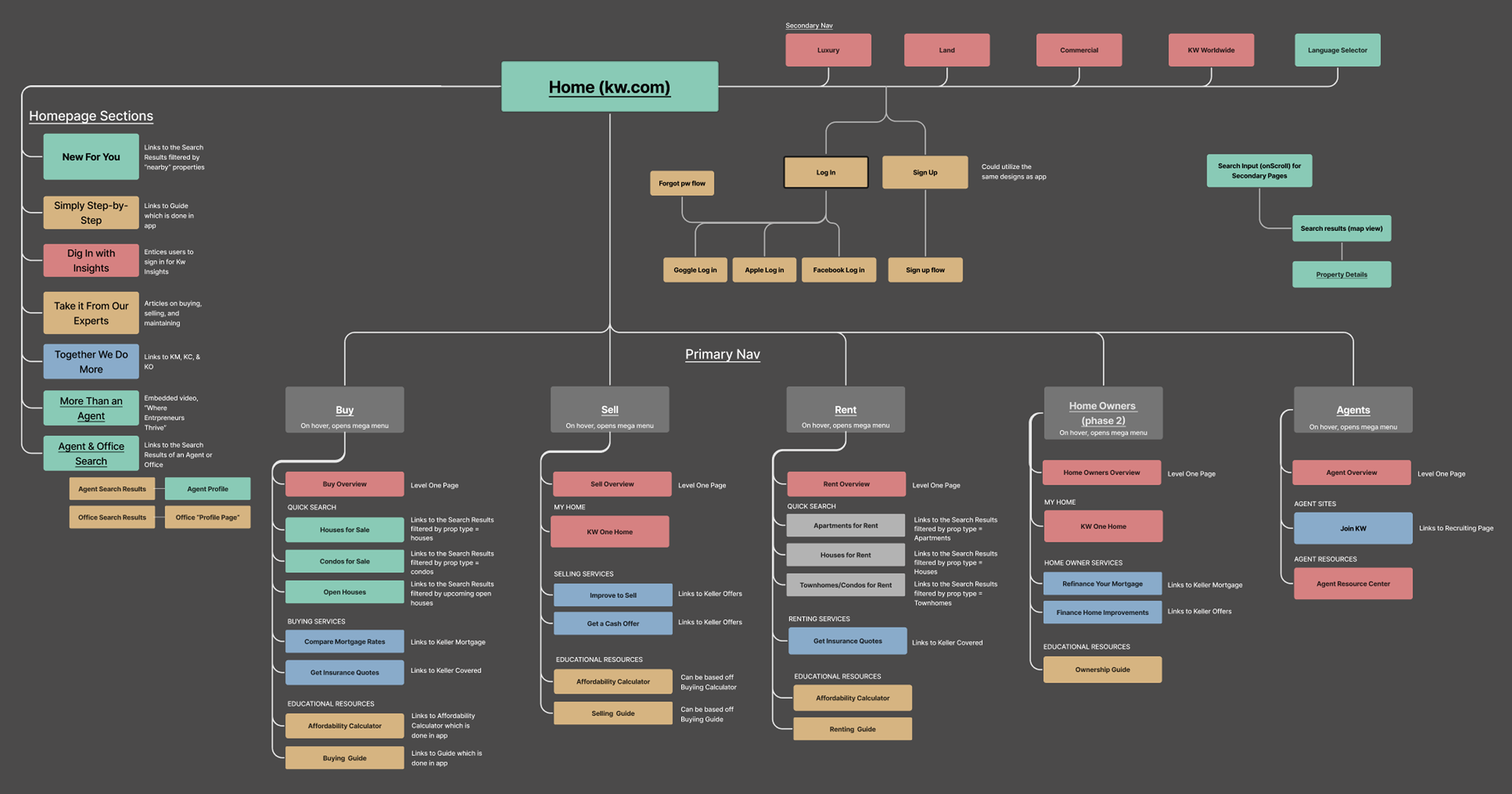
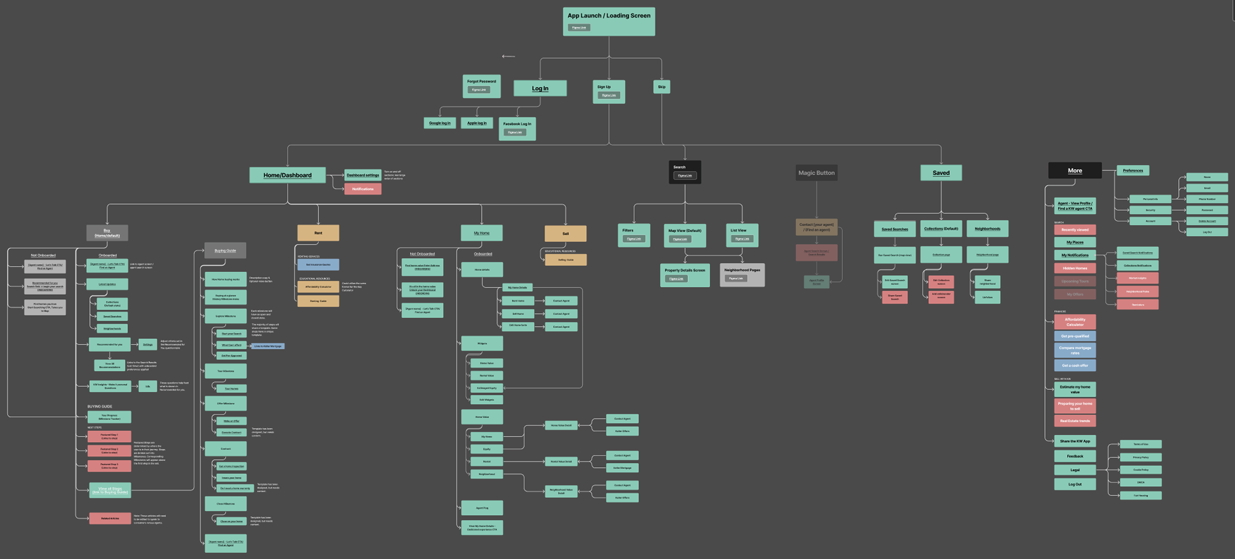
From this, we identified several critical gaps:
Disconnected decision-making flow — while users could browse listings, it was often unecessarily complex, with no cohesive way to evaluate or compare properties.
Unclear path to action — users lacked a consistent, guided path toward contacting an agent or scheduling a tour.
Siloed experiences — supporting services like loans and home management existed outside the core journey.
These insights shifted our focus from improving individual screens to designing a more unified, end-to-end experience centered around discovery, evaluation, and decision-making. To guide this work, I focused on three key principles:
Design for decision-making, not just browsing
Reframing the experience to help users evaluate properties more effectively through clearer information hierarchy, comparison tools, and actionable next steps.Unify the end-to-end journey
Connecting previously fragmented experiences—such as search, property details, and agent interaction—into a more seamless and guided flow from discovery to action.Build for consistency and scale
Establishing a design system to ensure a cohesive experience across surfaces, while enabling faster iteration and collaboration across teams.
The Solution
The following sections highlight key parts of the experience that demonstrate how the above principles were applied.
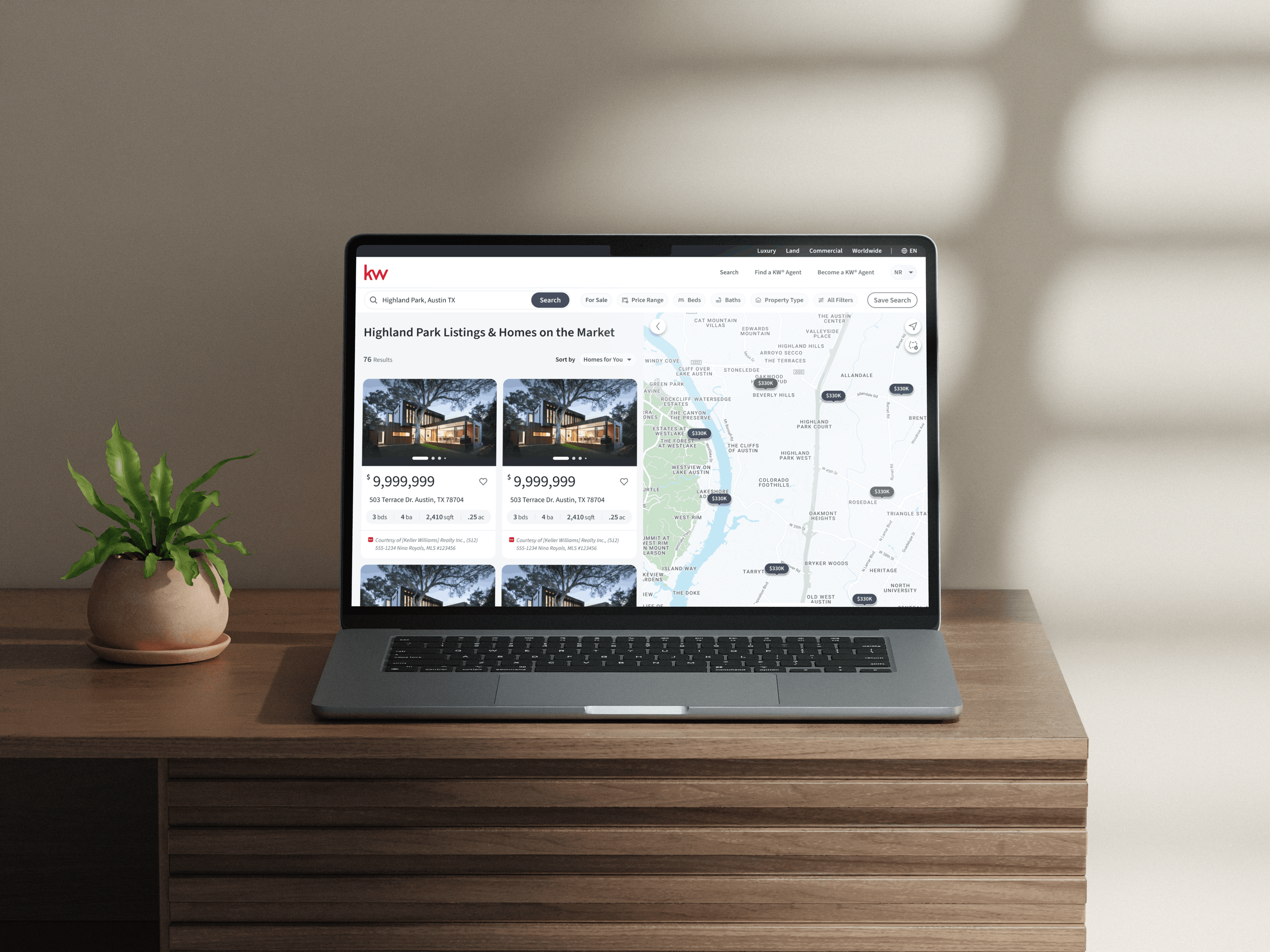
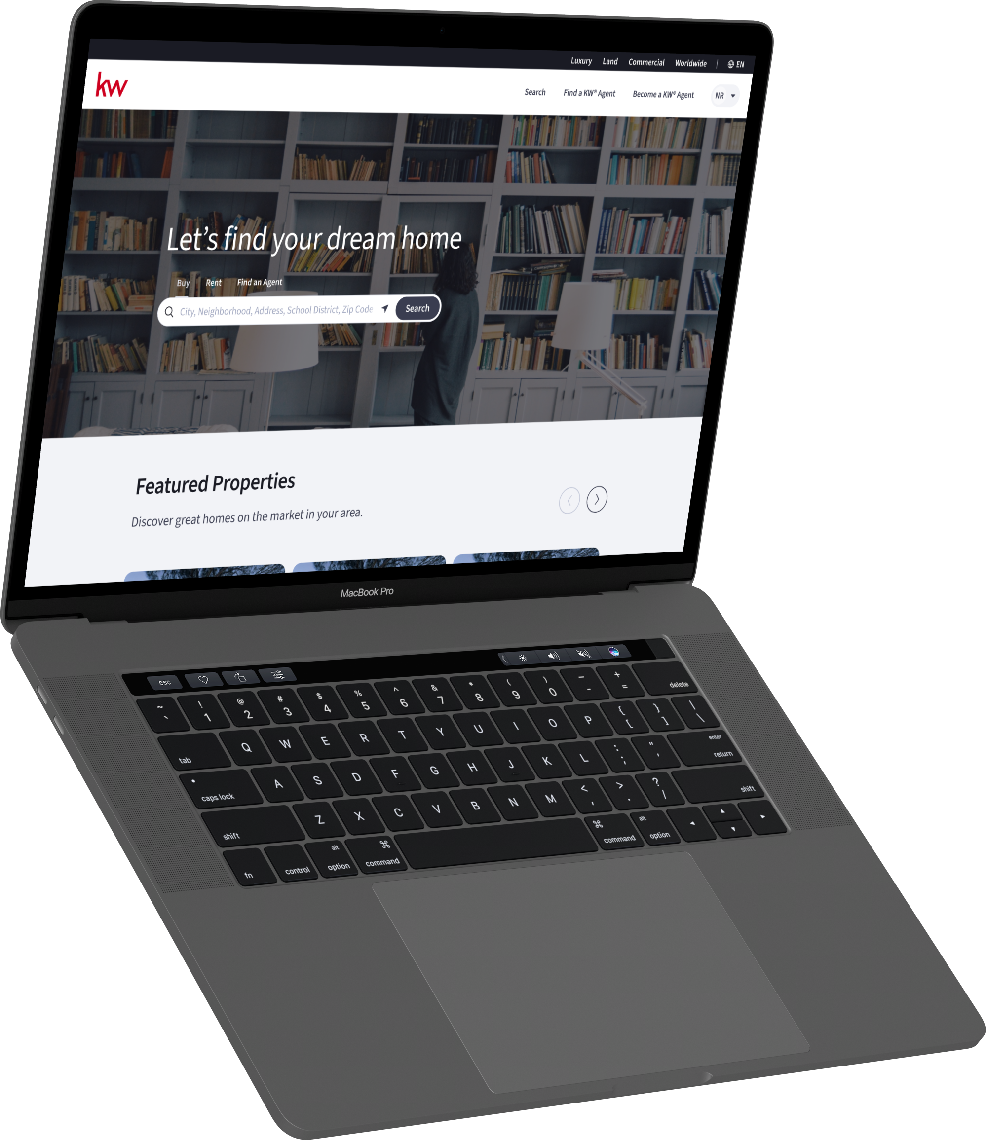
Discovery Experience
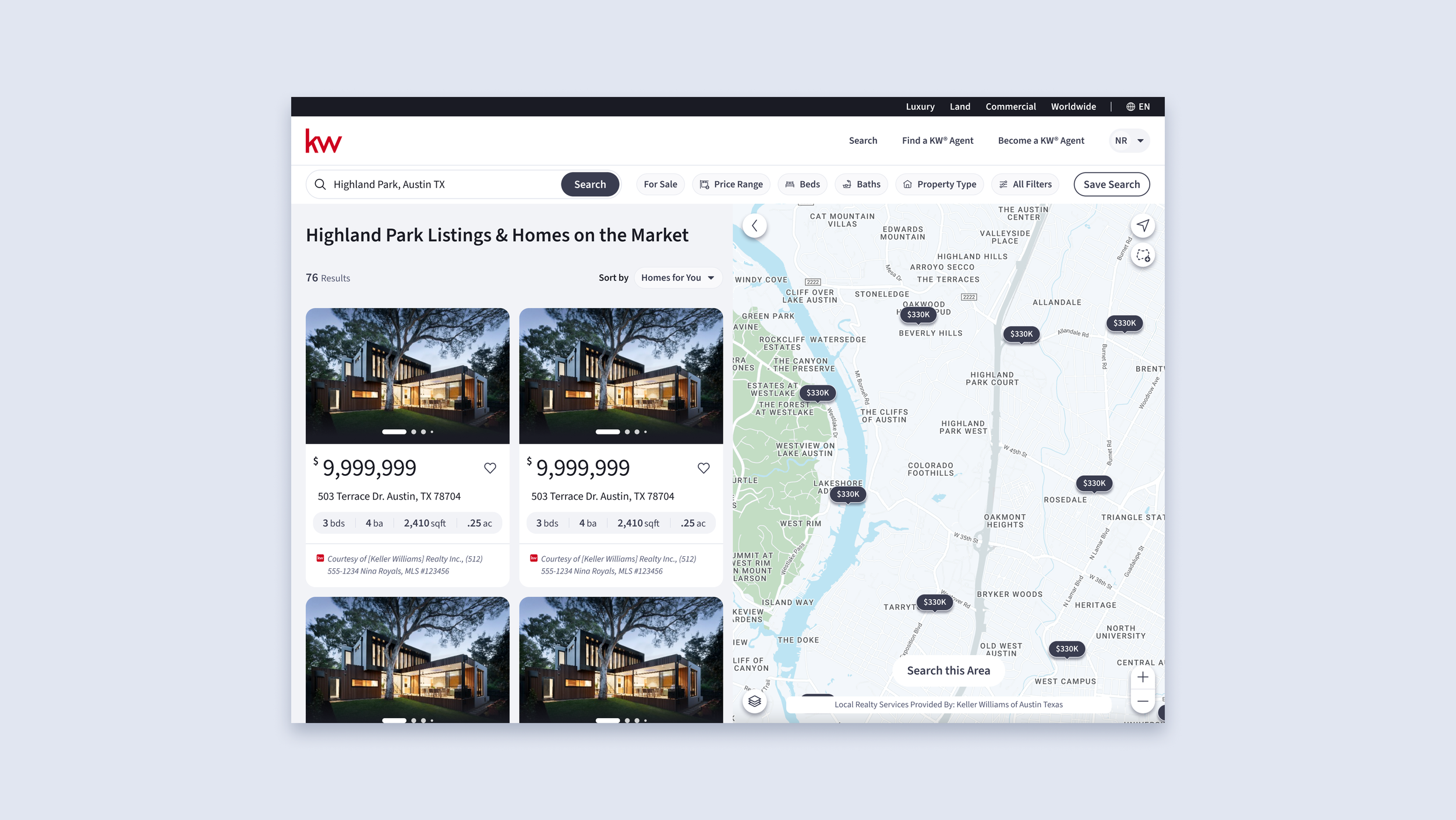
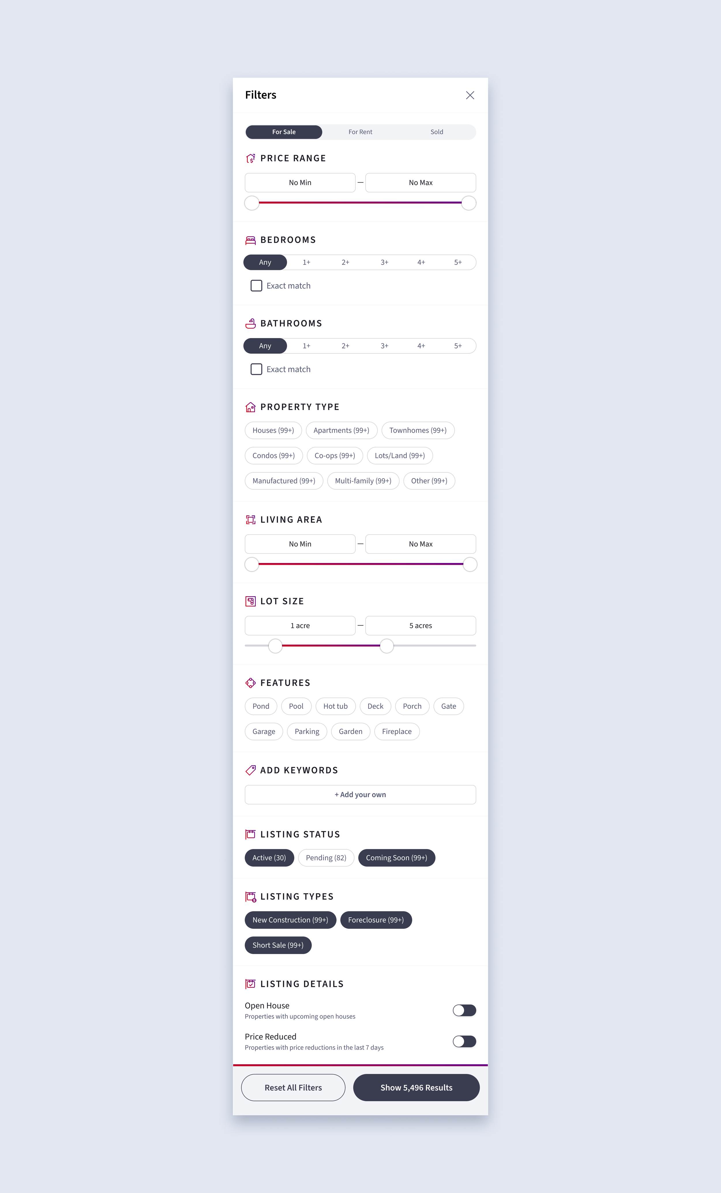
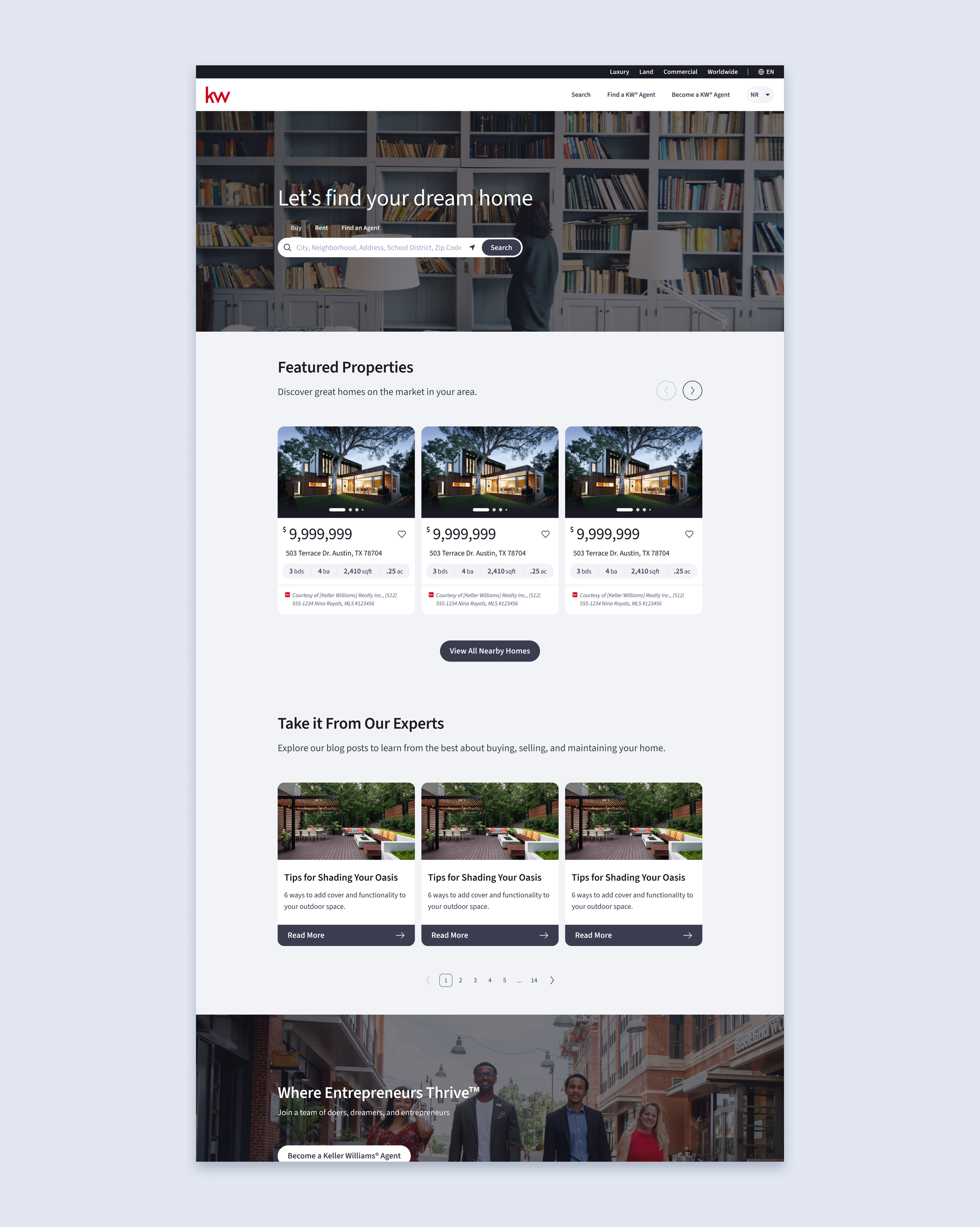
Searching and browsing should be easy and pain free. Users could browse listings, but narrowing down results was often overwhelming due to excessive filters and lack of prioritization.
Improvements
Simplified filtering — prioritized high-impact criteria and grouped options to reduce cognitive load
Clearer details — reduced visible complexity while keeping advanced options accessible

Design For Decision-Making
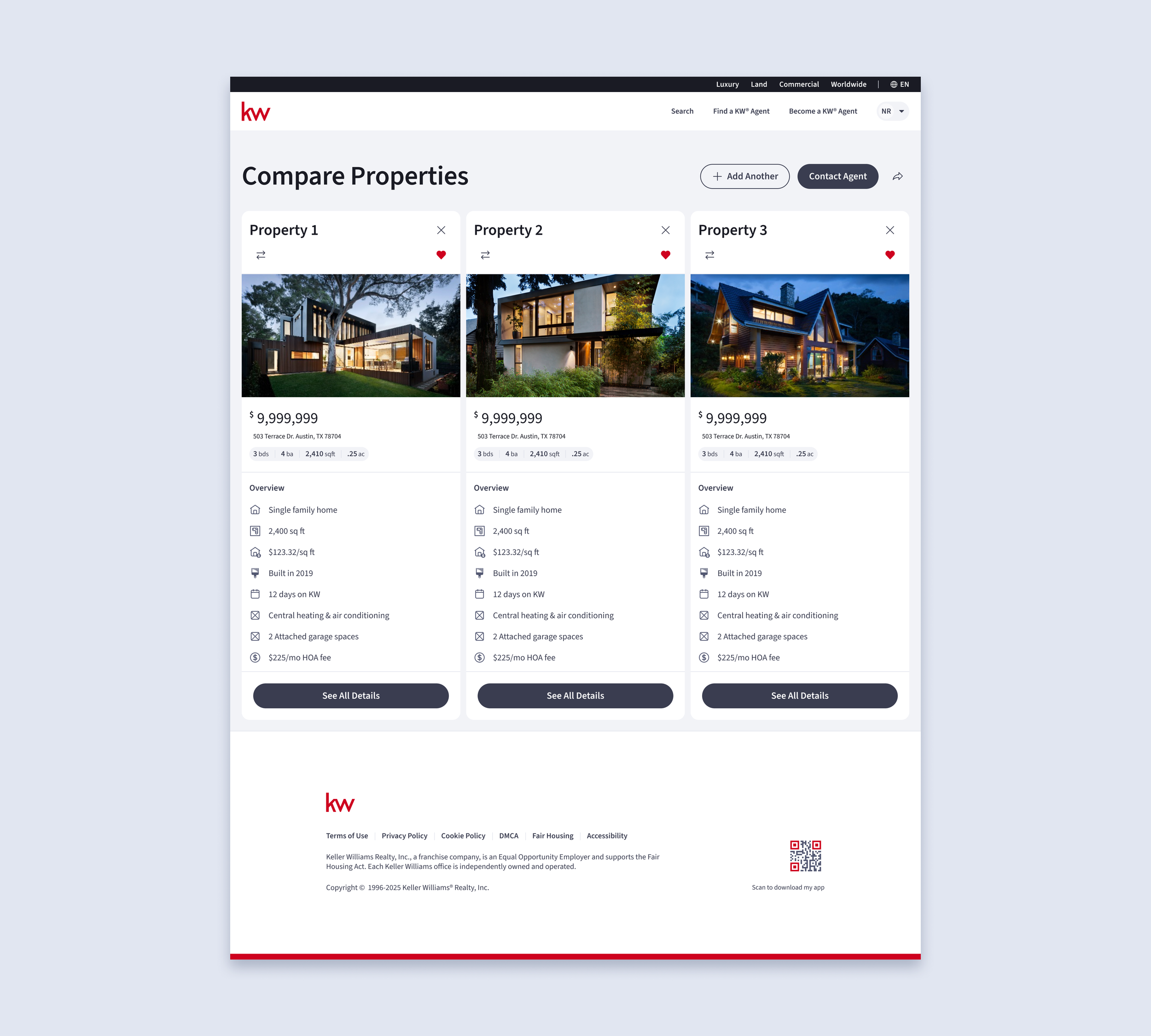
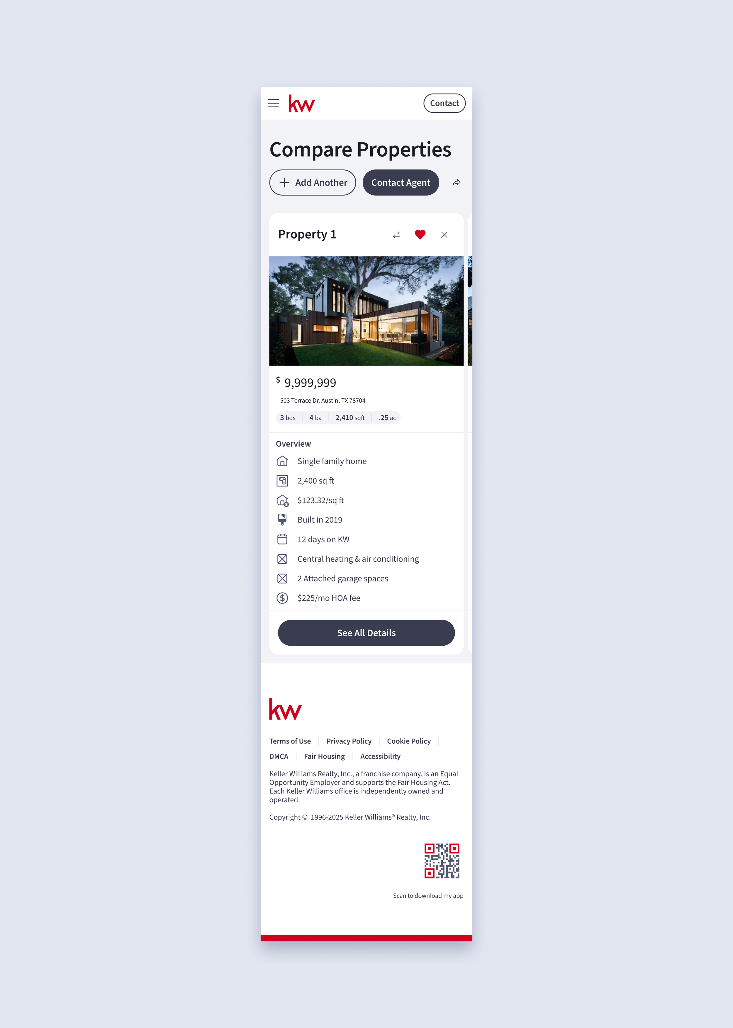
Evaluating and comparing properties required significant effort due to scattered information and unclear next steps.
Improvements
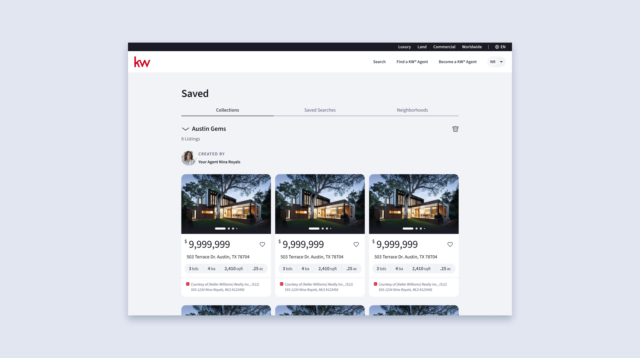
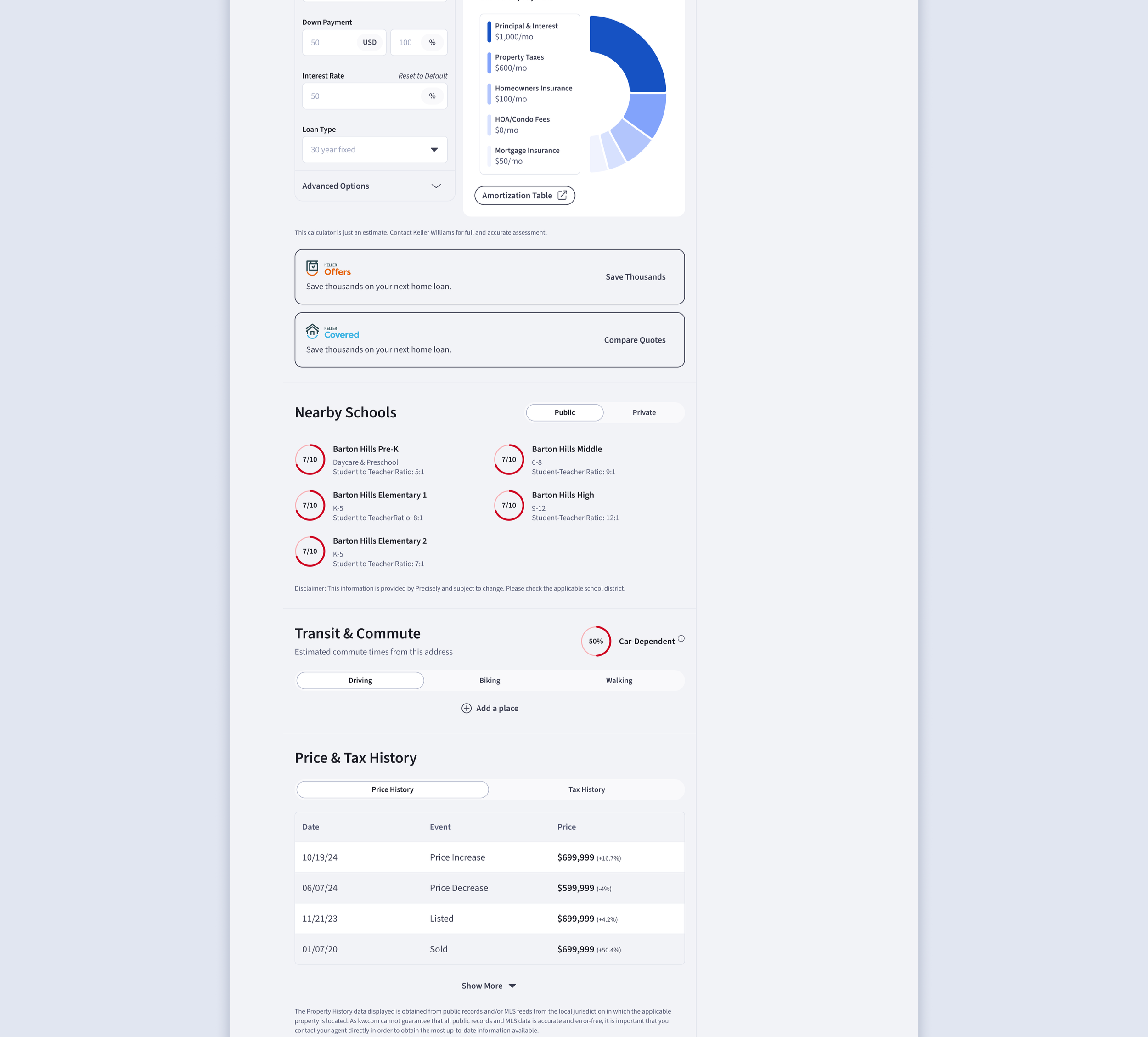
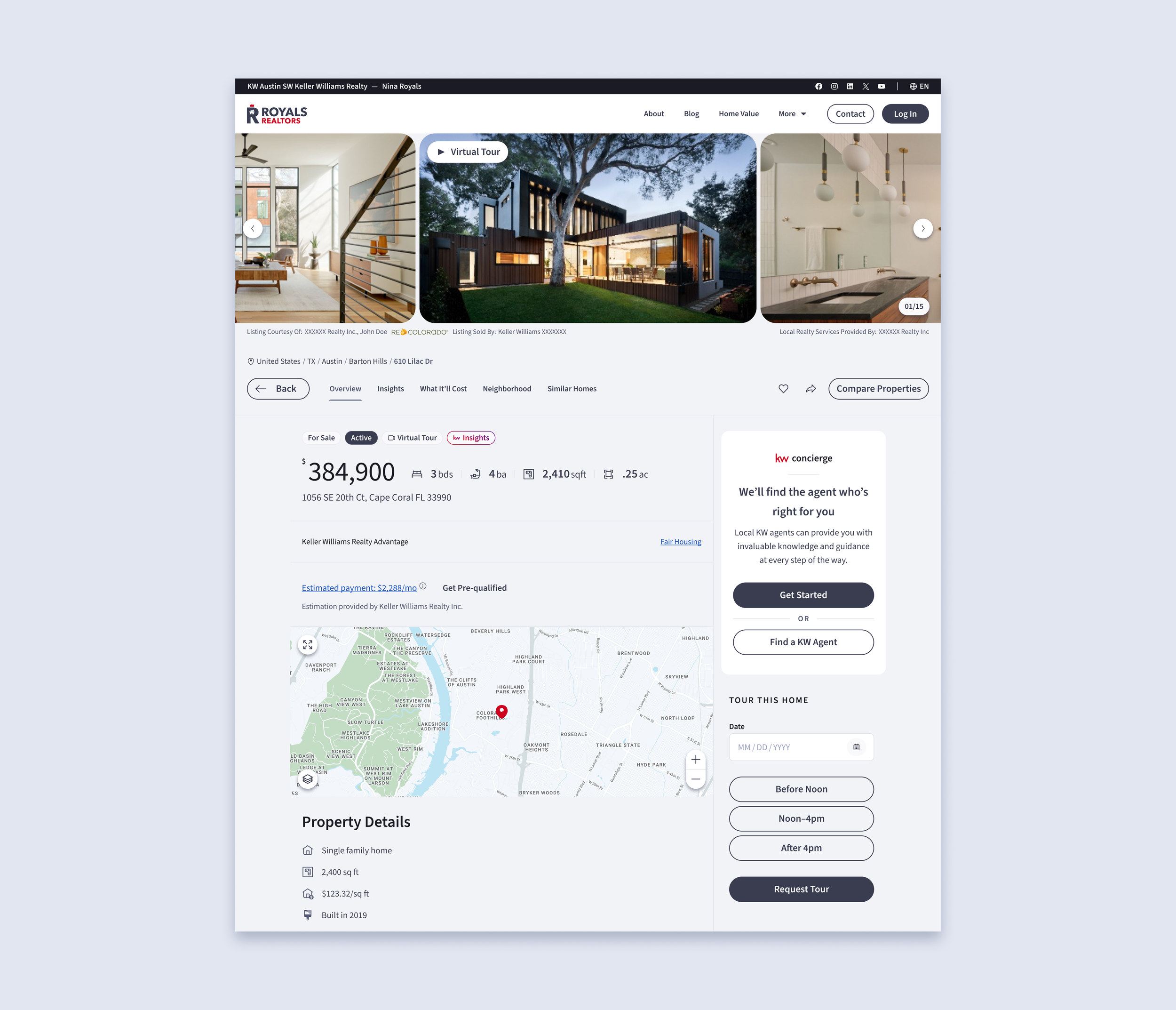
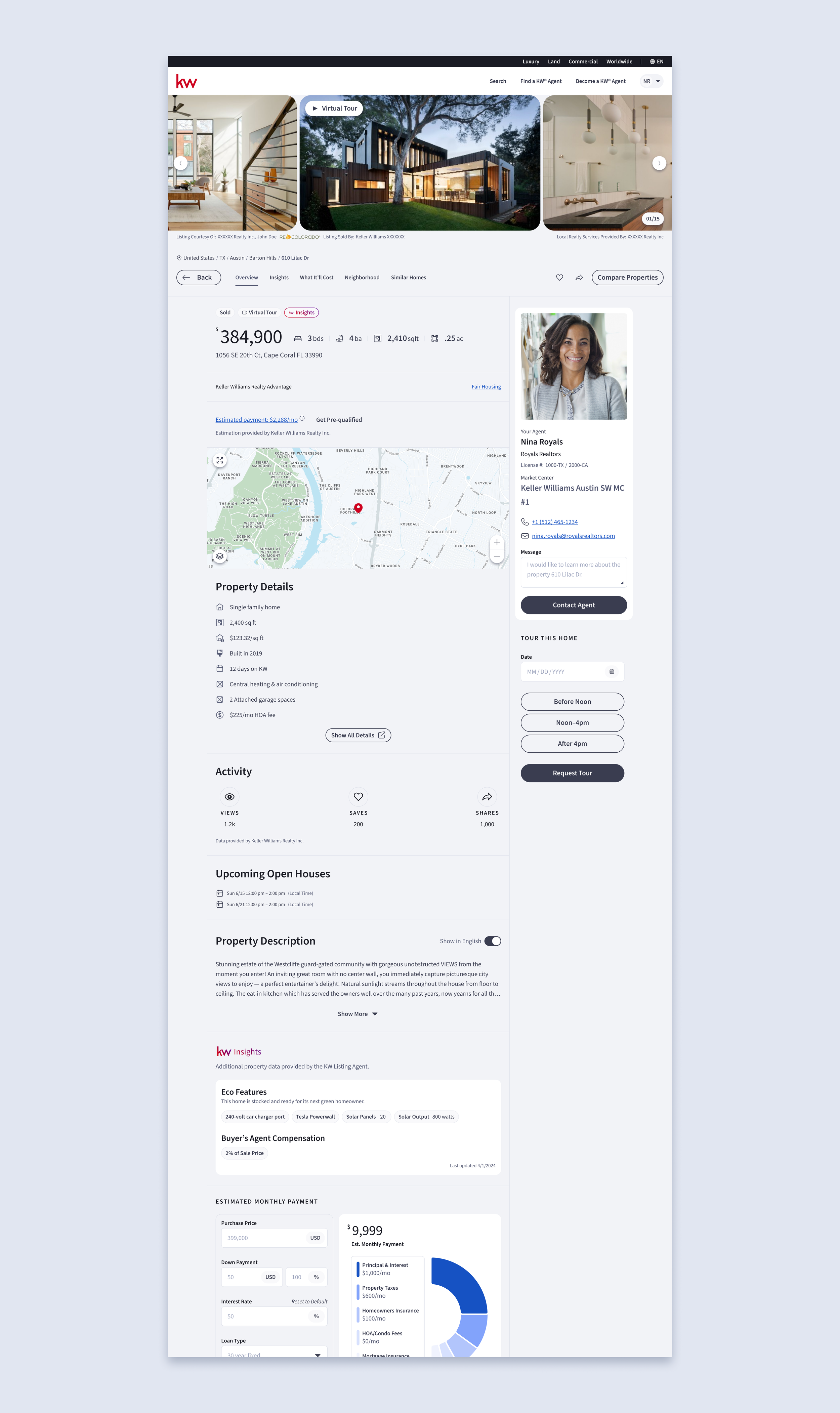
Tools of the trade — essential tools helpful for making big decisions such as data-driven insights, mortgage calculators, property comparisons, flexible collections/saved searches
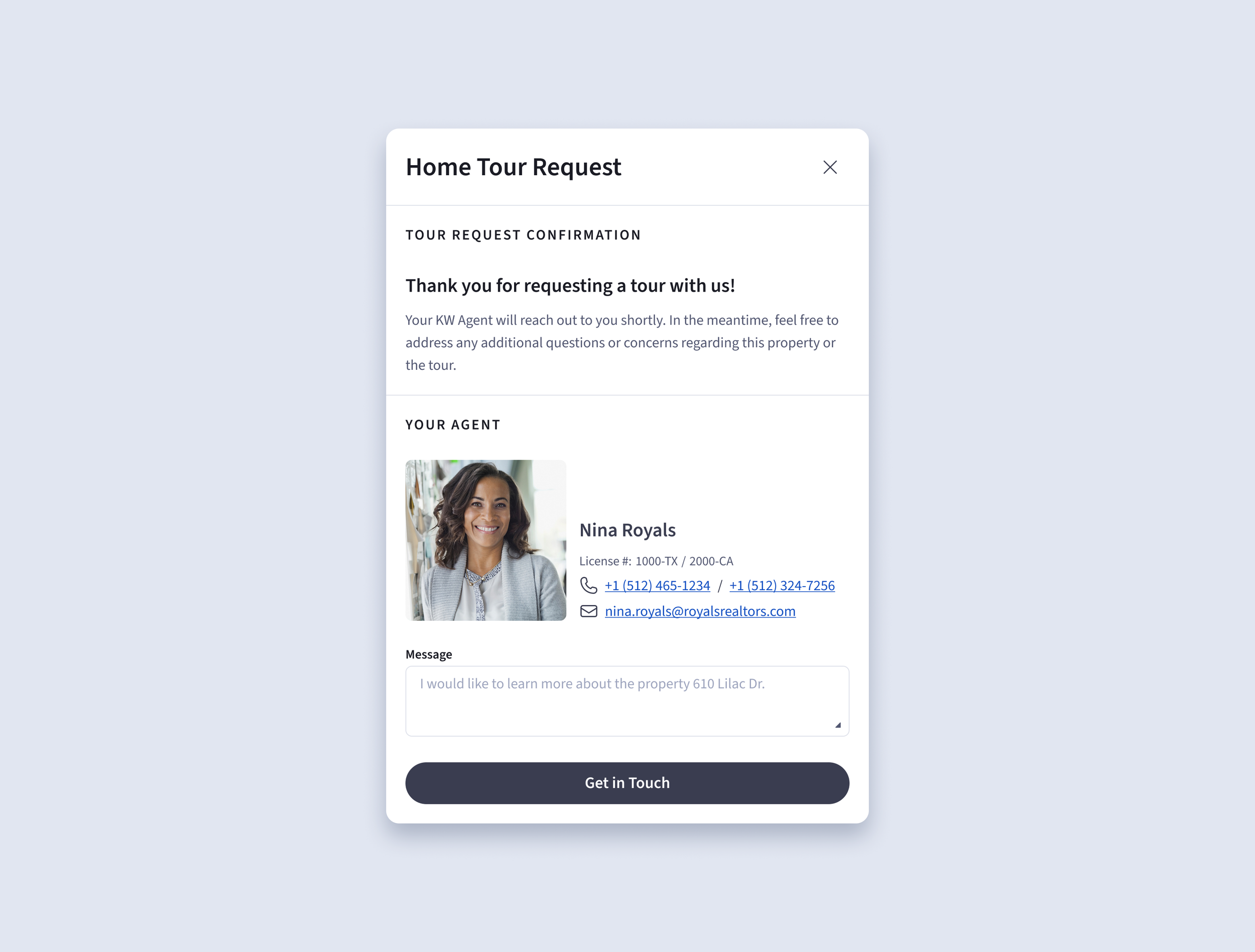
Clear next actions — upfront agent contact and tour scheduling to guide users toward decisions
Agent interaction — collections/saved searches curated & shared by agents to reduce consumer’s effort
Unify the End-to-End Journey
The fragmented experience across search, discovery, and agent interaction made it difficult for users to make the next action.
Improvements
Connected core experiences — aligned search, listing details, and agent interactions into a more cohesive flow
Consistent interaction patterns — standardized layouts and behaviors to create a predictable experience across surfaces
Integrated support — integrated touchpoints and access to supporting services to support continuity throughout the journey
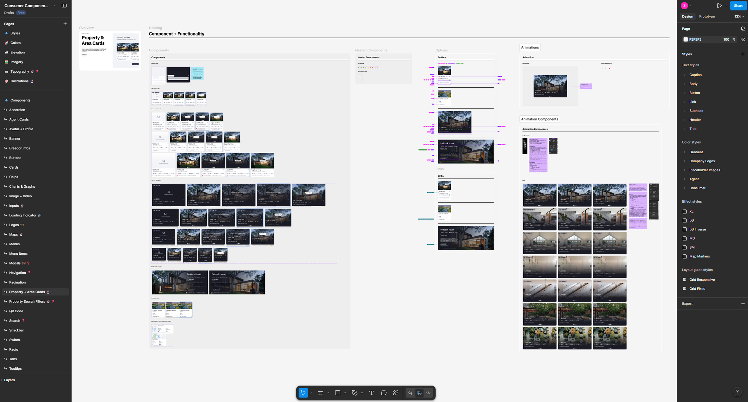
Design System & Documentation
As the platform evolved, inconsistencies across components and patterns made it difficult to scale design efforts and maintain a cohesive experience.
Improvements
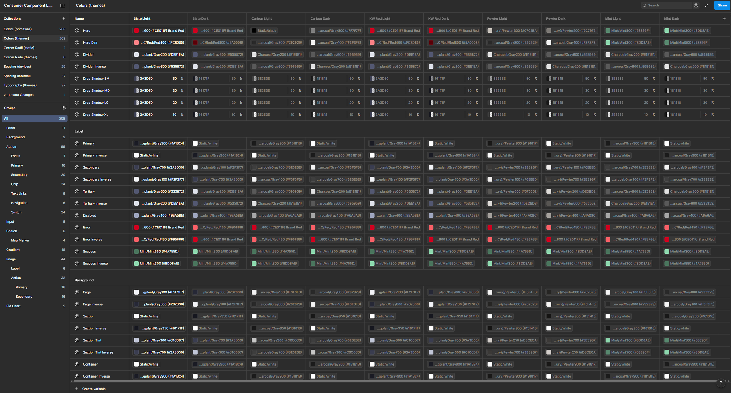
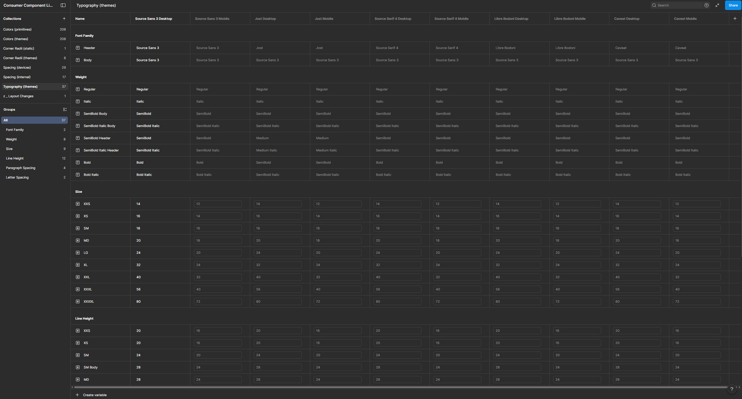
Established scalable foundations — re-defined reusable components, typography, and color systems by converting to Figma variables
Improved consistency across surfaces — standardized patterns to align experiences across web and mobile
Enabled faster iteration — streamlined collaboration between design and engineering through shared system guidelines
Outcomes & Impact
The redesign improved the overall usability and cohesion of the consumer experience, making it easier for users to move from discovery to decision.
Impact
Improved usability and clarity — simplified workflows and clearer information hierarchy reduced friction during search and evaluation
Increased engagement in key flows — stronger connections between search, property details, agent actions, and supporting services encouraged deeper interaction
Established a scalable foundation — the design system enabled more consistent experiences and faster iteration across teams
Reflection
Balancing simplicity and flexibility
As designers, we are always tempted to focus on creating what ‘seems logical’. However, we must always remember and question the ‘why’. Simplifying the experience while still supporting diverse user needs required careful prioritization and tradeoffs, especially in areas like search and filtering.Designing beyond individual features
This project reinforced the importance of thinking in systems—focusing on how experiences connect across the entire journey, not just within isolated screens.Building for scale early
Establishing a design system early on proved critical in maintaining consistency and enabling faster iteration as the product evolved.