
Pacific Life Retirement Solutions - Accelerating the experience of annuities and retirement through a digital-first mindset
Corporate Work / UI, UX, User Research, Visual Design, Branding

INTRO
I was fortunate enough to join and continue my UI/UX journey with the Corporate Innovations team (Hatch Labs) at Pacific Life as a UX Designer, where we strive to provide pleasing and hassle-free digital solutions across different teams, departments, and projects throughout the entire organization.
Pacific Life is a 150+ year old life insurance company with great traditions and history. With that however, came very conservative approaches especially given the industry we stand in. We decided to push for a digital-first mindset across the entire organization, and decided to start with the Retirement Solutions Department, where I was assigned as the primary UX Designer.
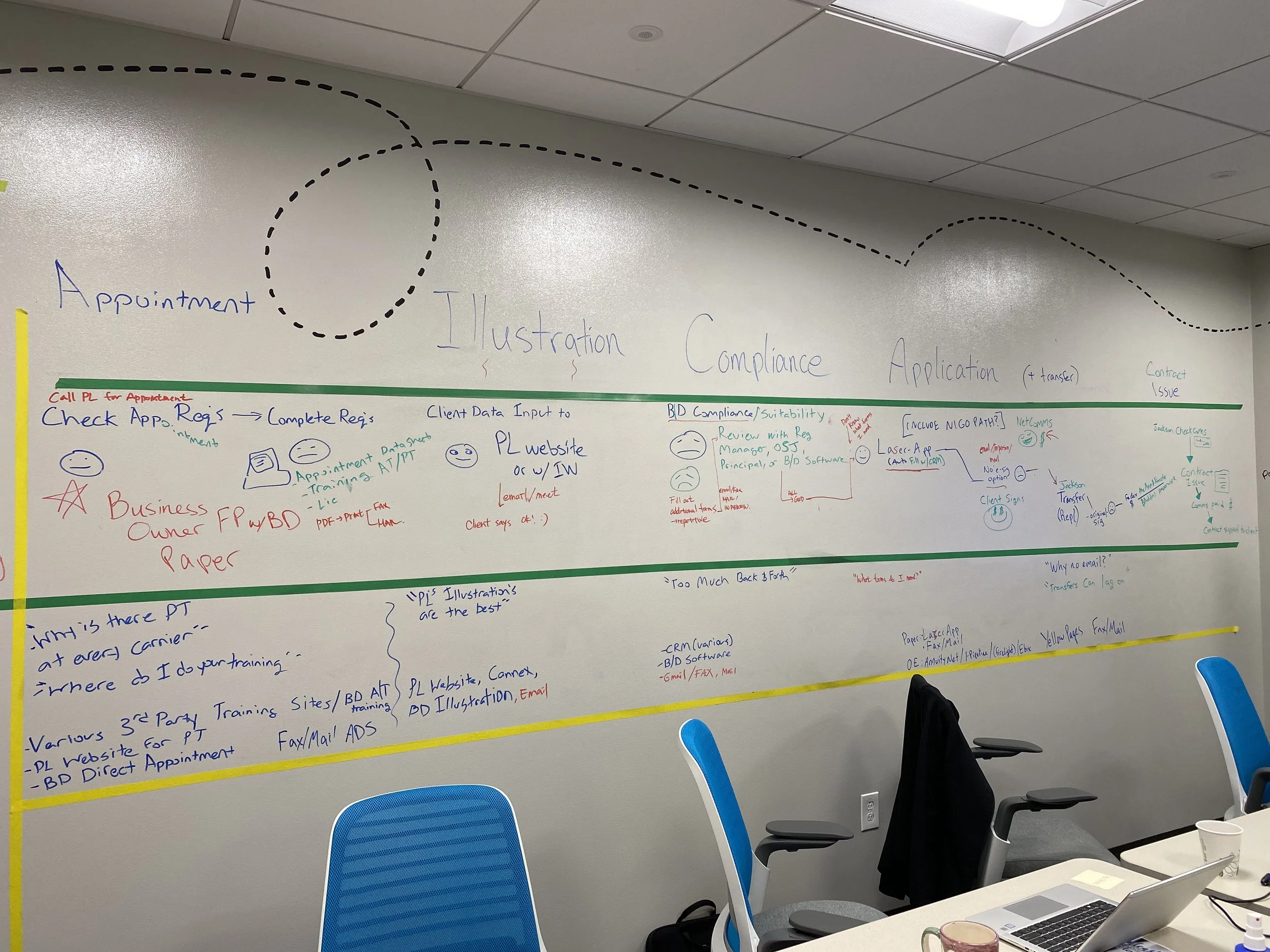
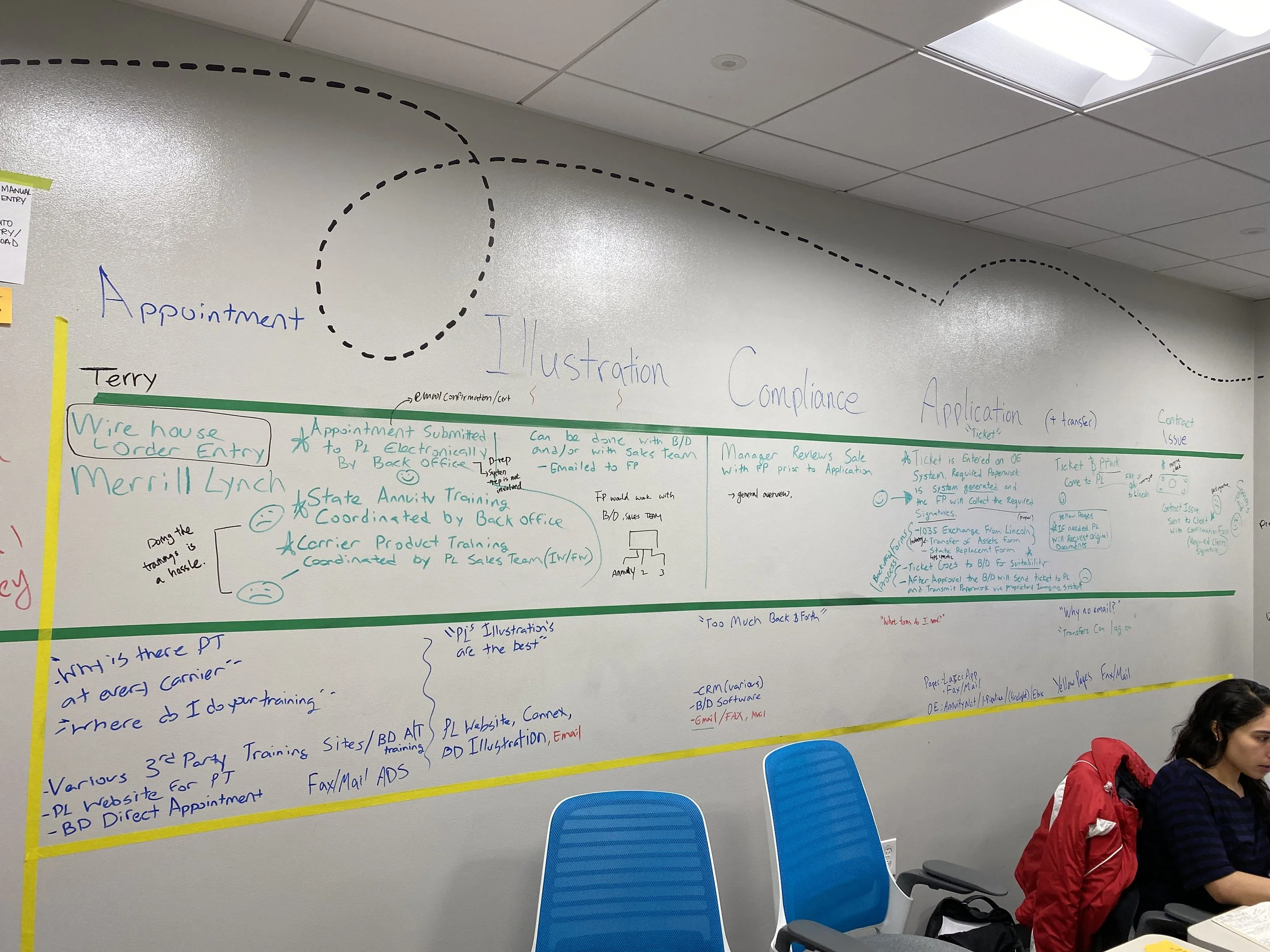
Our main goal was to solve for the traditional paper-only process of how Broker/Dealers sell our annuity products to their clients. We needed to provide clear, hassel-free ways for Broker/Dealers that sell our products, while solving and simplifying the incredibly complicated process of annuities.
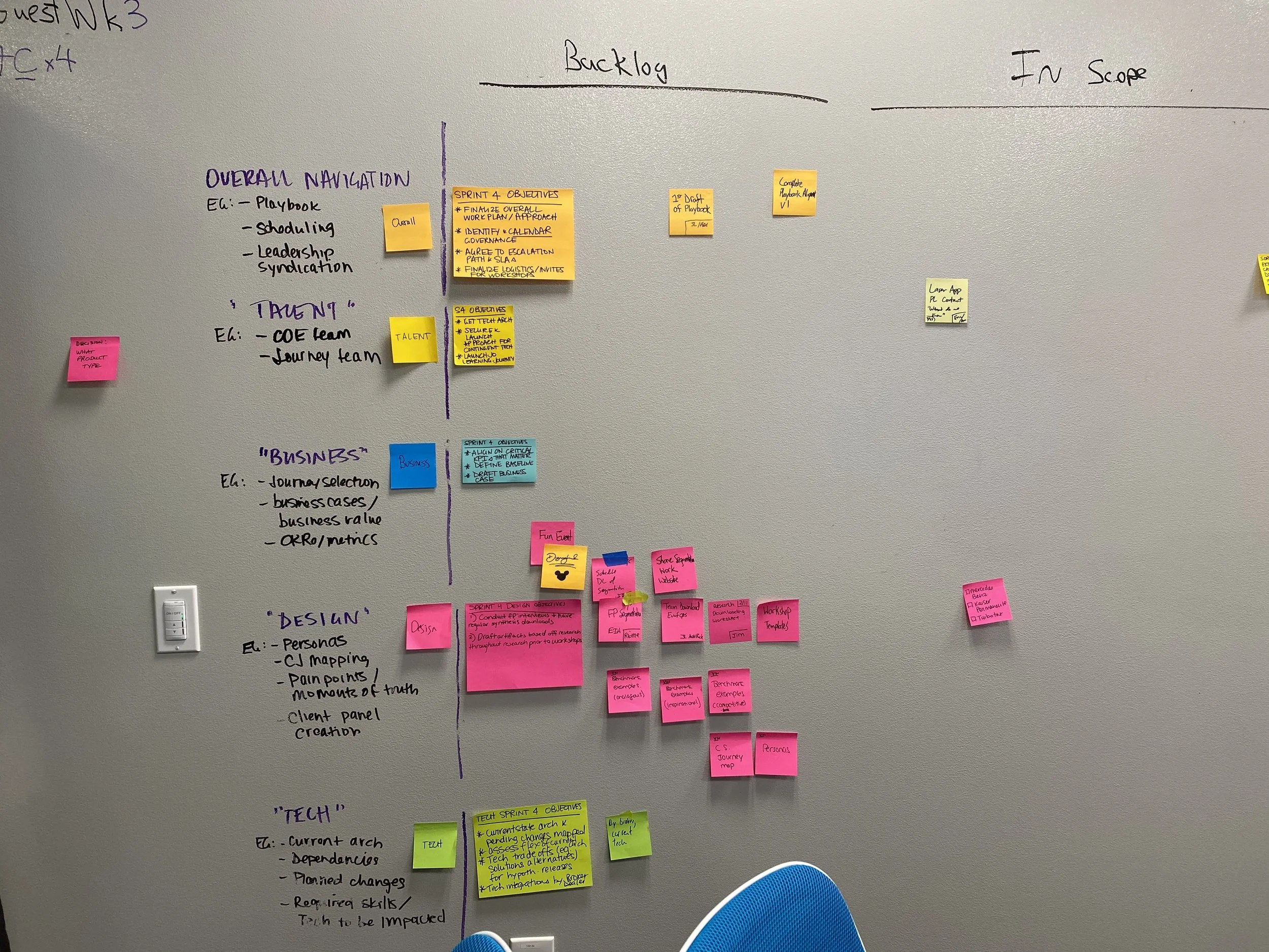
RESEARCH
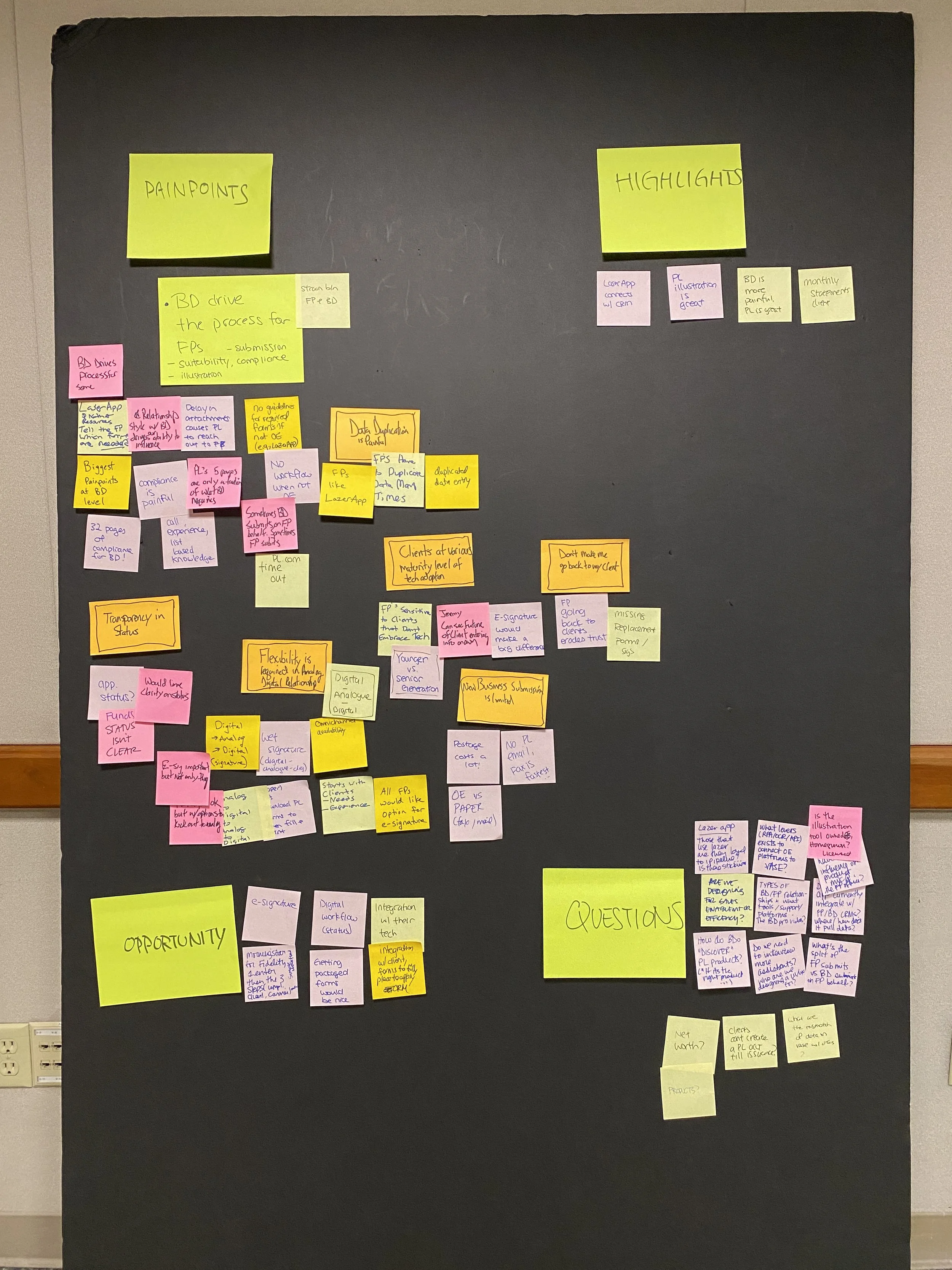
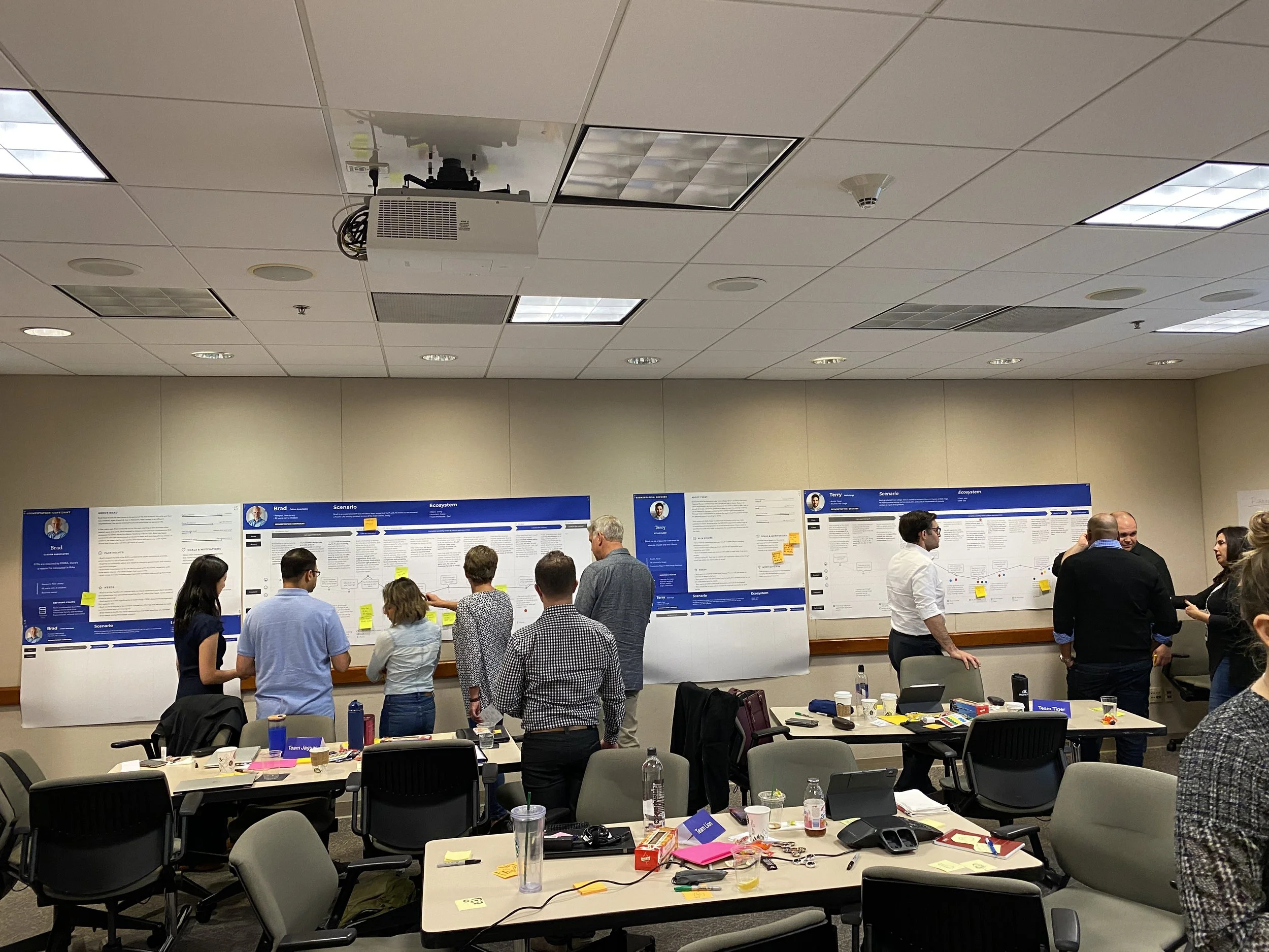
With this clear goal set in our minds, we began reaching out and interviewing different financial professionals that both have worked with us already and those that haven’t - in order to identify the problems they face, pain points, highlights, and any additional insights that we could use in order to provide a better experience. As an agile team with talented journey owners, product owners, scrum masters, business operations/analysts and front-end/back-end developers, we had daily scrums and quickly adopted in understanding the entire process and flows of different financial professionals, and determined their primary needs.
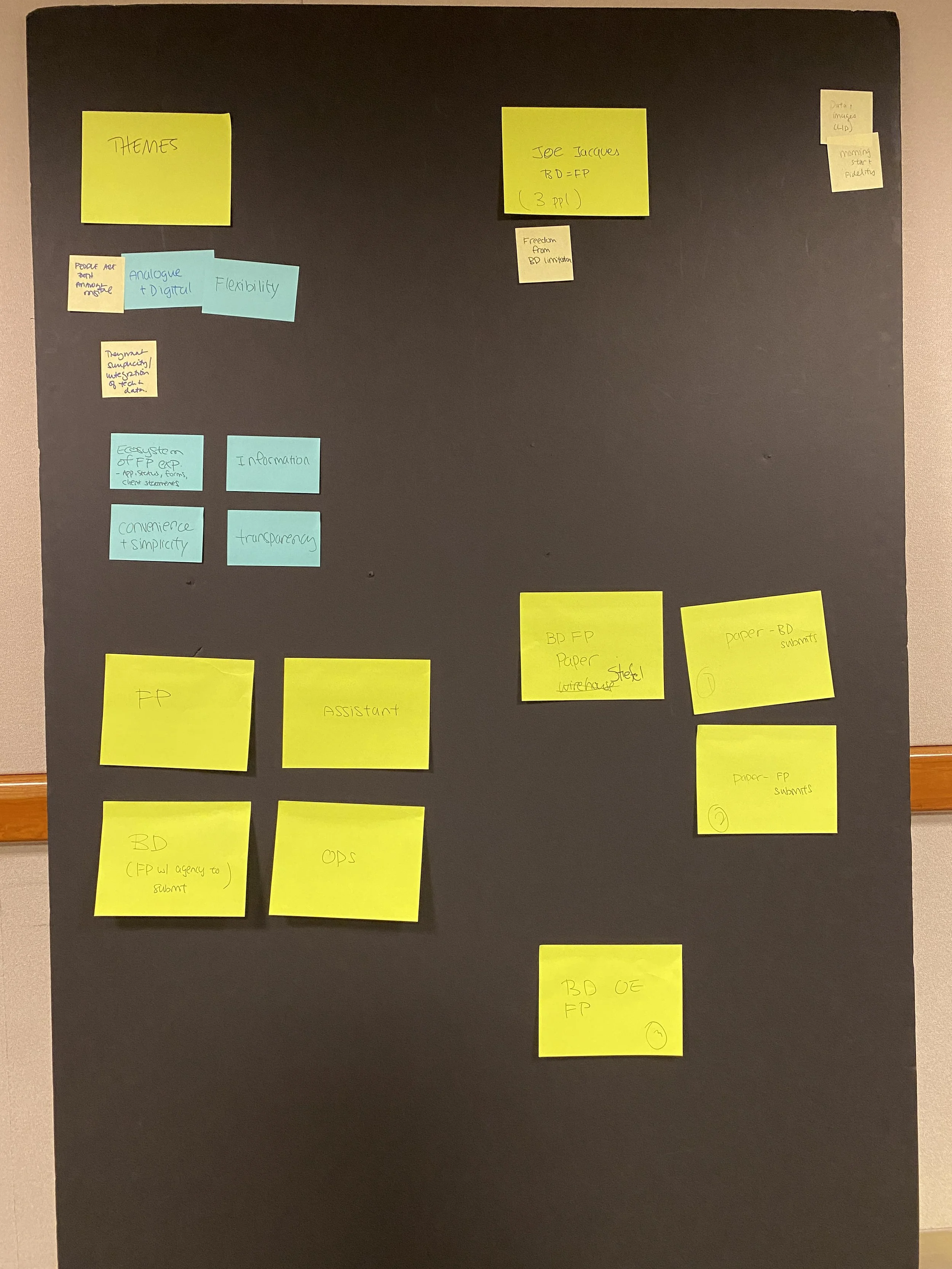
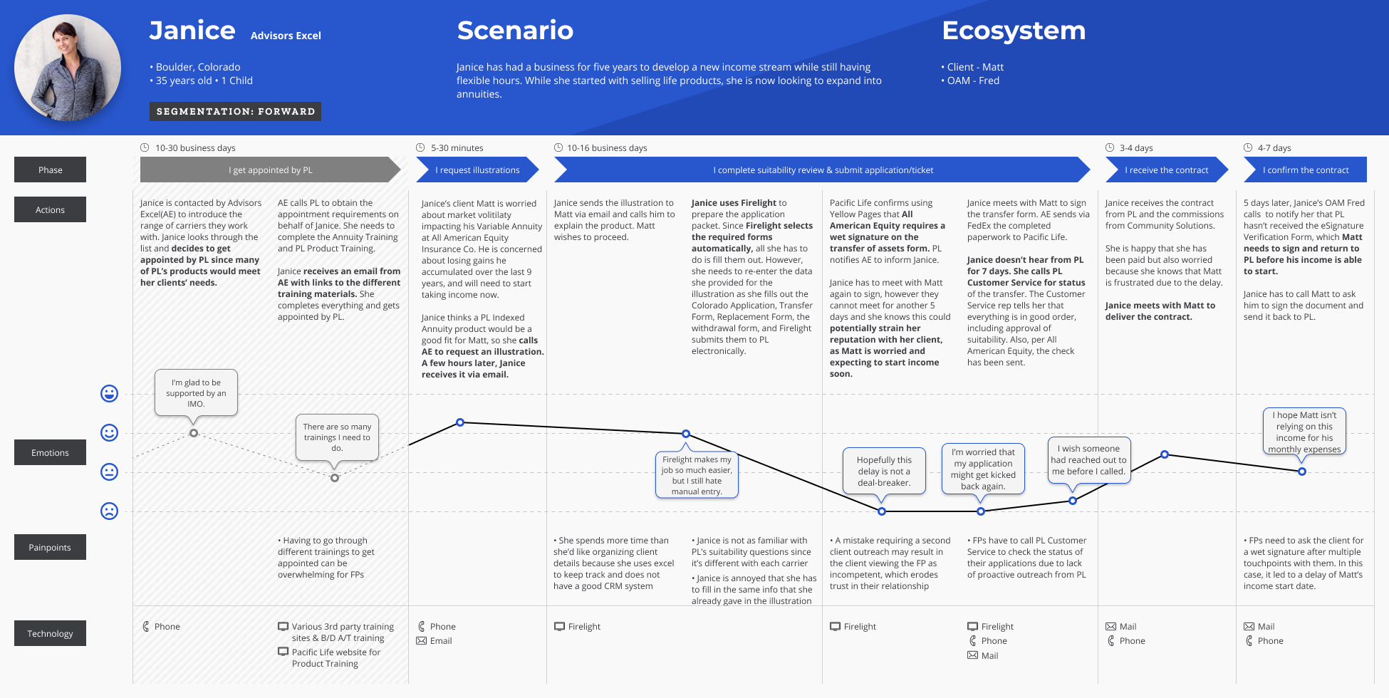
PERSONAS
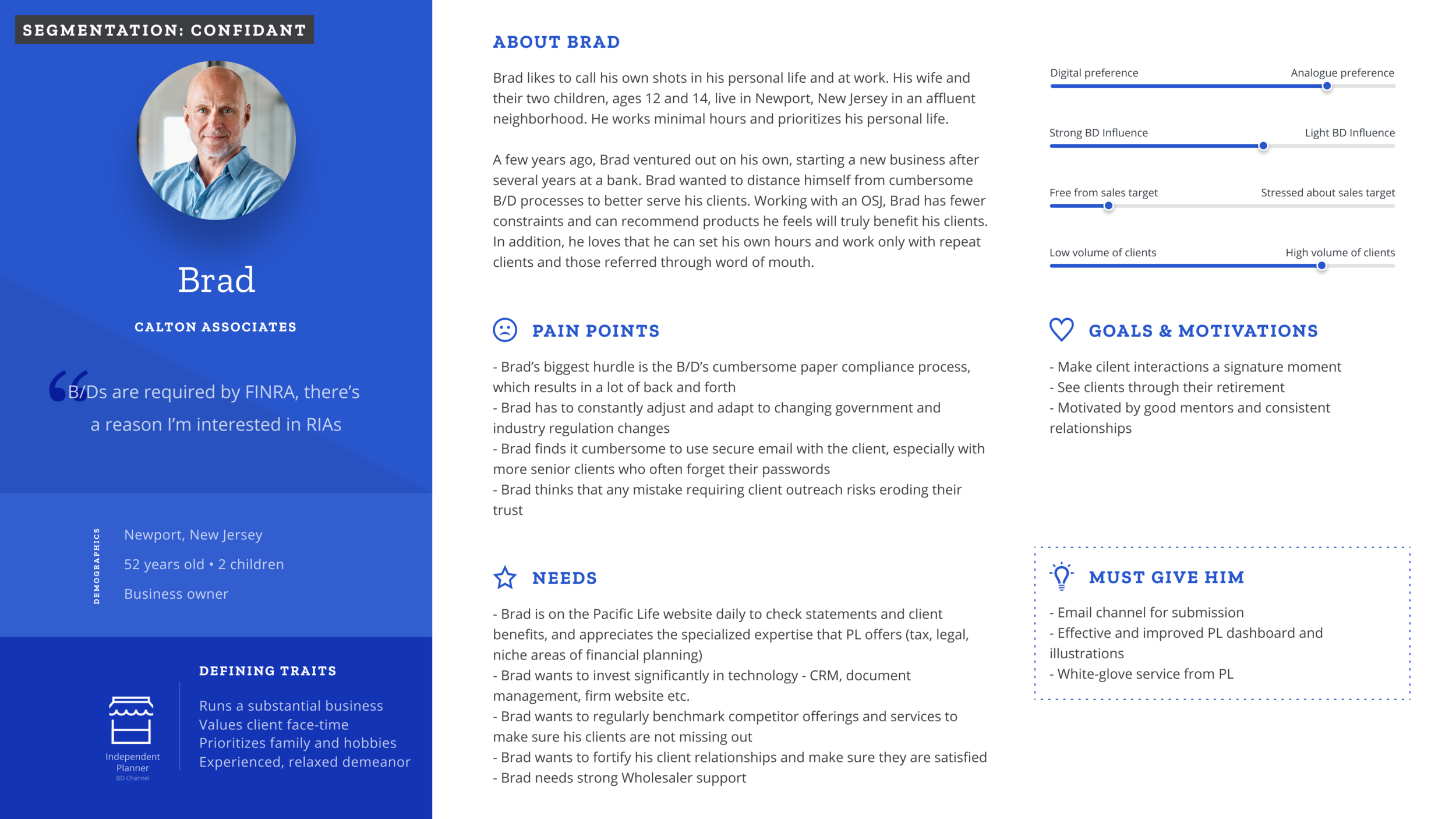
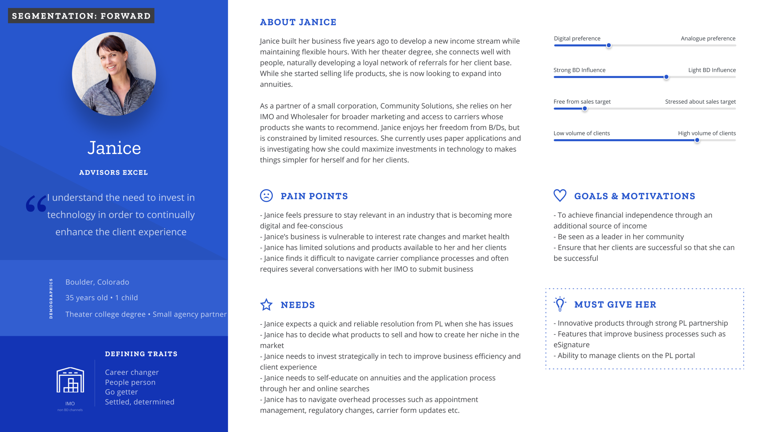
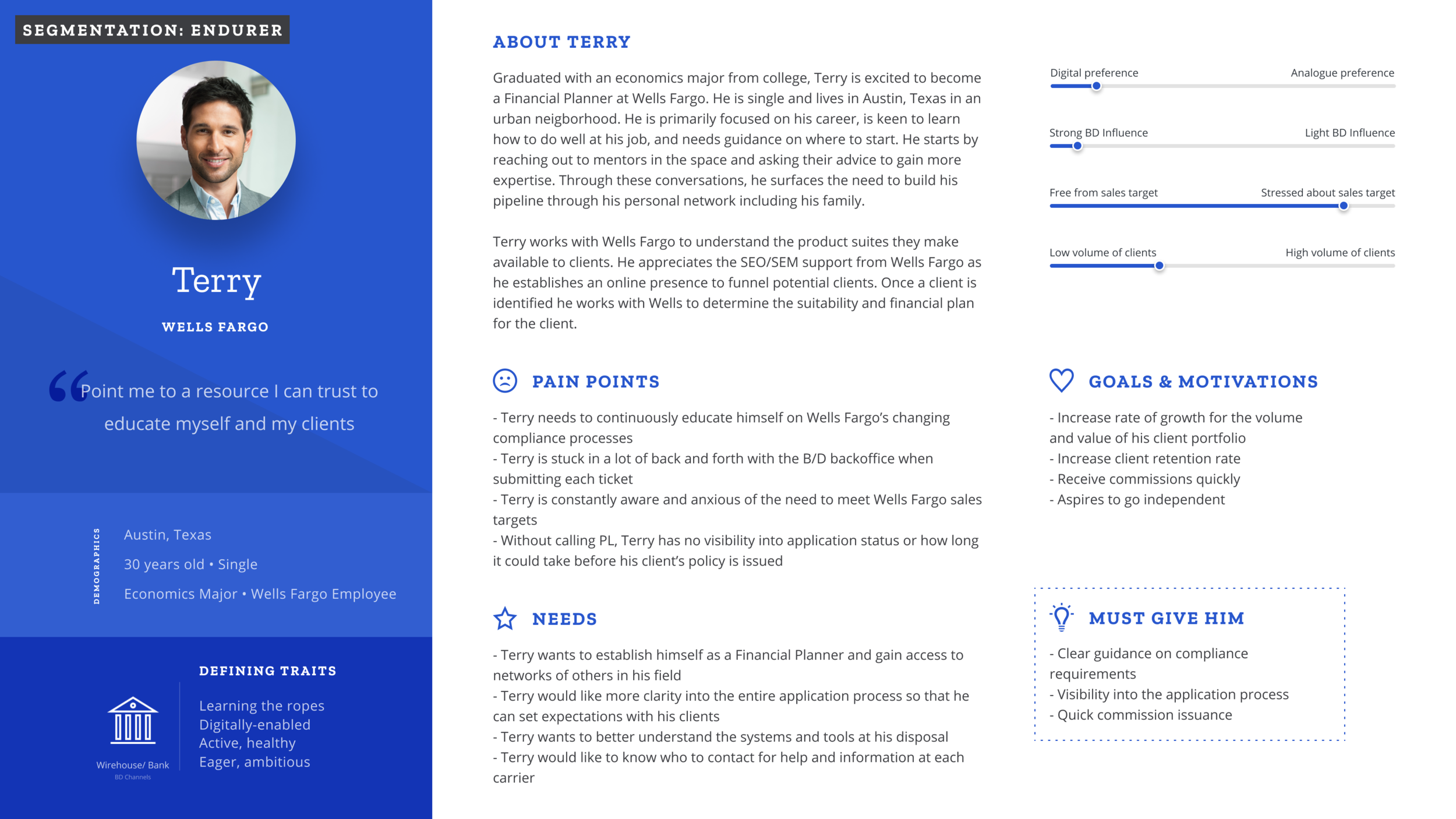
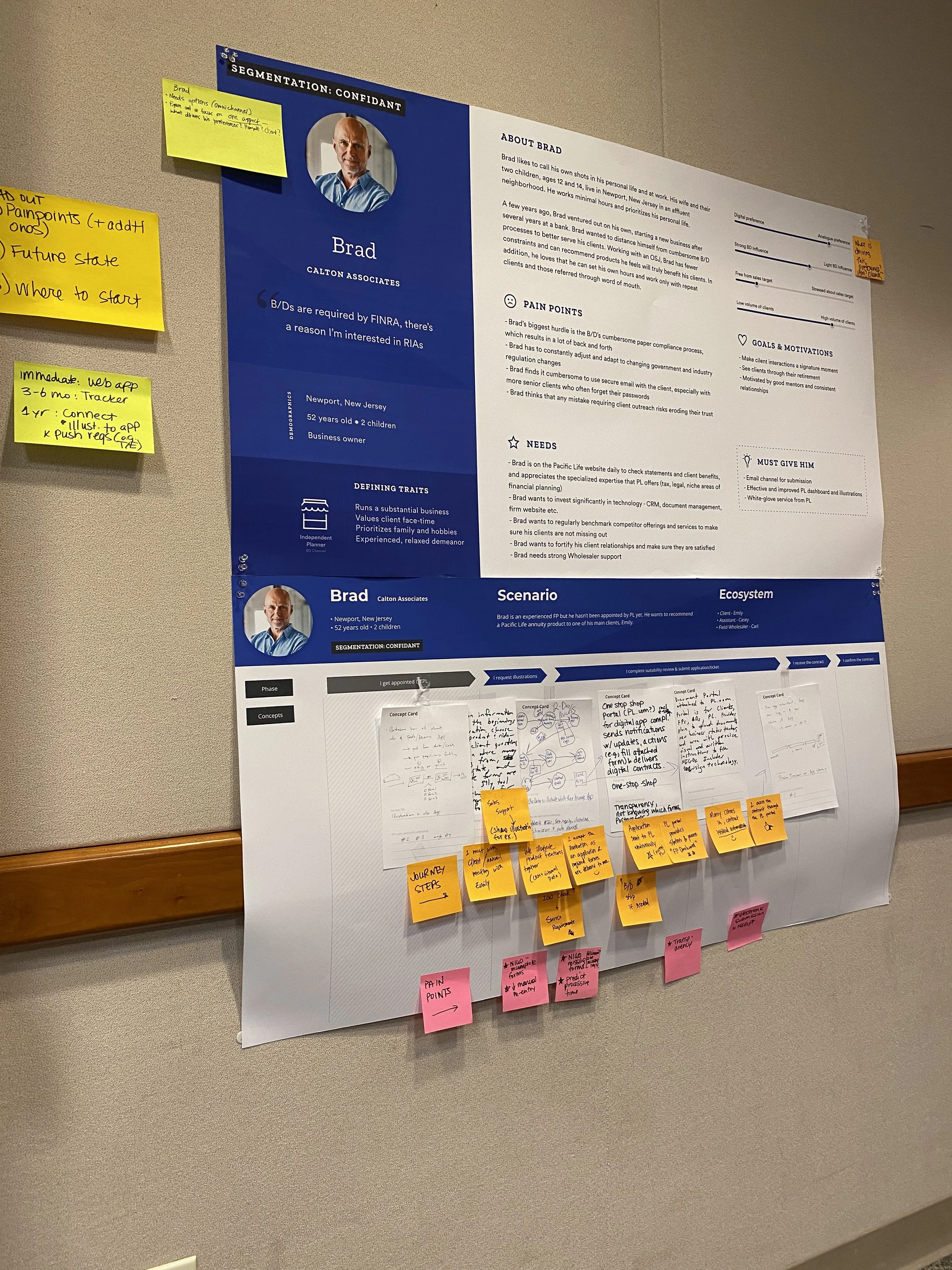
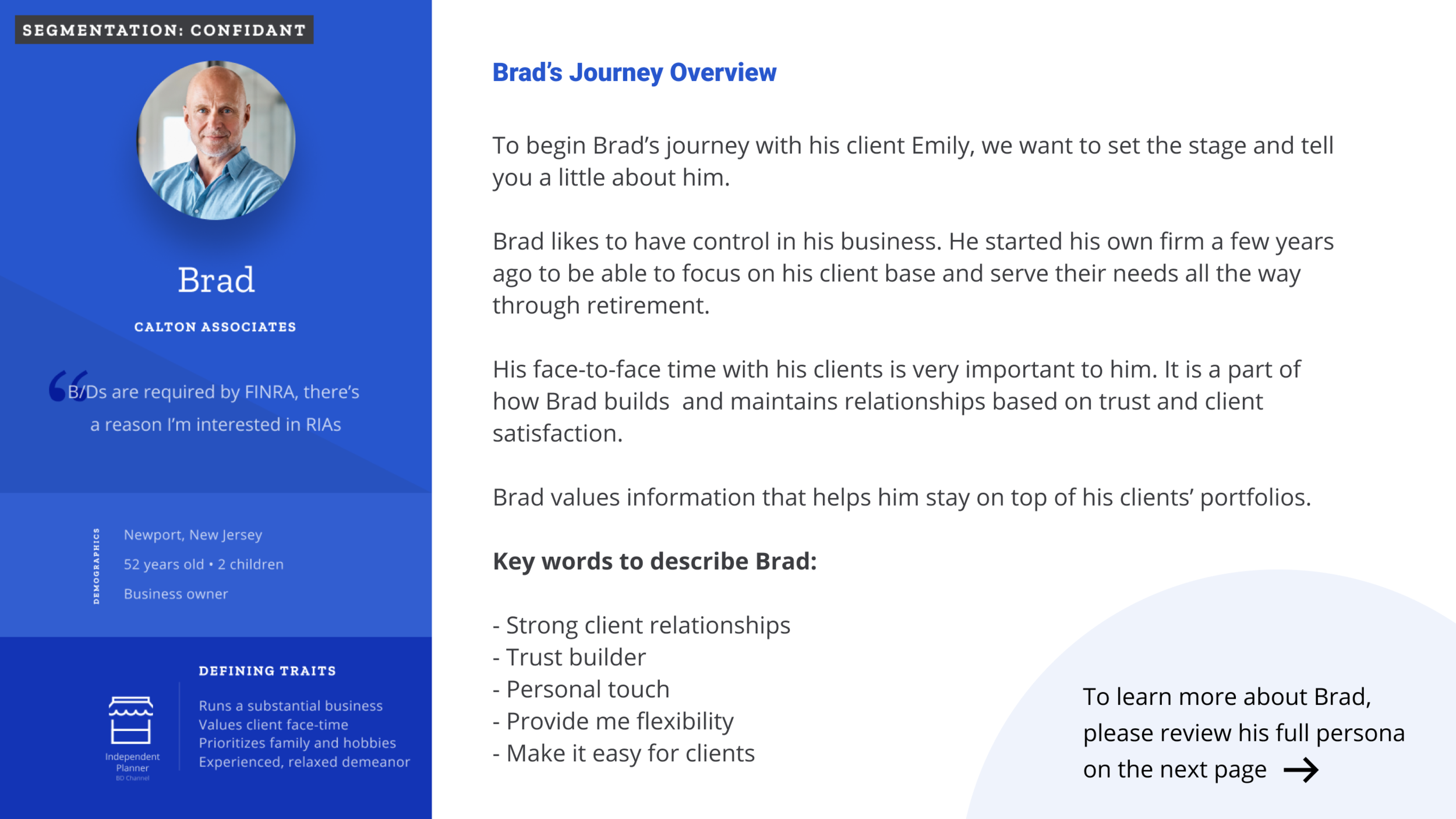
3 key personas were developed based on our initial research:
SHARING & LEARNING
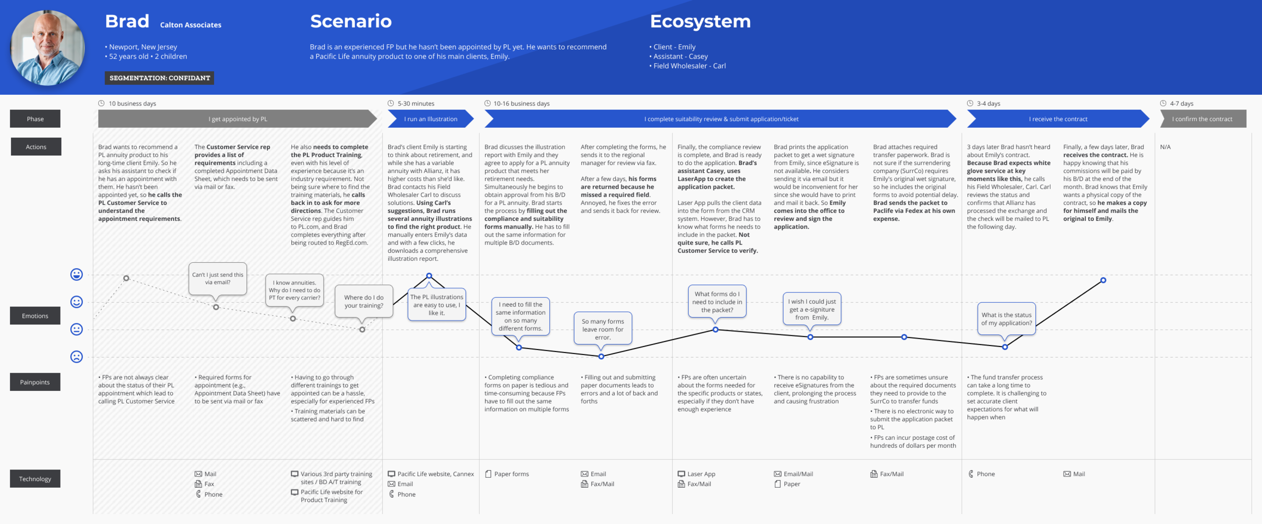
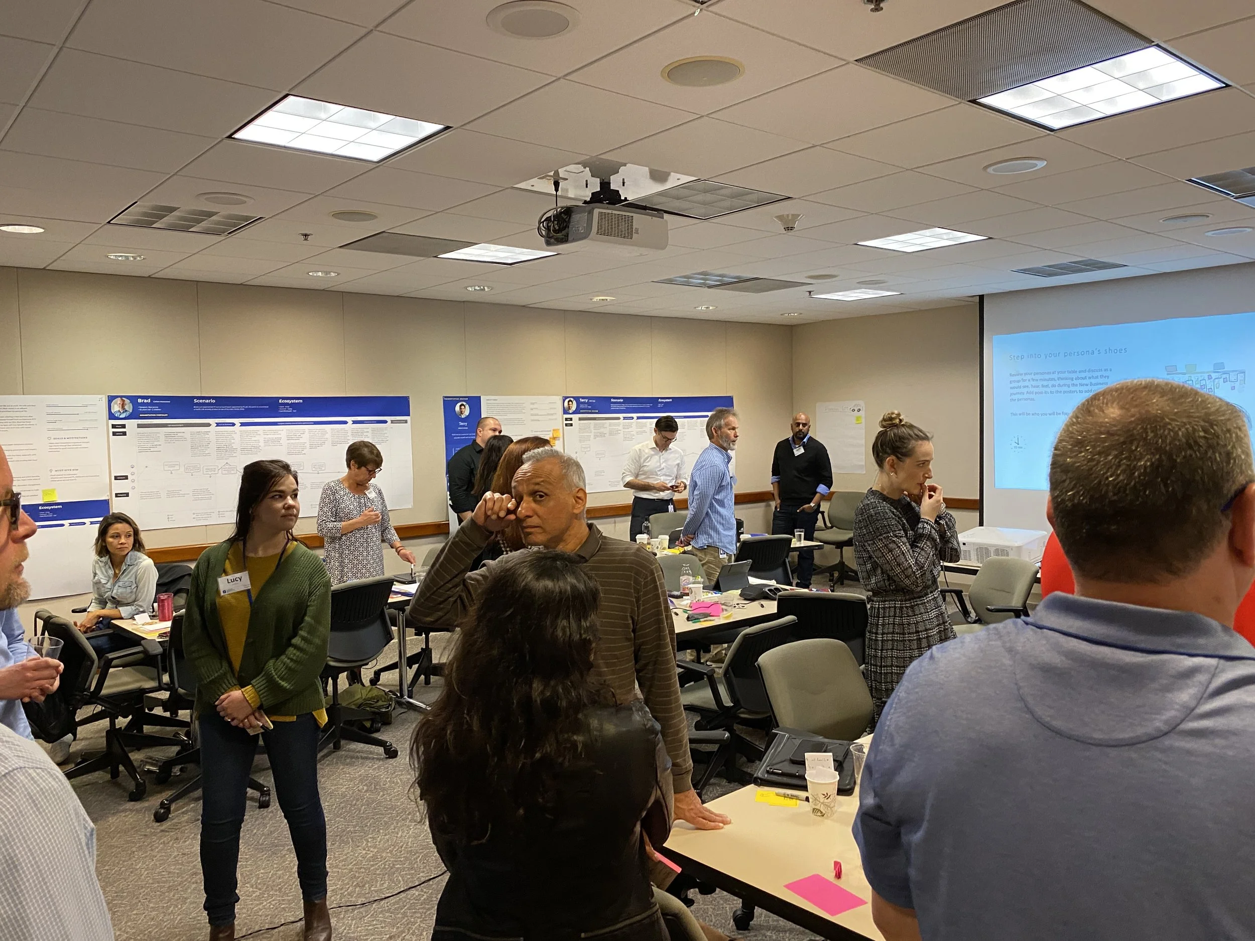
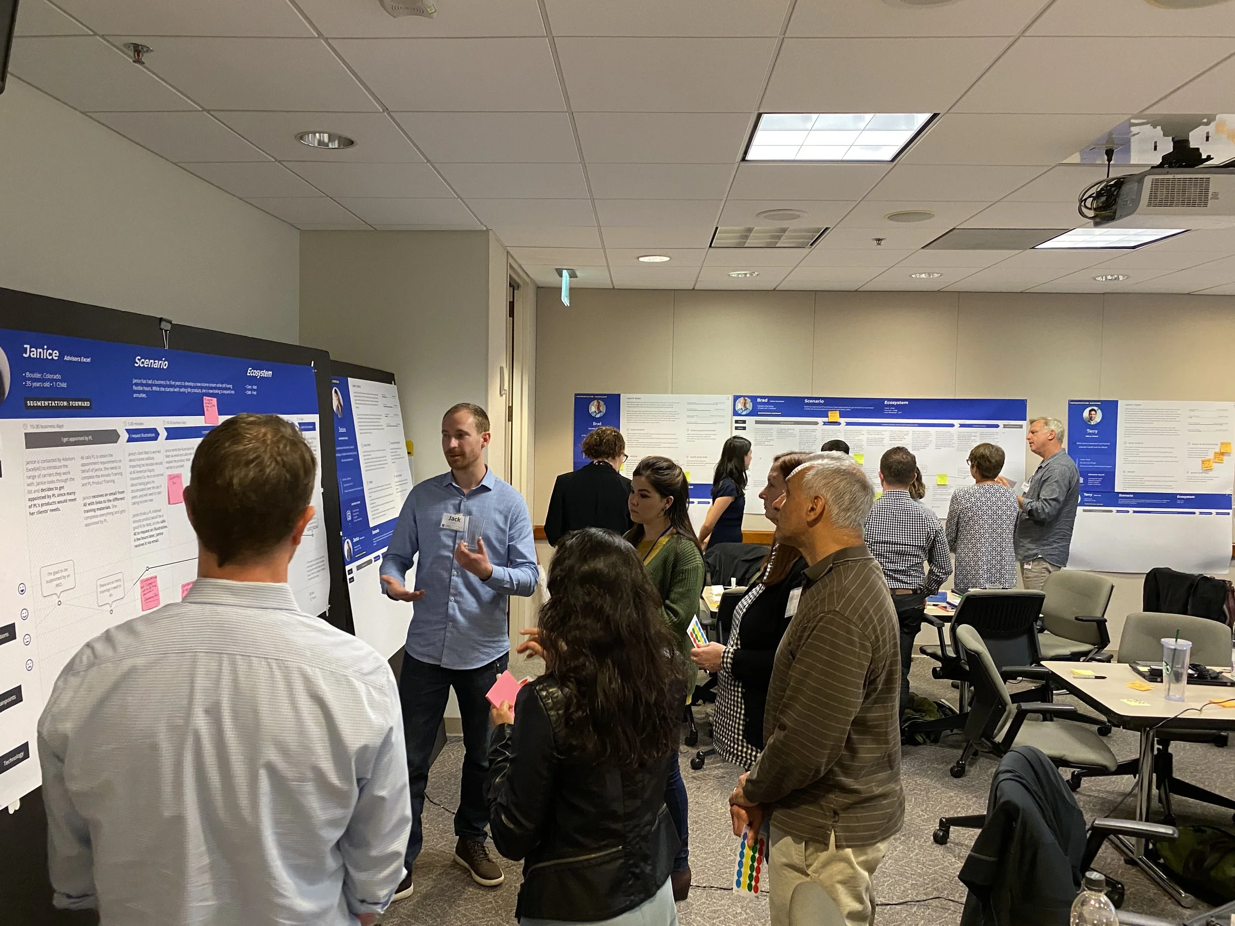
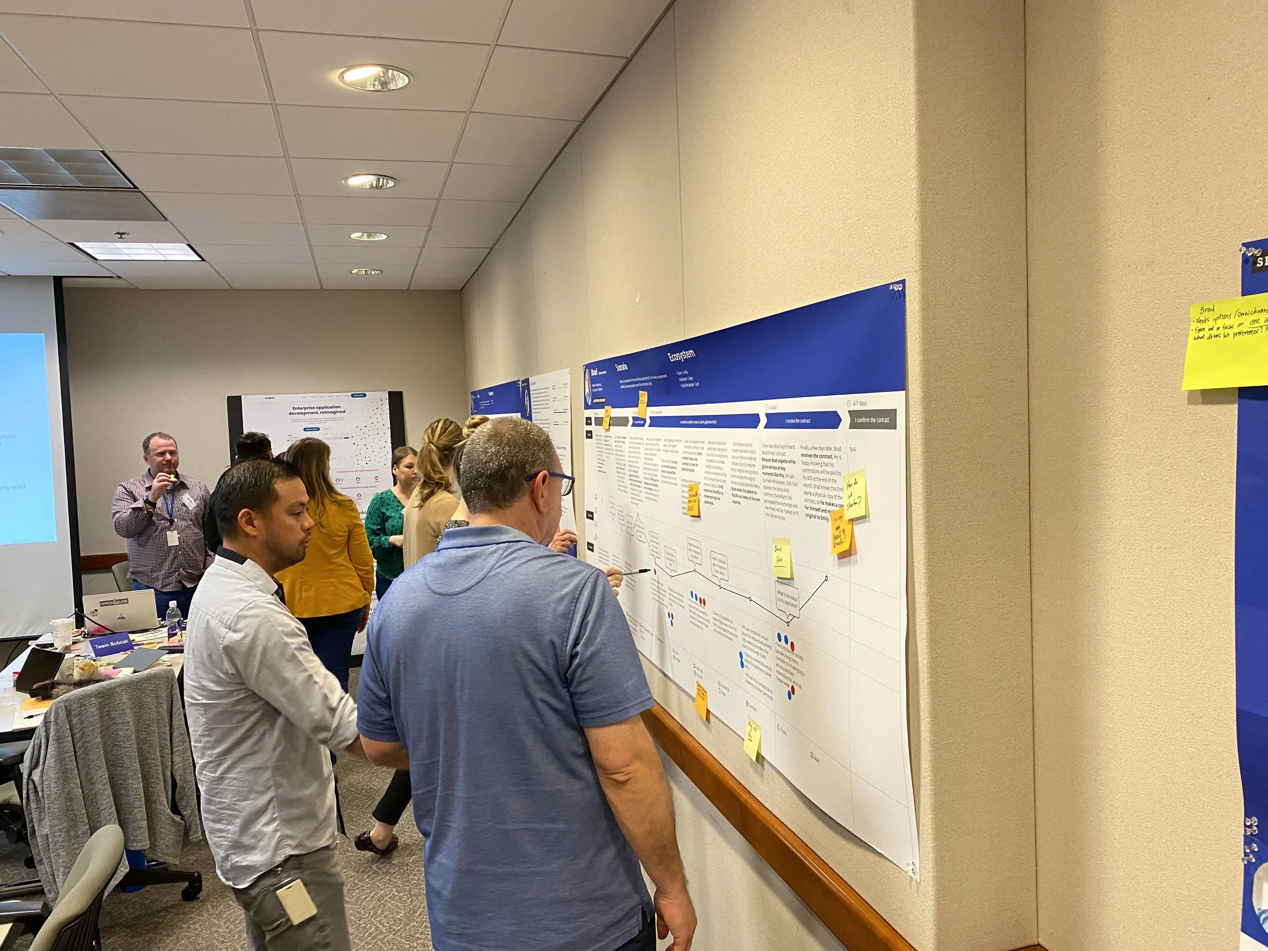
Next up was making sure that we help the organization understand our learnings, and why we push for a digital transformation. We created user flows based on our personas, and presented them in a customer experience workshop in order to help our stakeholders understand the who, what, when, where, and why - as well as to gain additional insight and new ideas.

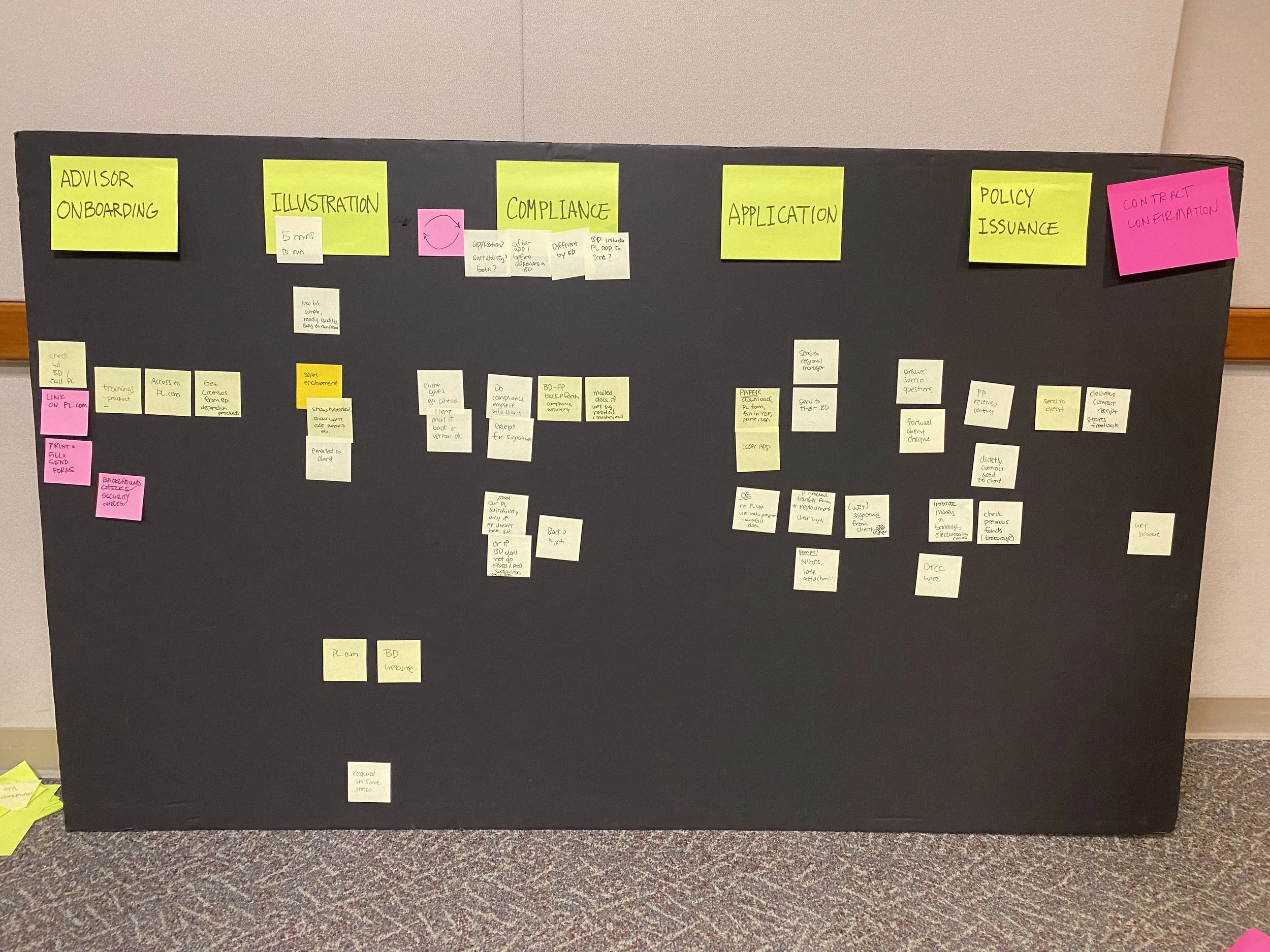
STORYBOARDING
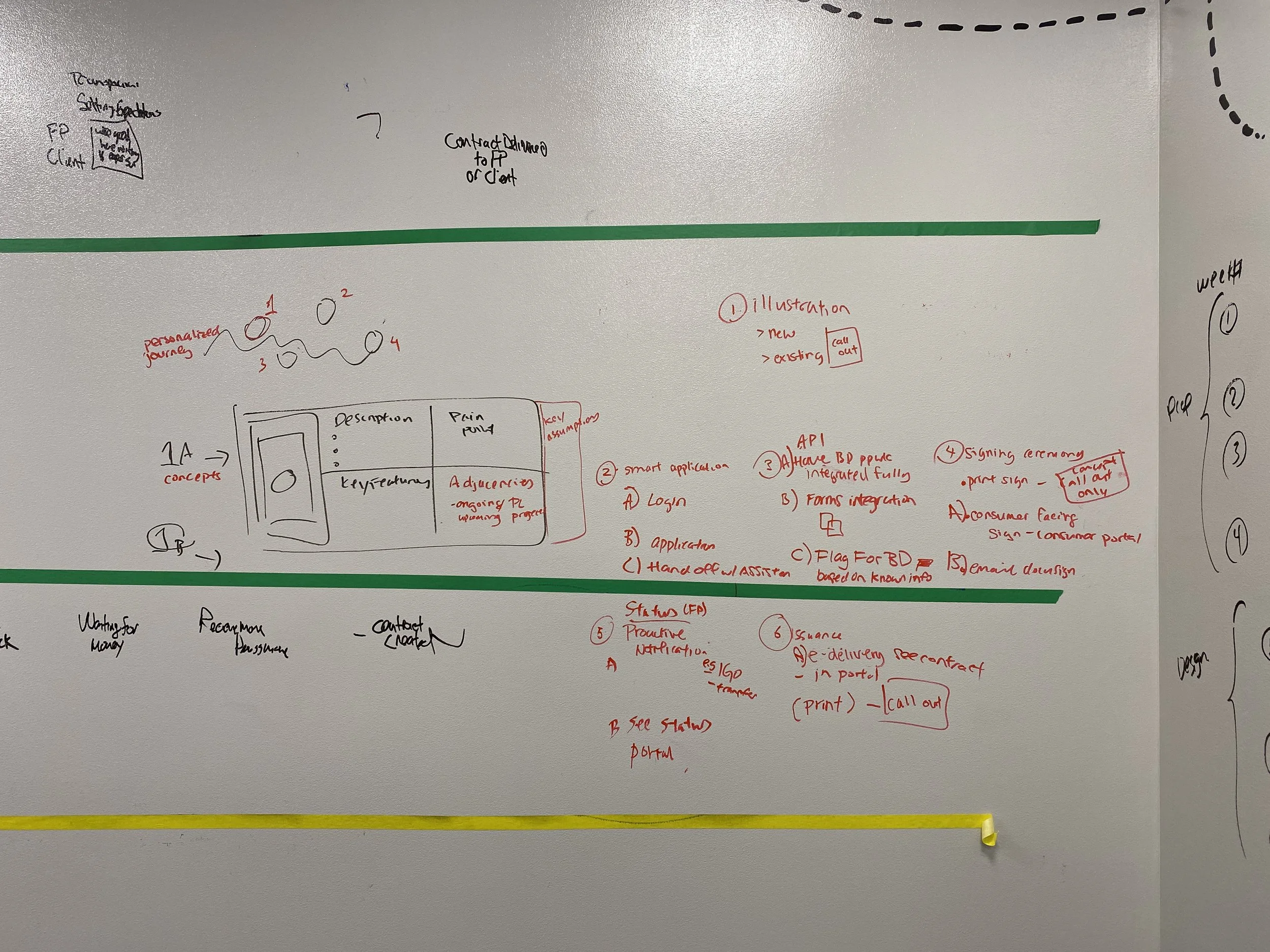
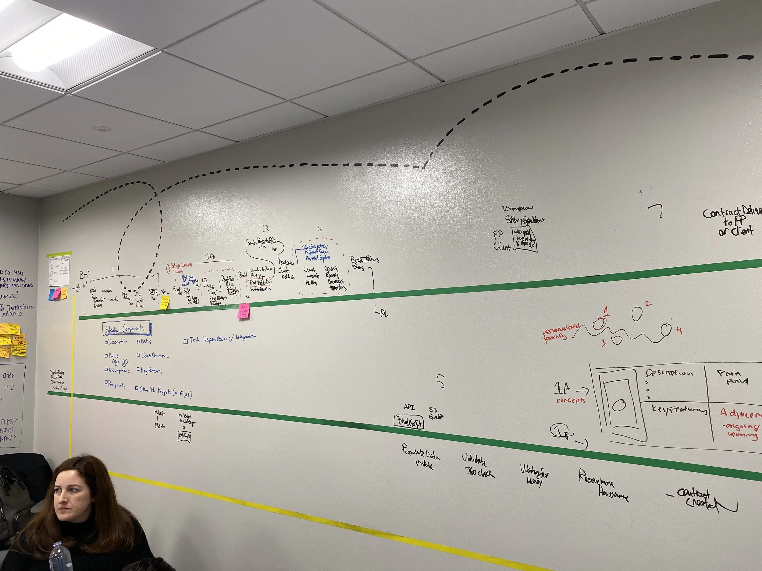
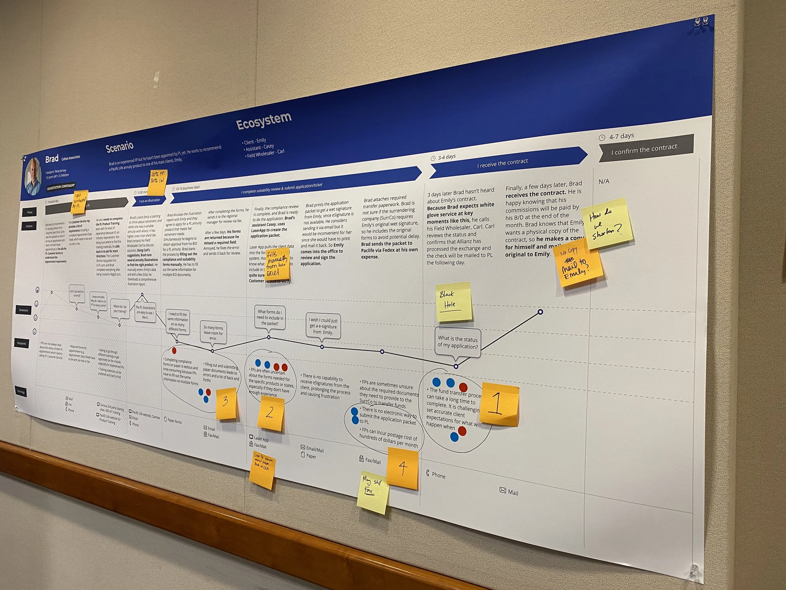
In order to narrow down and focus on a more unified path and solution, we developed conceptual storyboards to help the team stay focused on this journey.
WIREFRAMES & USER TESTING
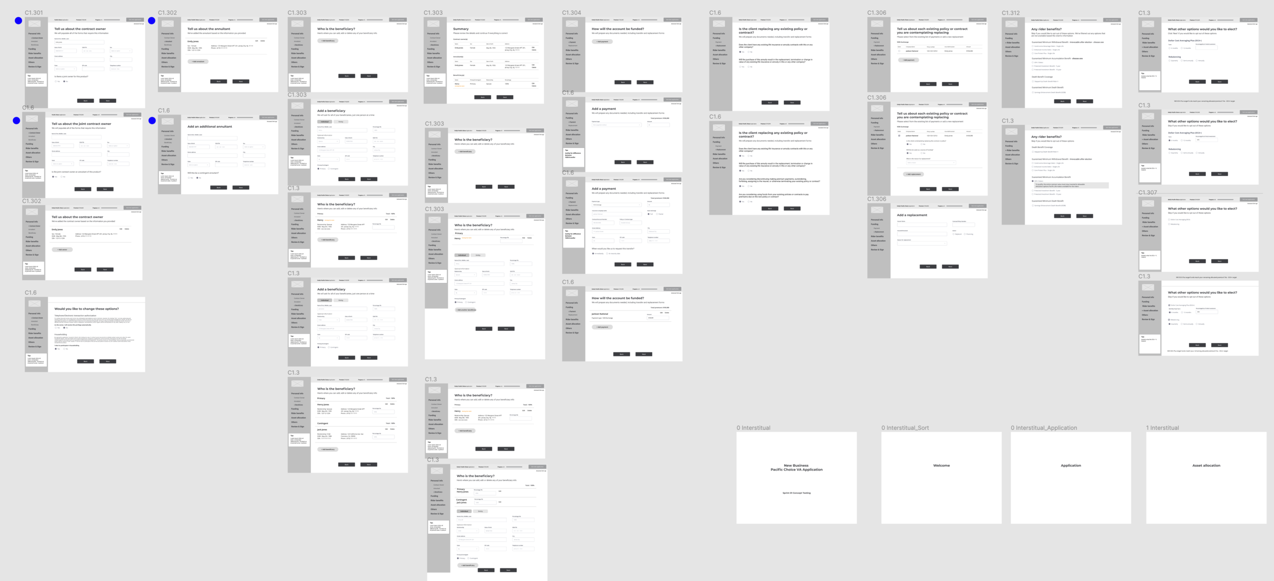
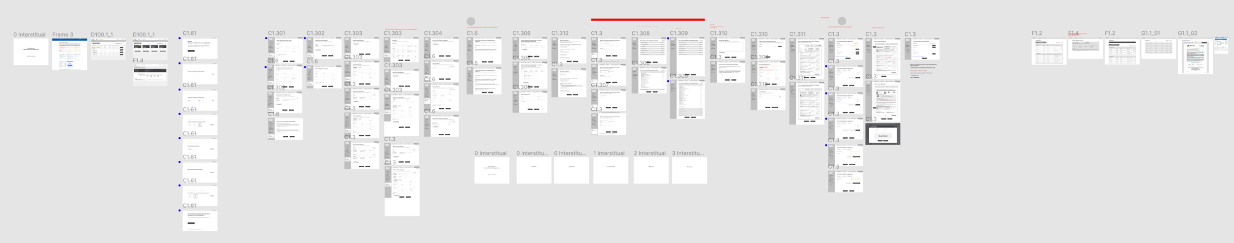
After determining the initial MVPs, I began creating wireframes that we can use to start testing users right away.
Before jumping into more finalized mockups, our research and findings indicated a number of things:
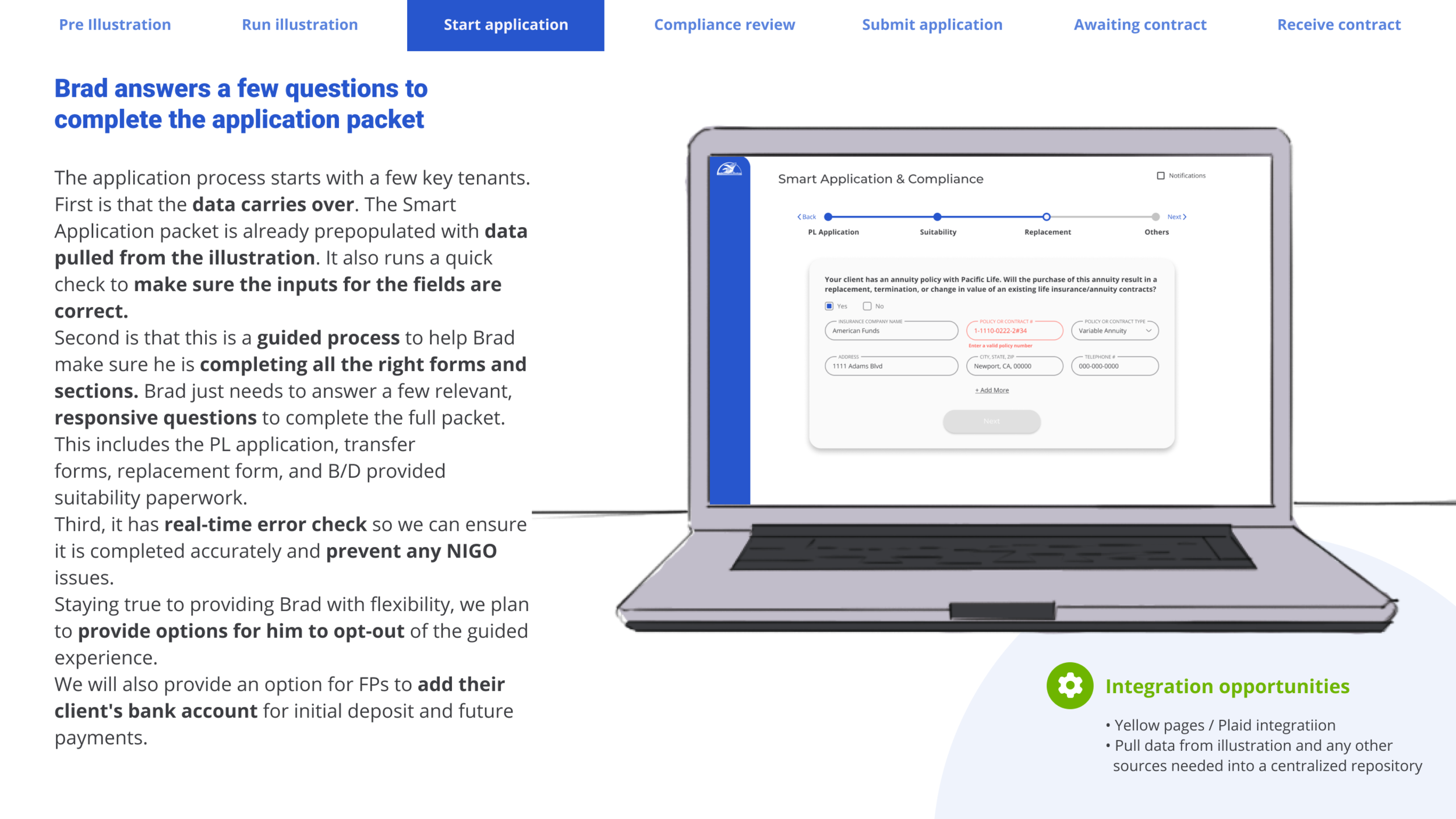
The paper application requires so many repetitive, redundant information which are all regulated very strictly. Unfortunately changing the paper application itself would cost us much more time and money.
Any minor issues would cause a NIGO (Not In Good Order), which causes more back and forth with the application, resulting in delays and a potential loss of the financial professional’s reputation/trust-relationship with their clients.
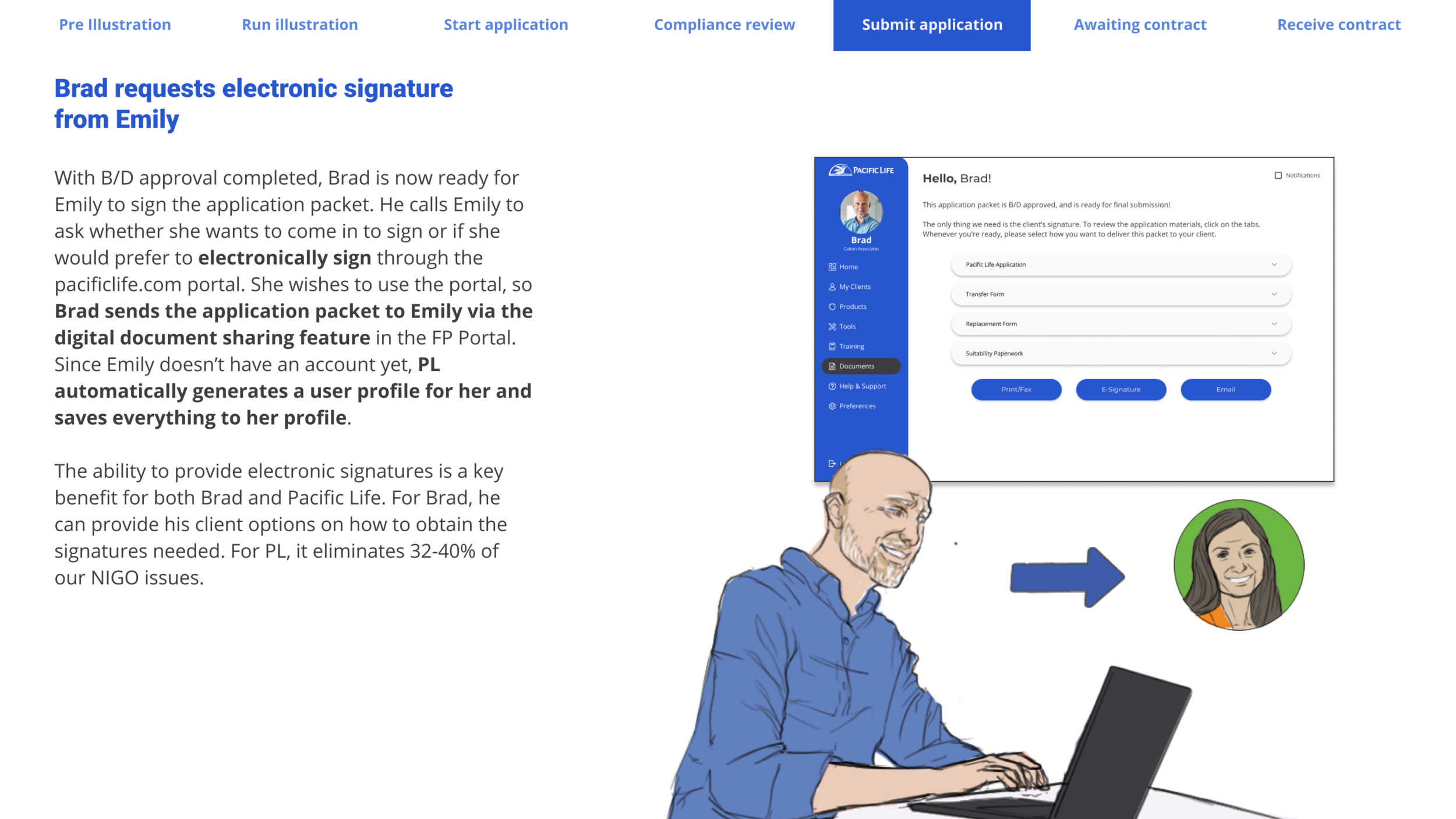
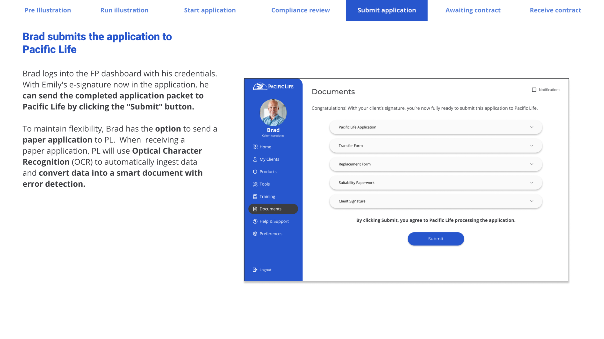
It’s 2020, faxing or mailing in a physical application shouldn’t be the ONLY option - but some of our financial professionals are not tech savvy and prefers to work & submit in traditional ways. We needed to figure out a way for them to be able to work in any way they prefer (such as filling the application digitally but submitting wet signatures etc).
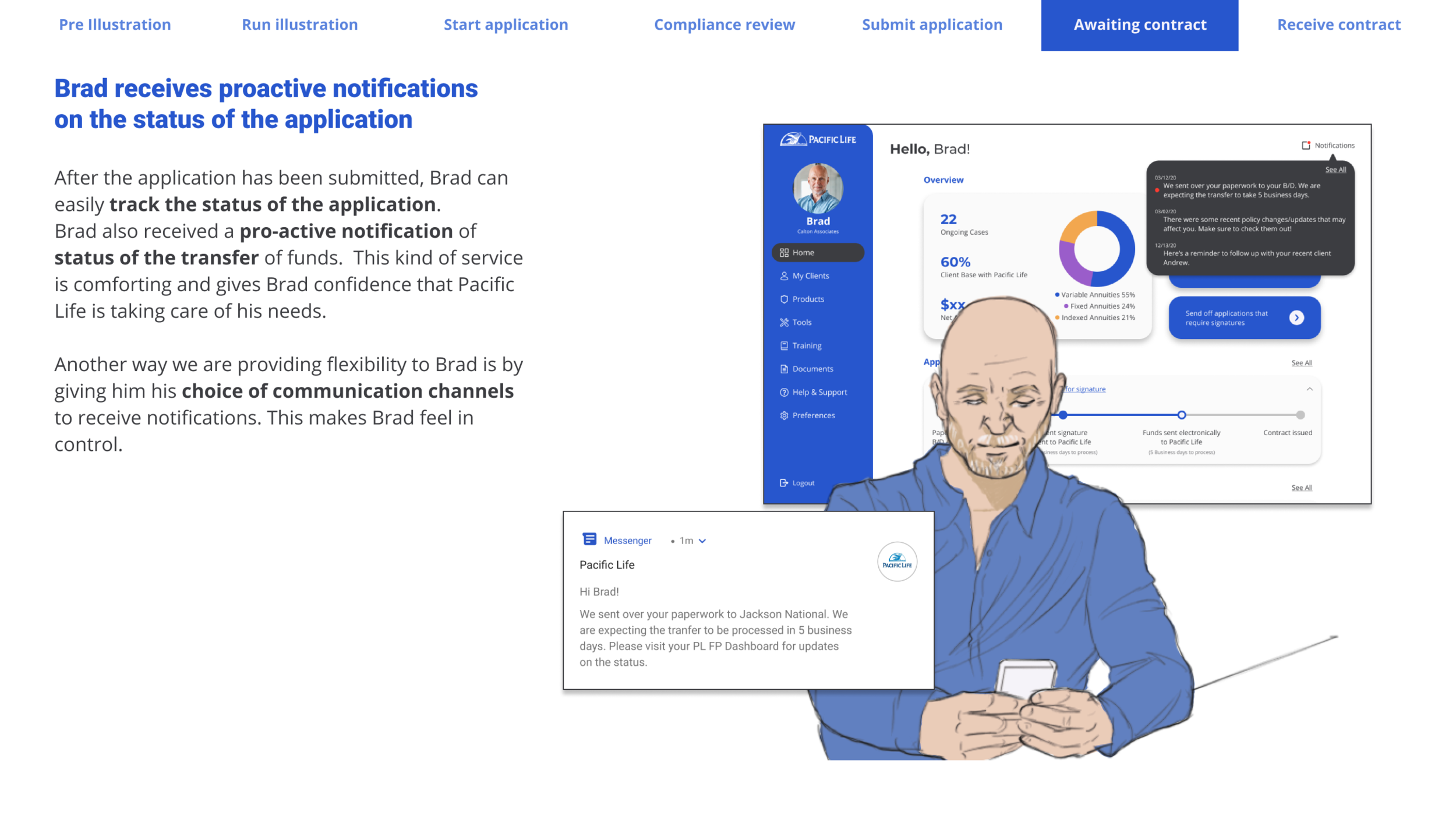
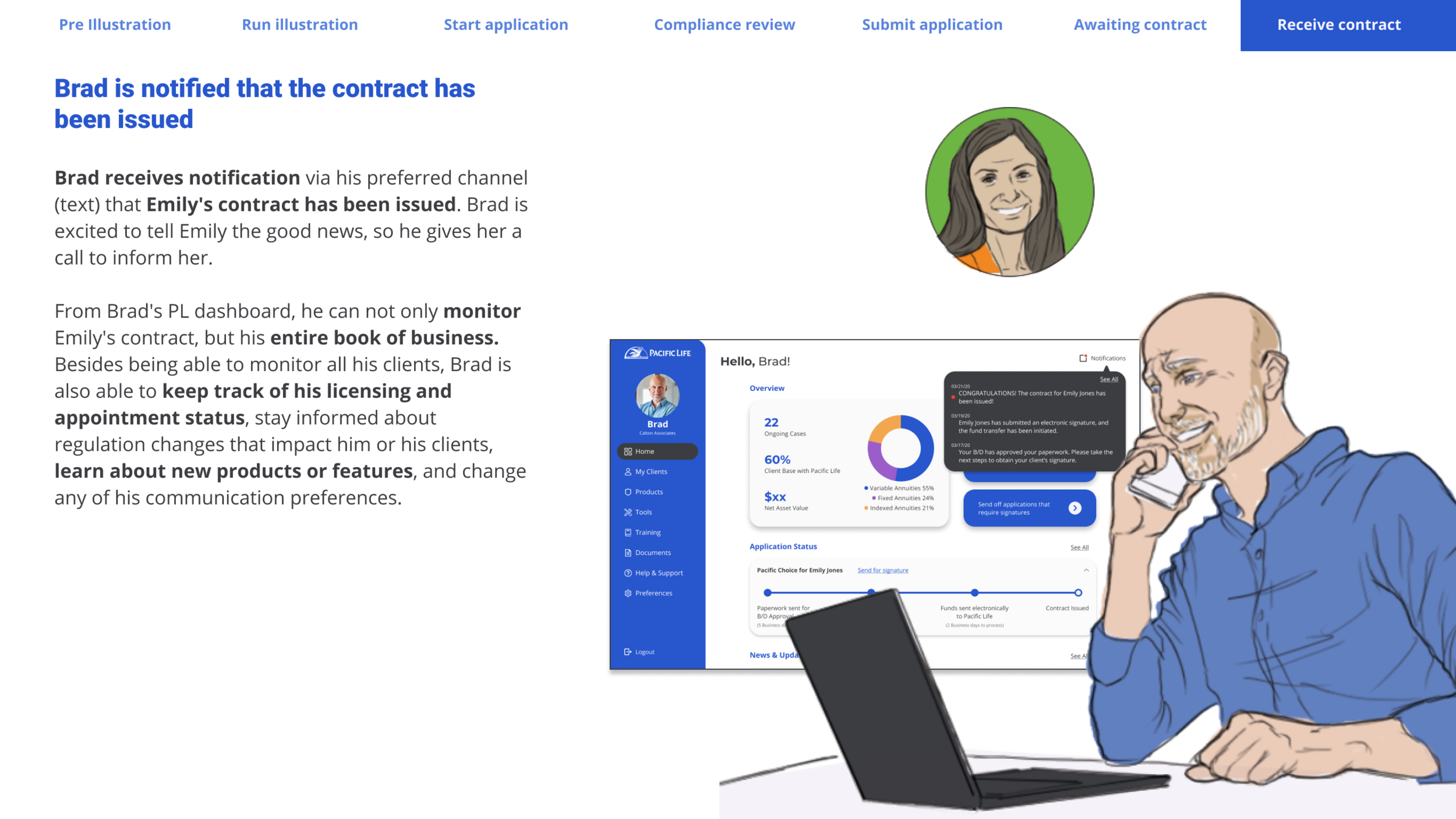
Financial professionals, upon submitting an application, need to have access to all of their submitted applications with detailed statuses.
Financial professionals need helpful tools and features, such as information about product training requirements, compliance reviews, company search/browser, etc.
After creating an initial set of finalized mockups and working with the front-end and back-end developers for MVP first release, it was back to the lab right away - ideate (divergence), test & learn (convergence), reiterate! Throughout constant testing, we continued (and still do) to further enhance the product. During this process, we had regular sprint demo sessions where we invited key stakeholders and presented our progress and gathered feedback.
Countless prototypes created, and hours and hours of testing & gathering feedback.
I promise, there’s MUCH more to this.. :)
FINAL MOCKUPS
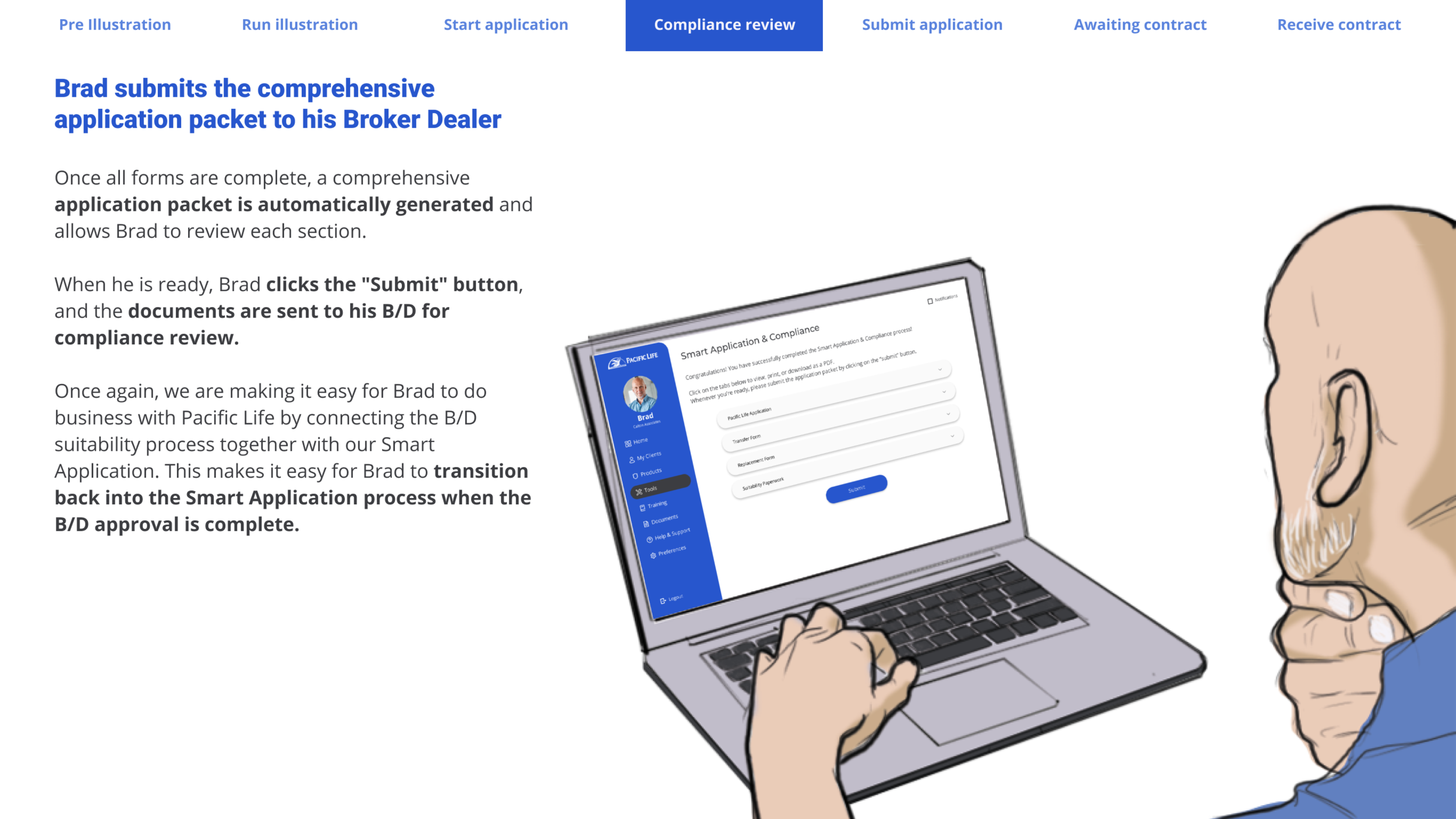
The solution we came up with comes in several parts:
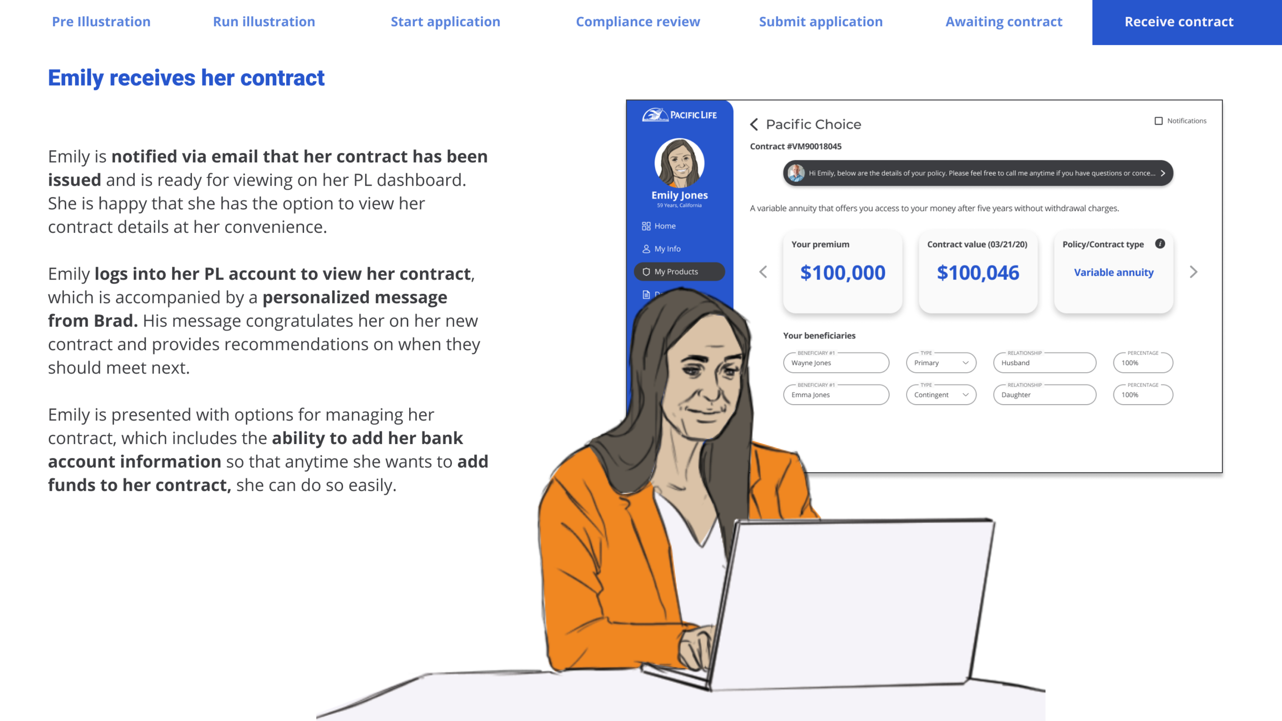
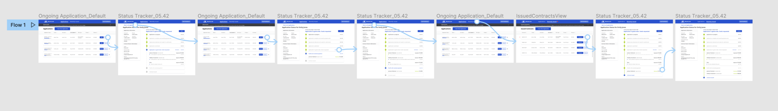
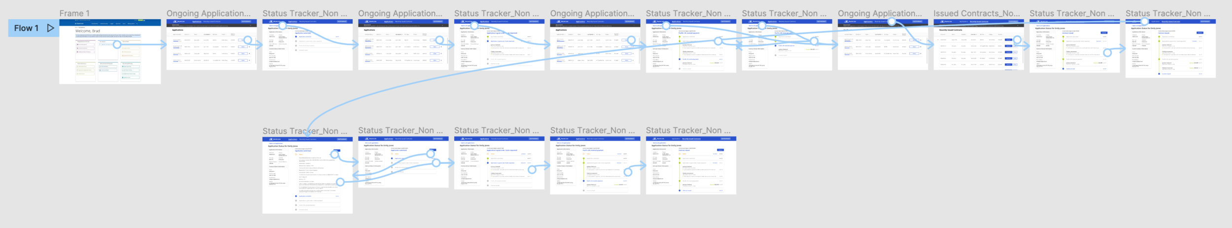
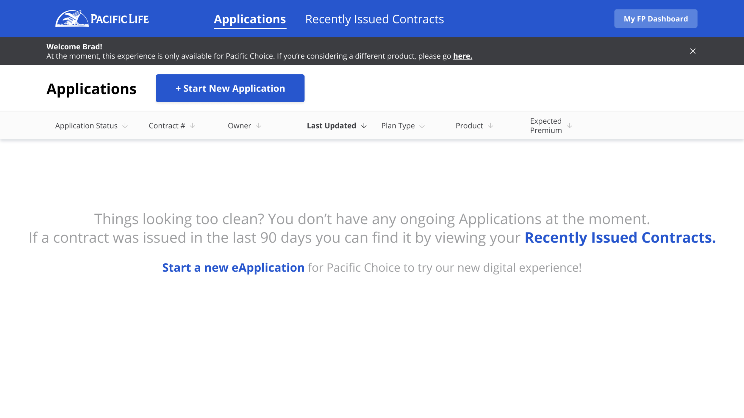
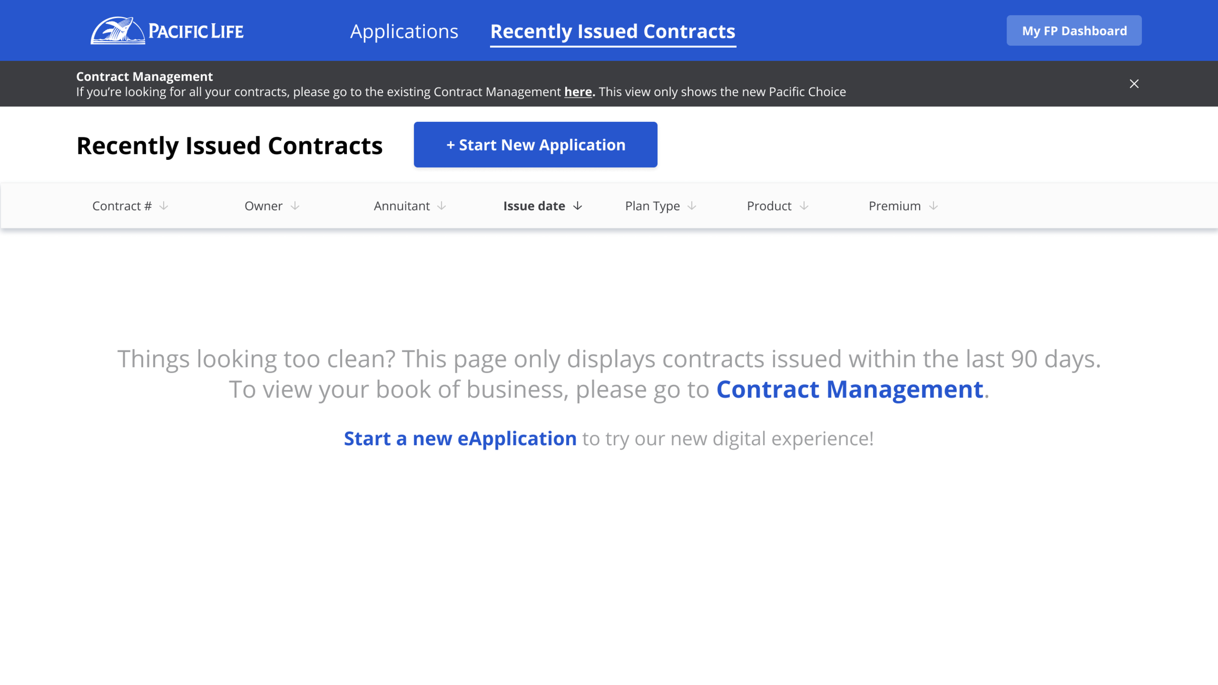
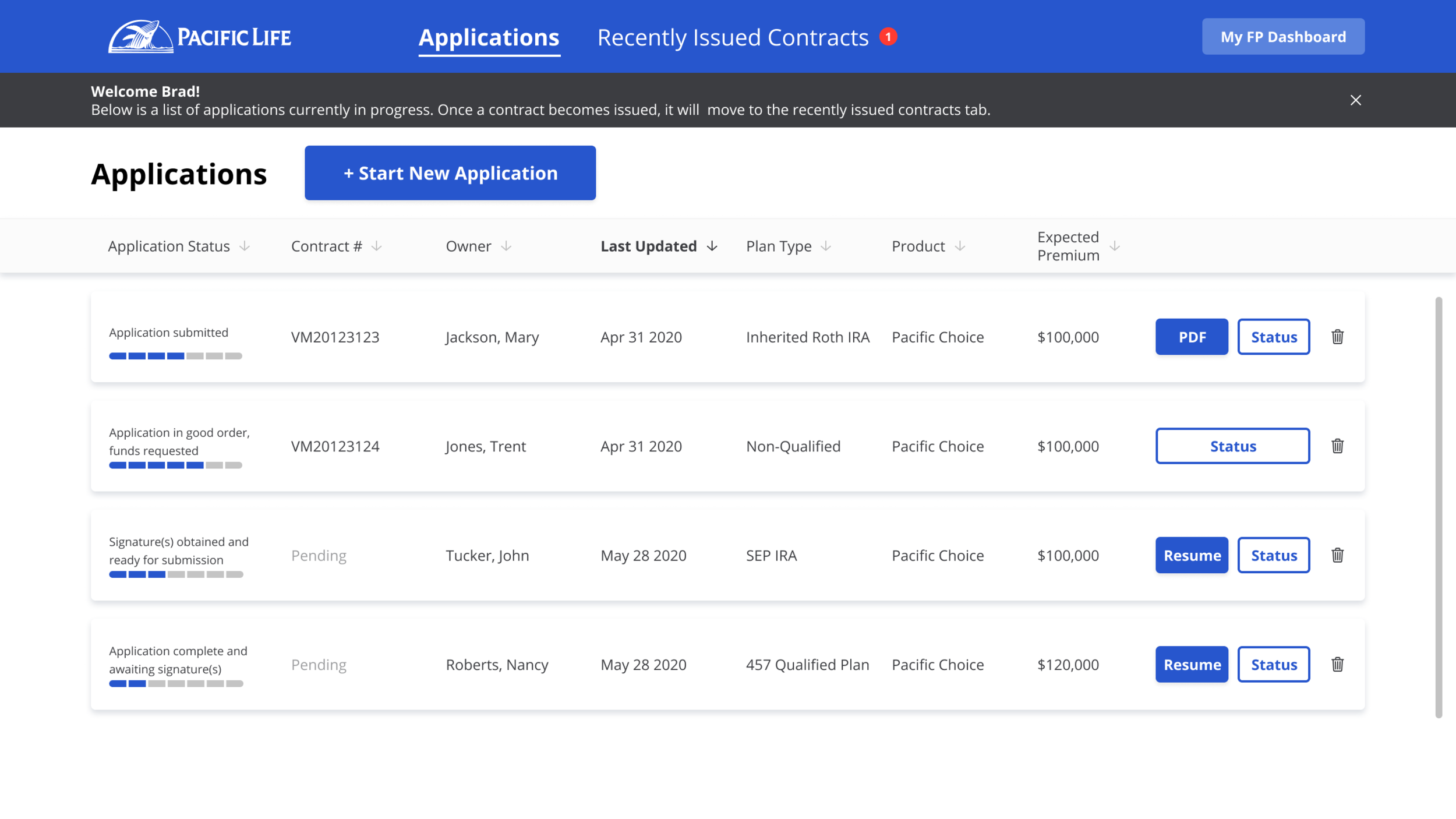
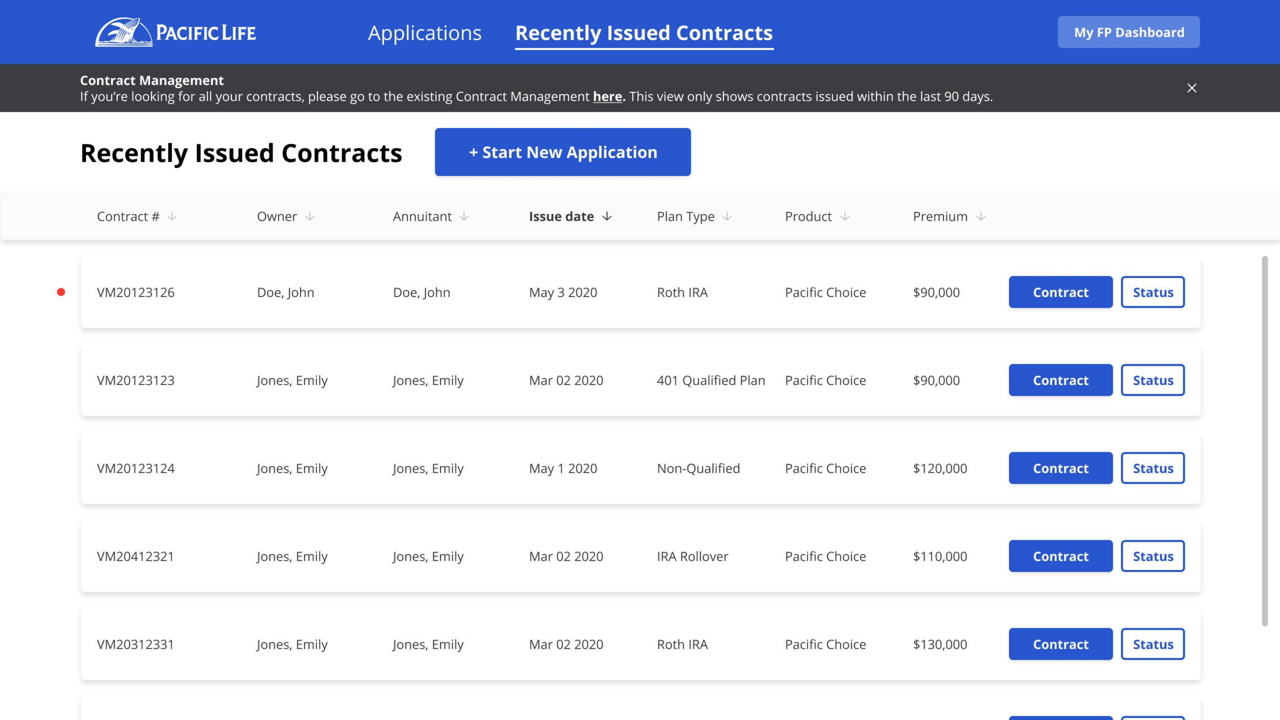
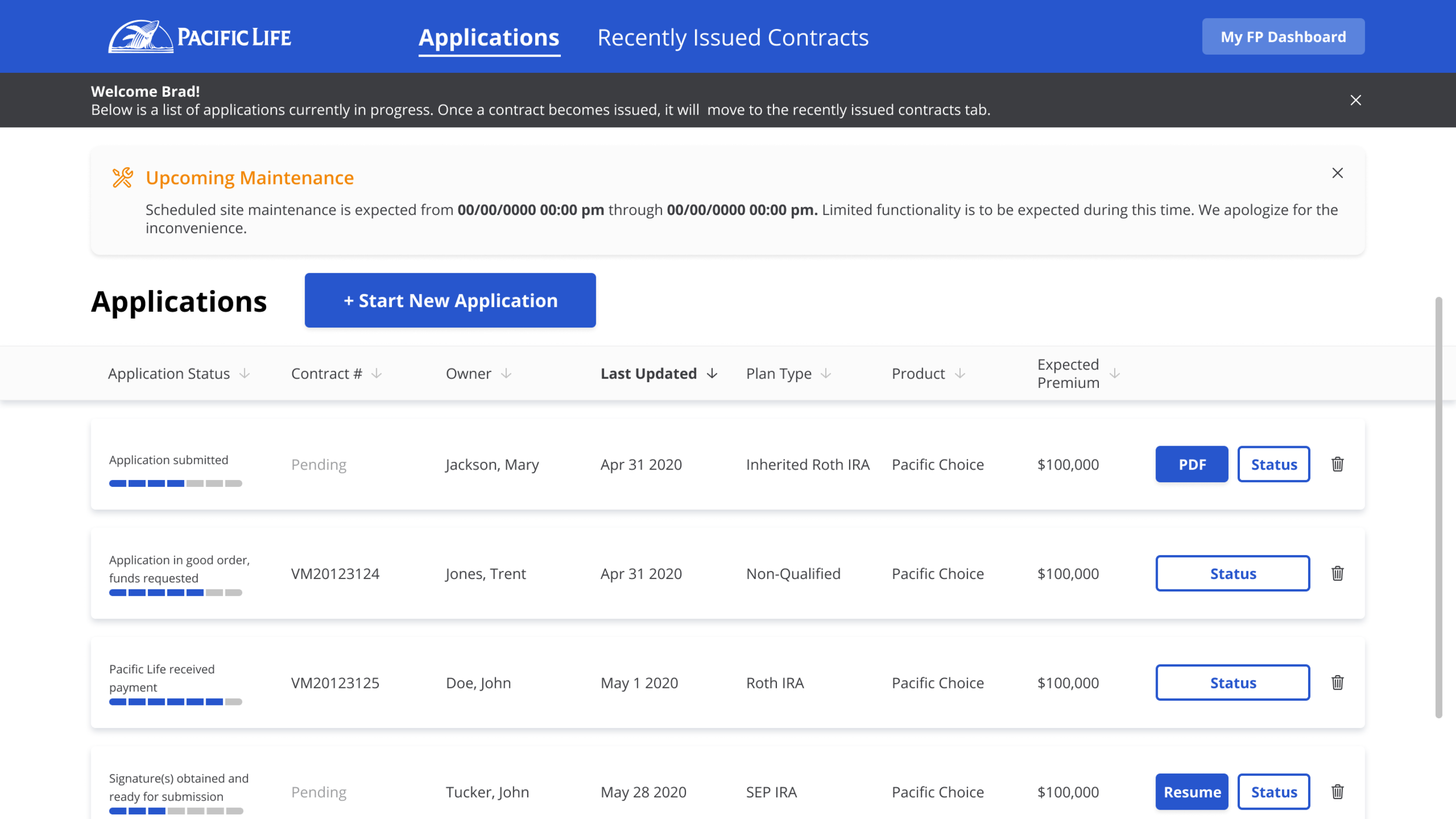
[List of Ongoing Applications & Recently Issued Contracts]
This is a centralized location where the financial professional will find their list of all ongoing applications, as well as contracts that have been issued recently. They will be able to start new applications, view the status of applications, retrieve a digital copy of submitted applications and issued contracts, and so forth.
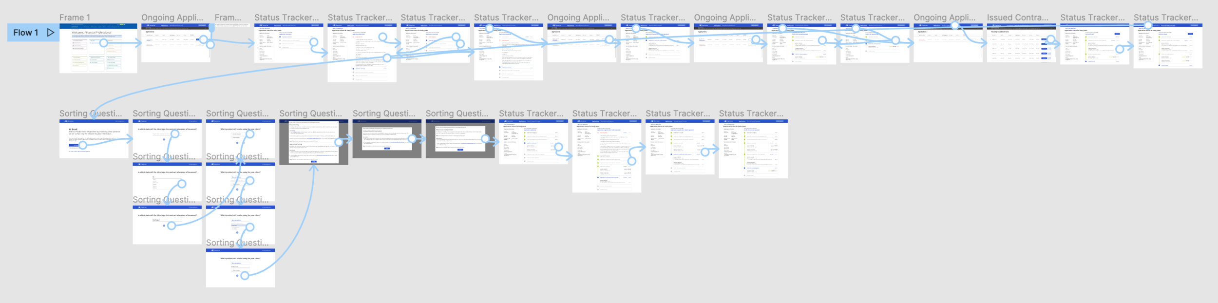
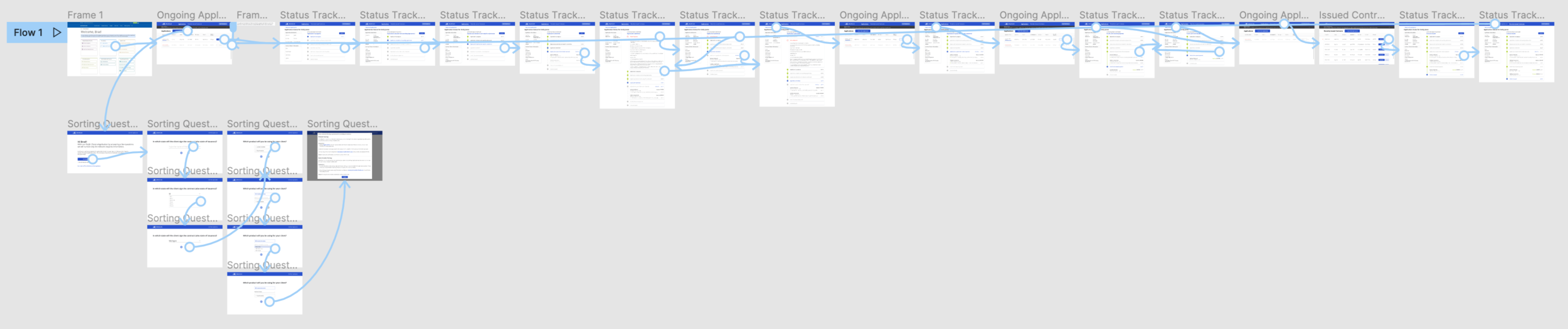
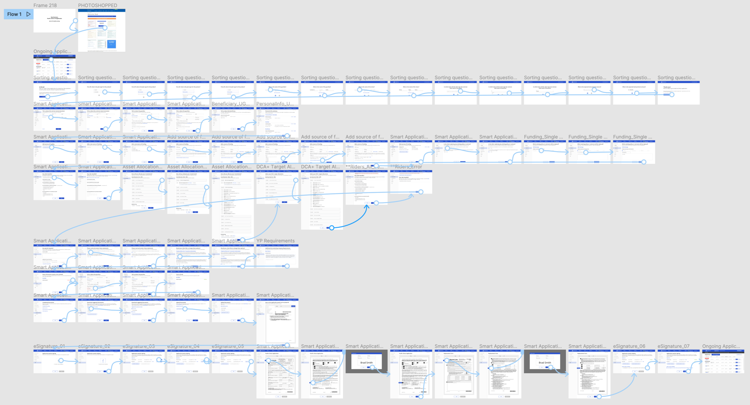
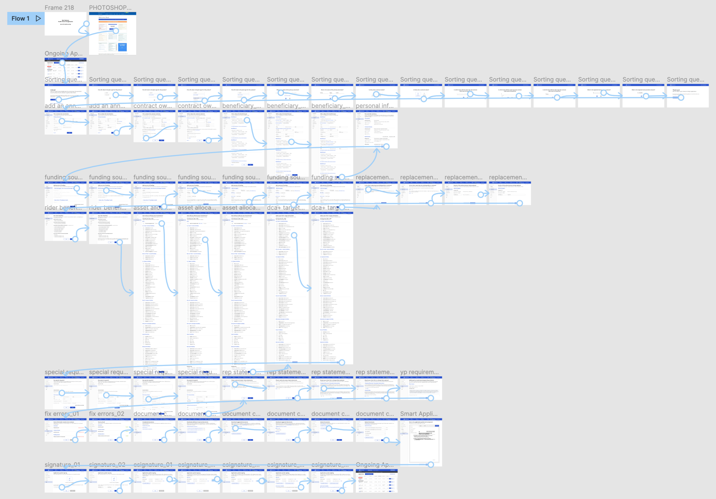
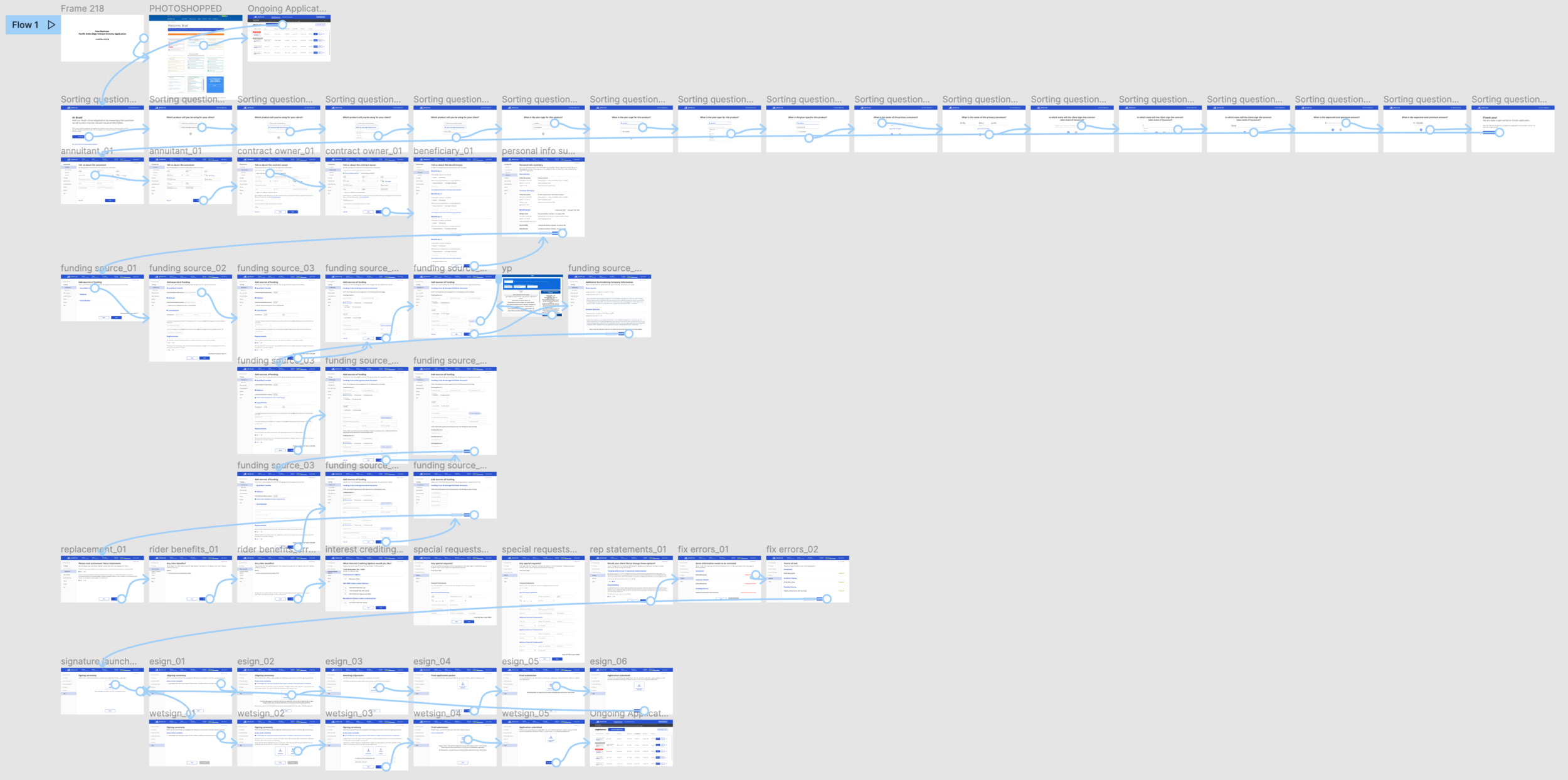
[Sorting Questions]
Sorting questions is a series of preliminary questions we ask financial professionals when they first start an application. This allows us to check pre-qualification details before the financial professional starts an application, prepare the correct paperwork required for the selected line of business, and receive key information that we can pre-populate through the digital application process, reducing the amount of time required to fill out an application.
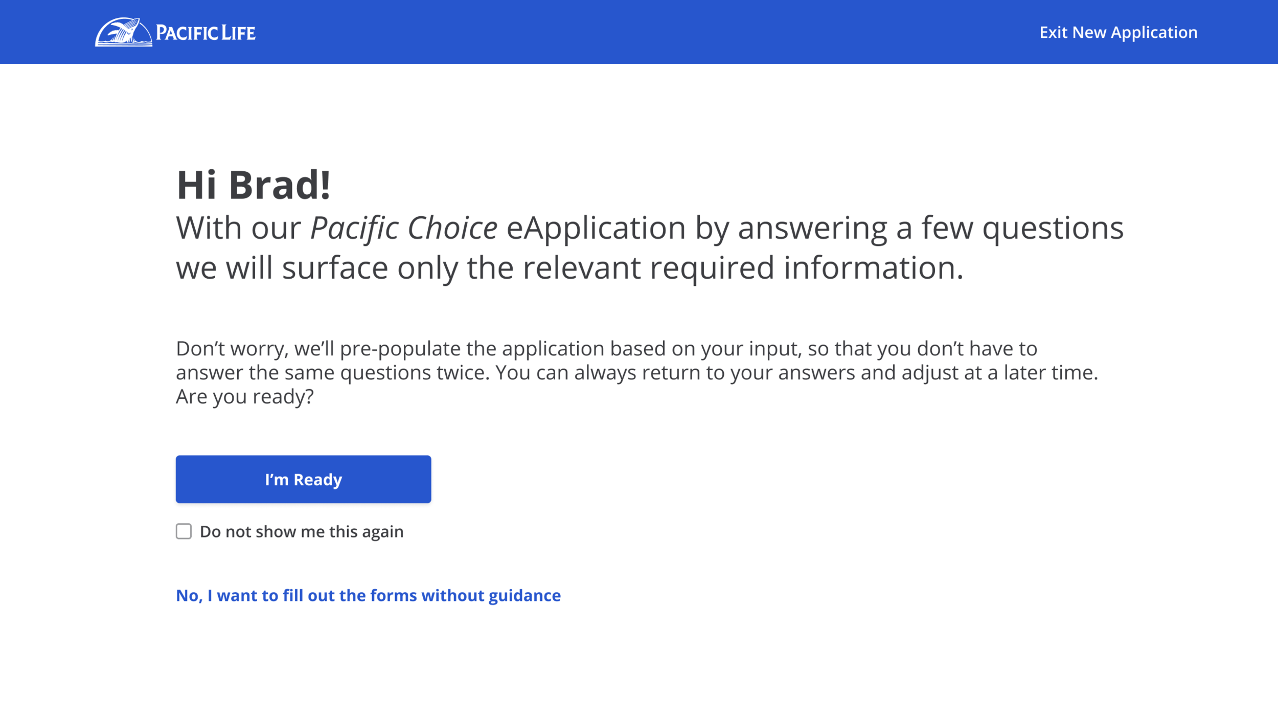
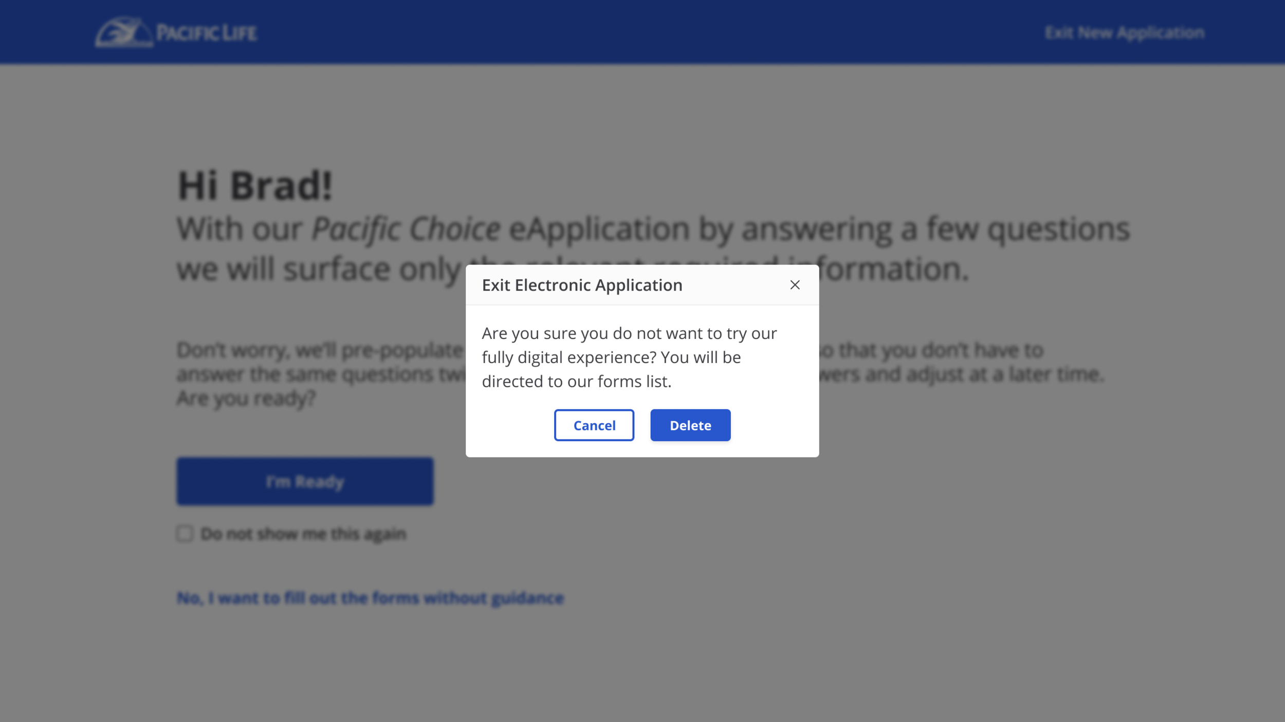
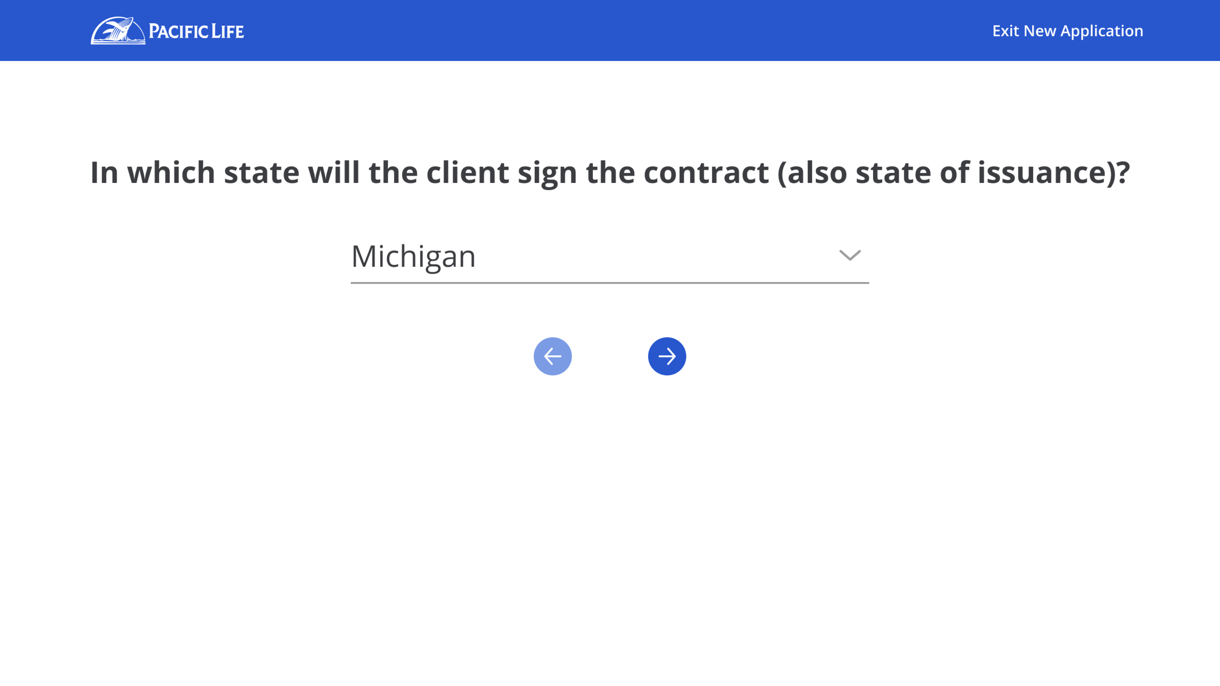
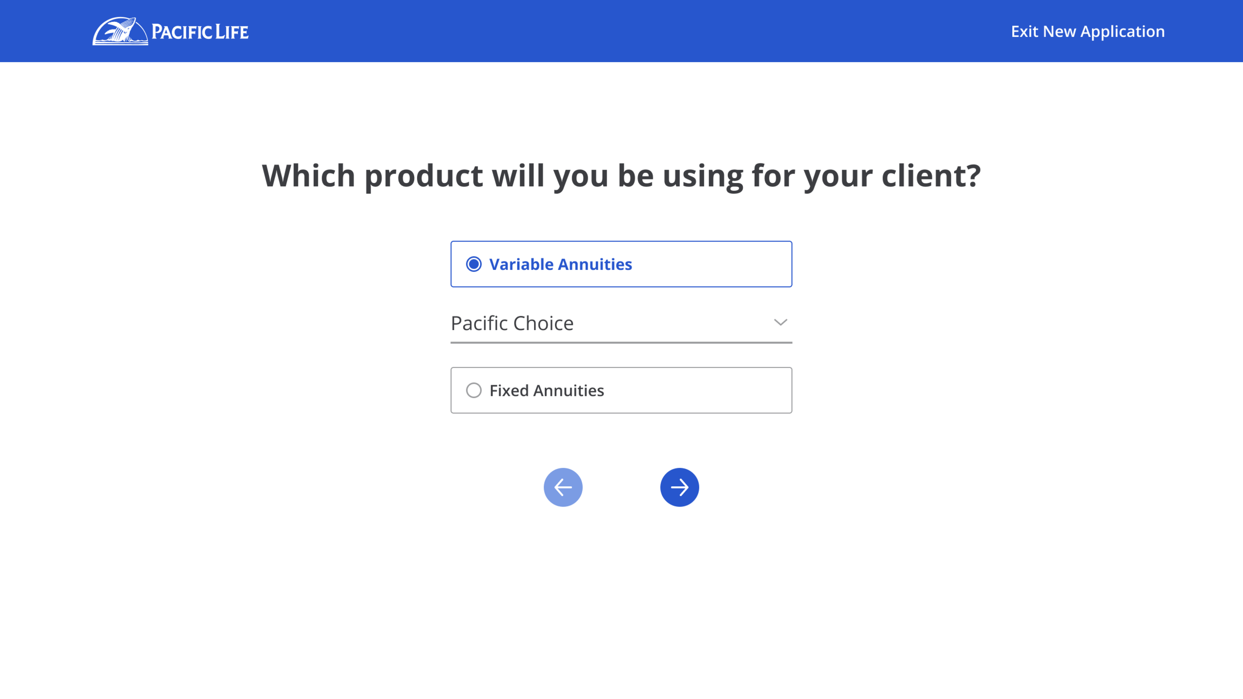
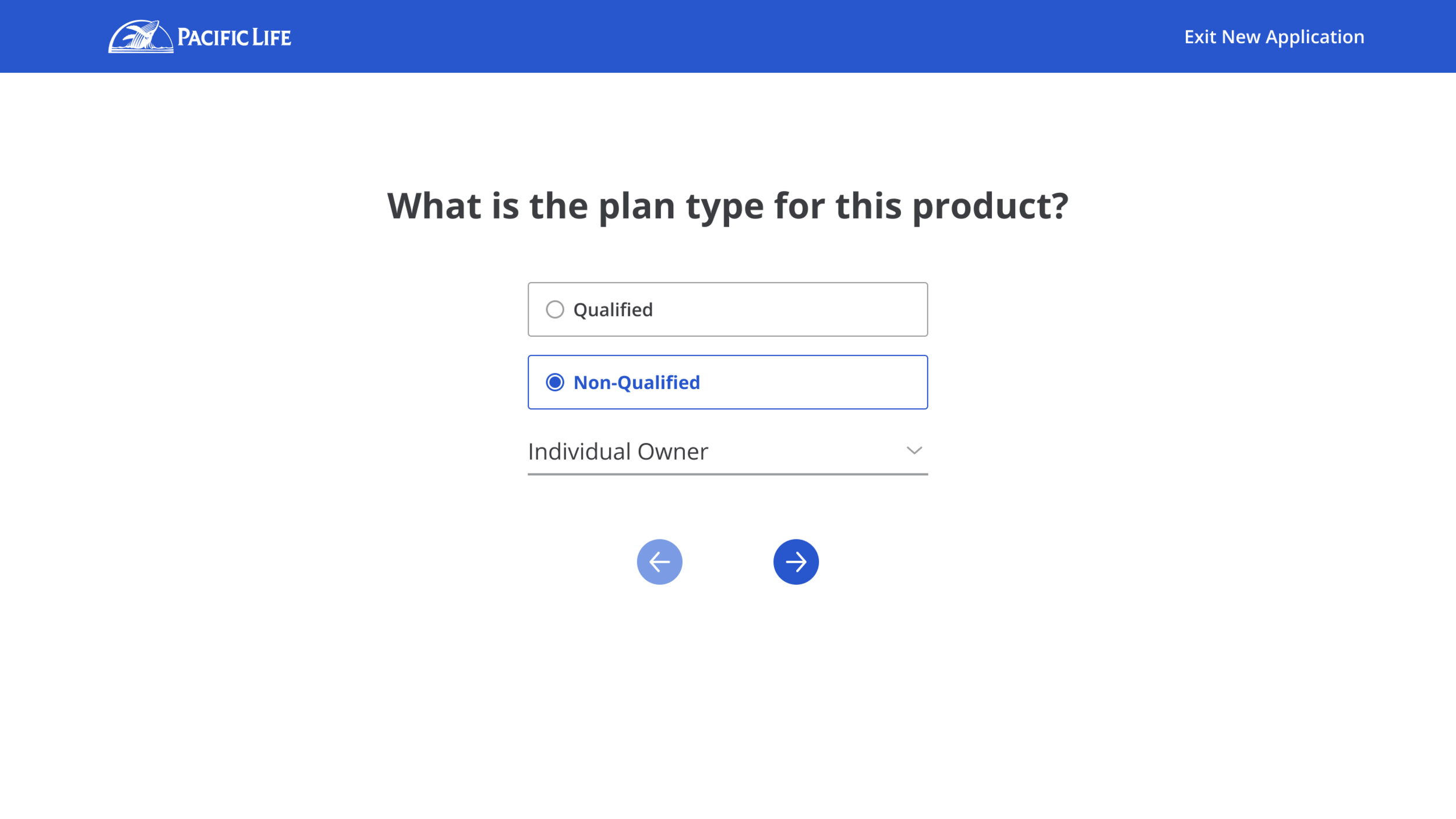
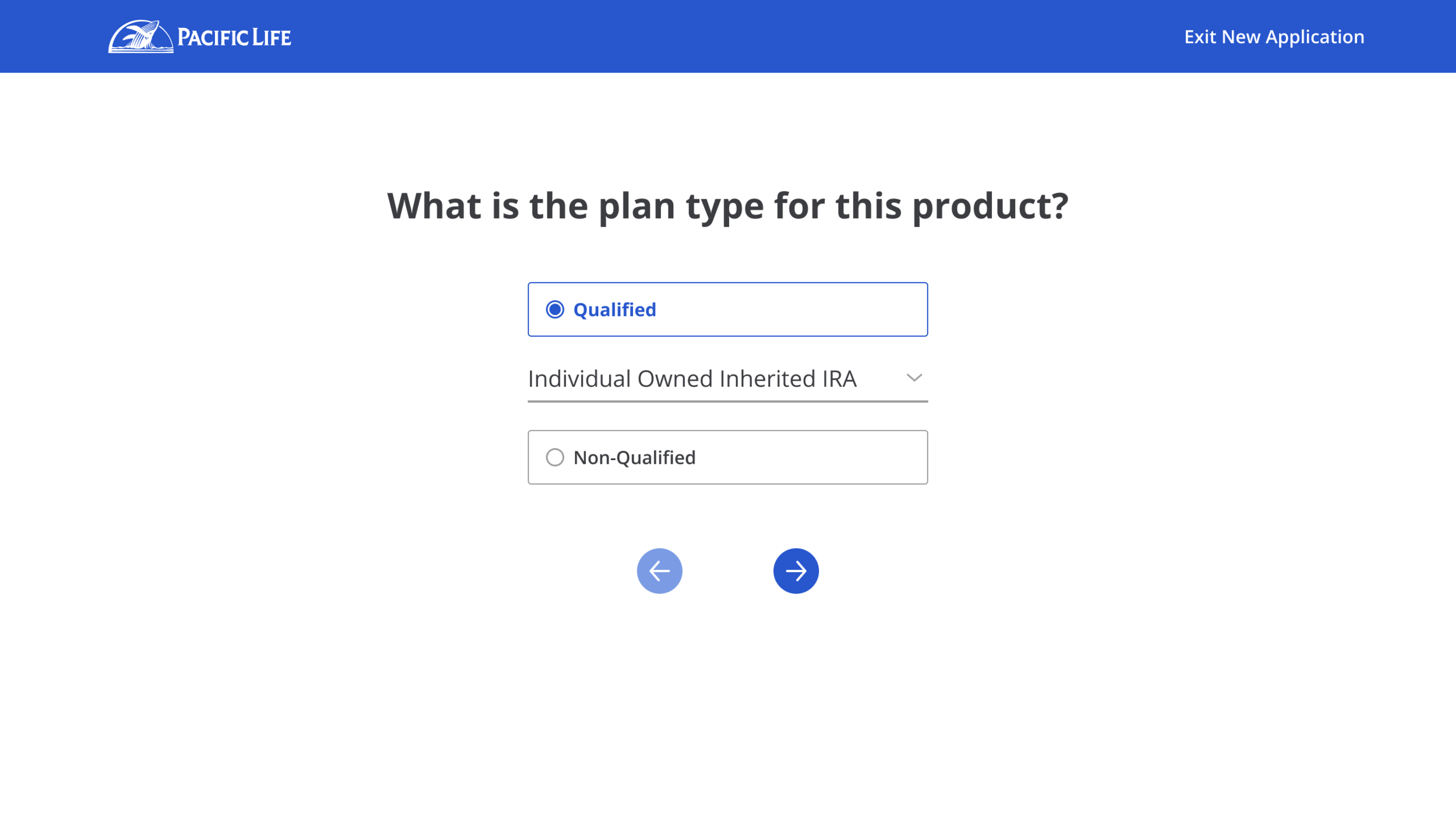
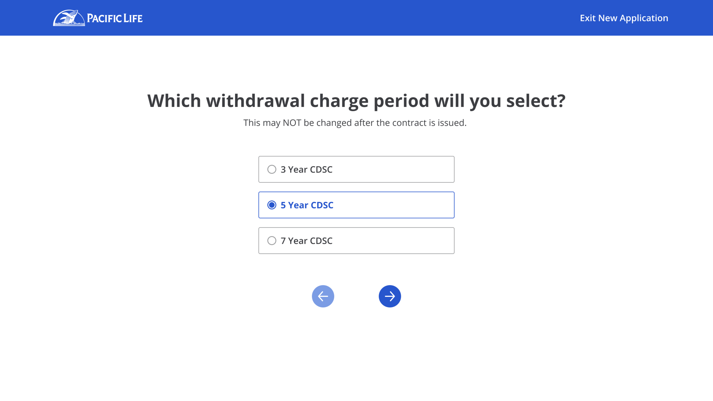
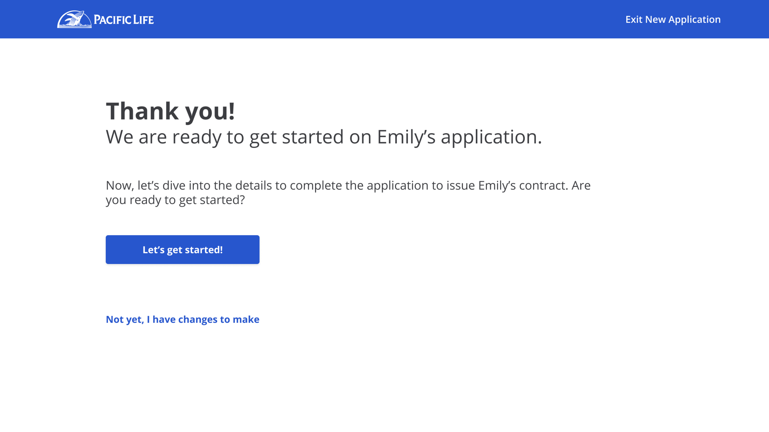

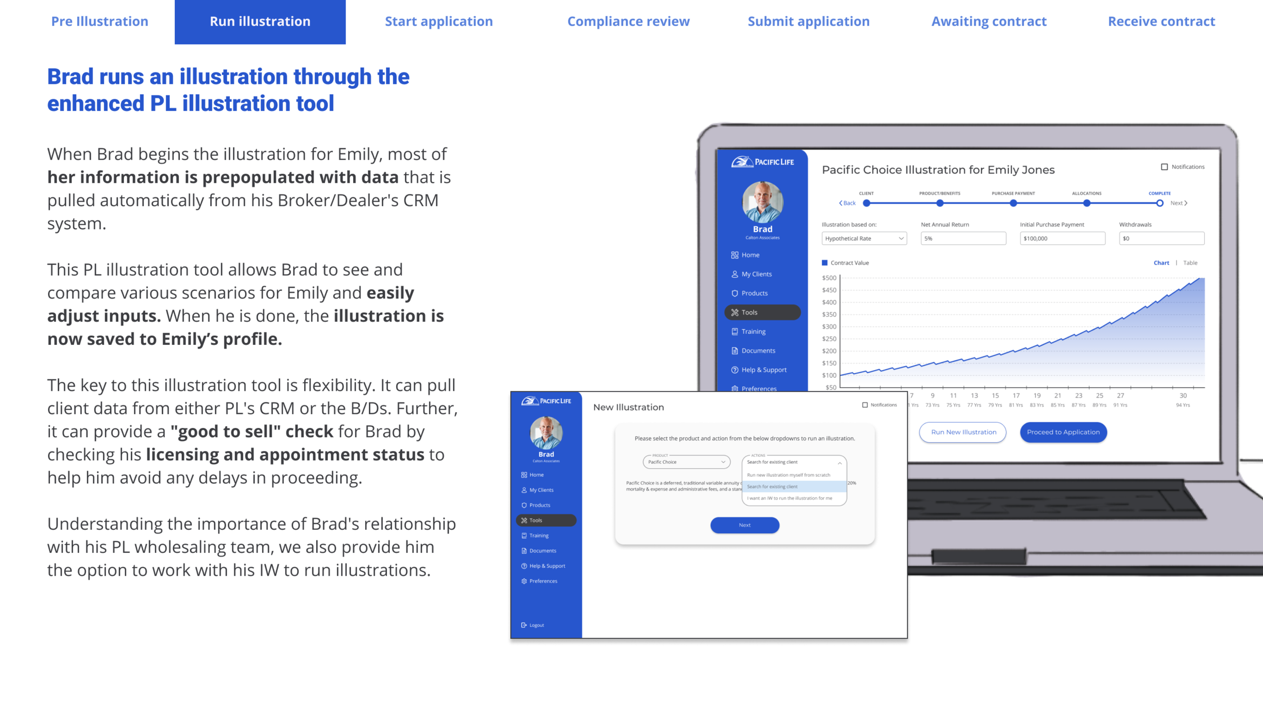
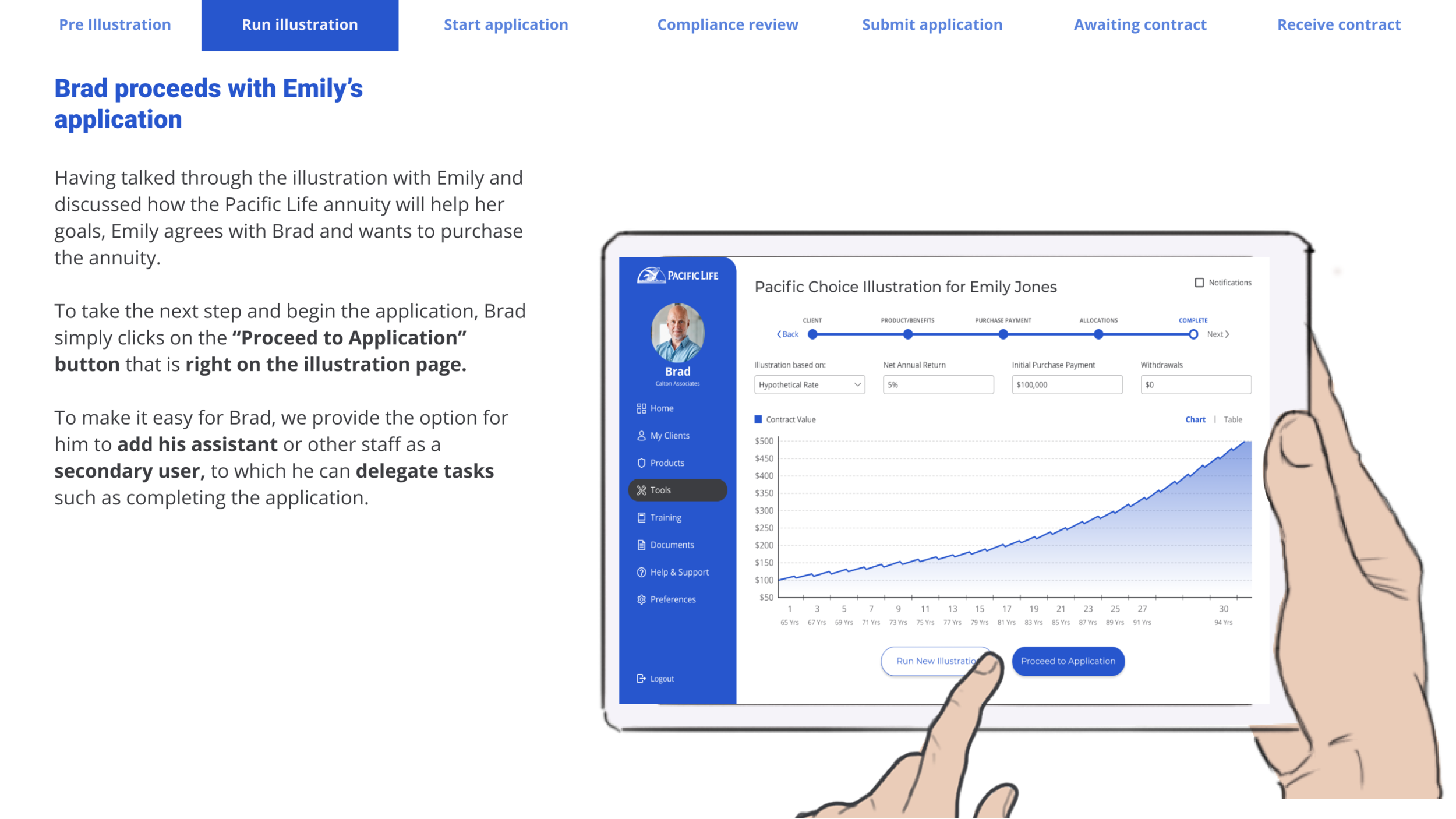
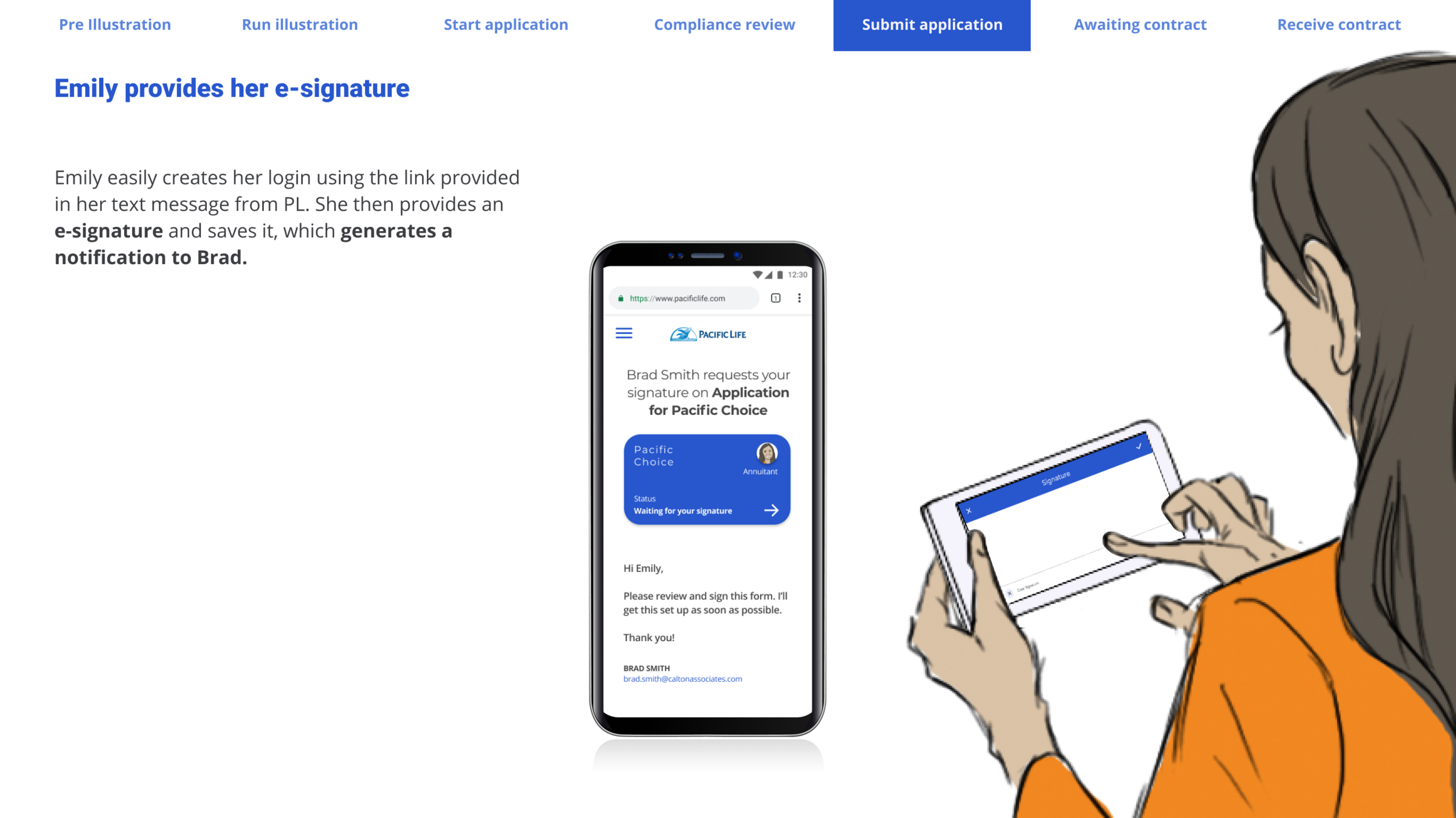
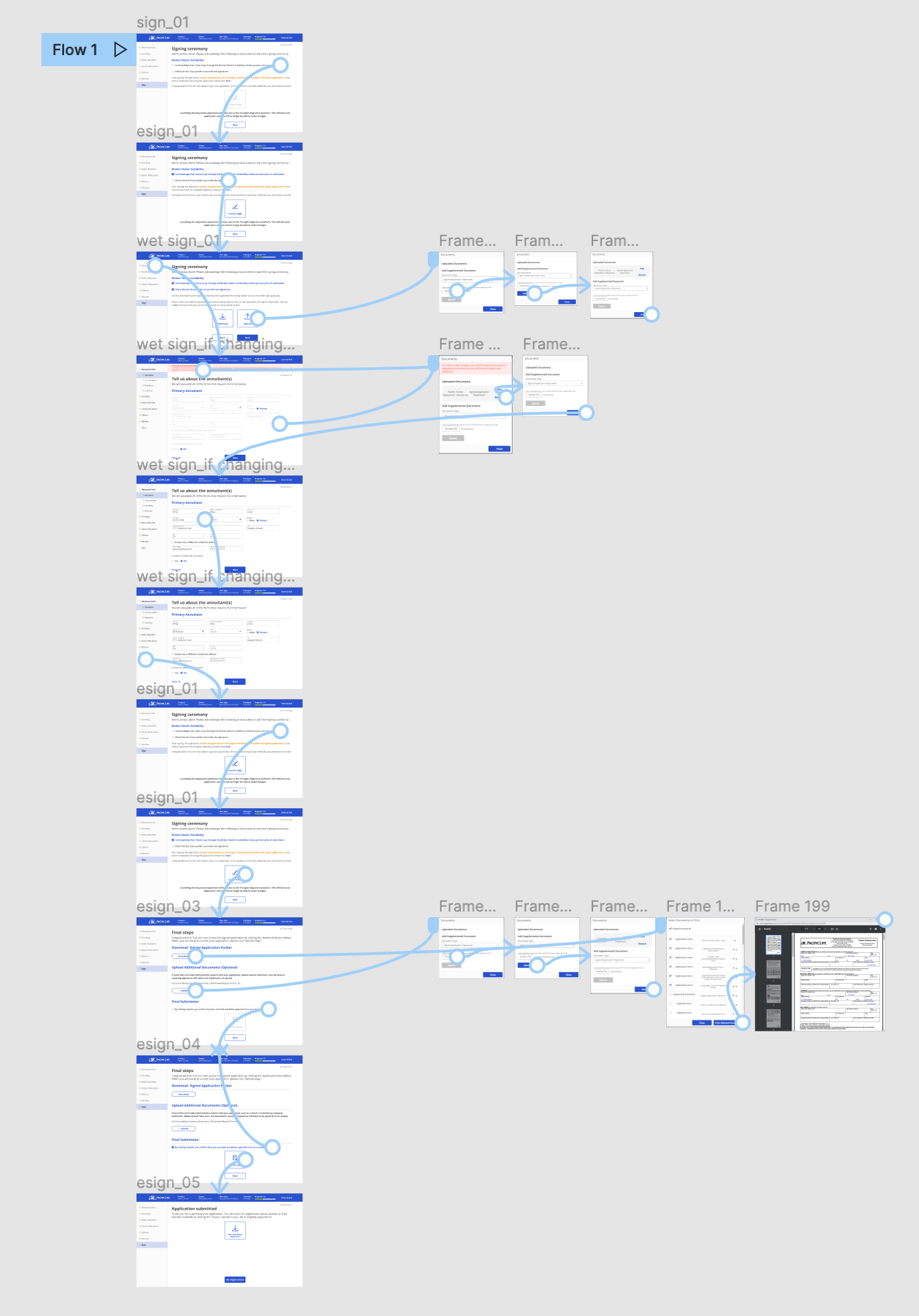
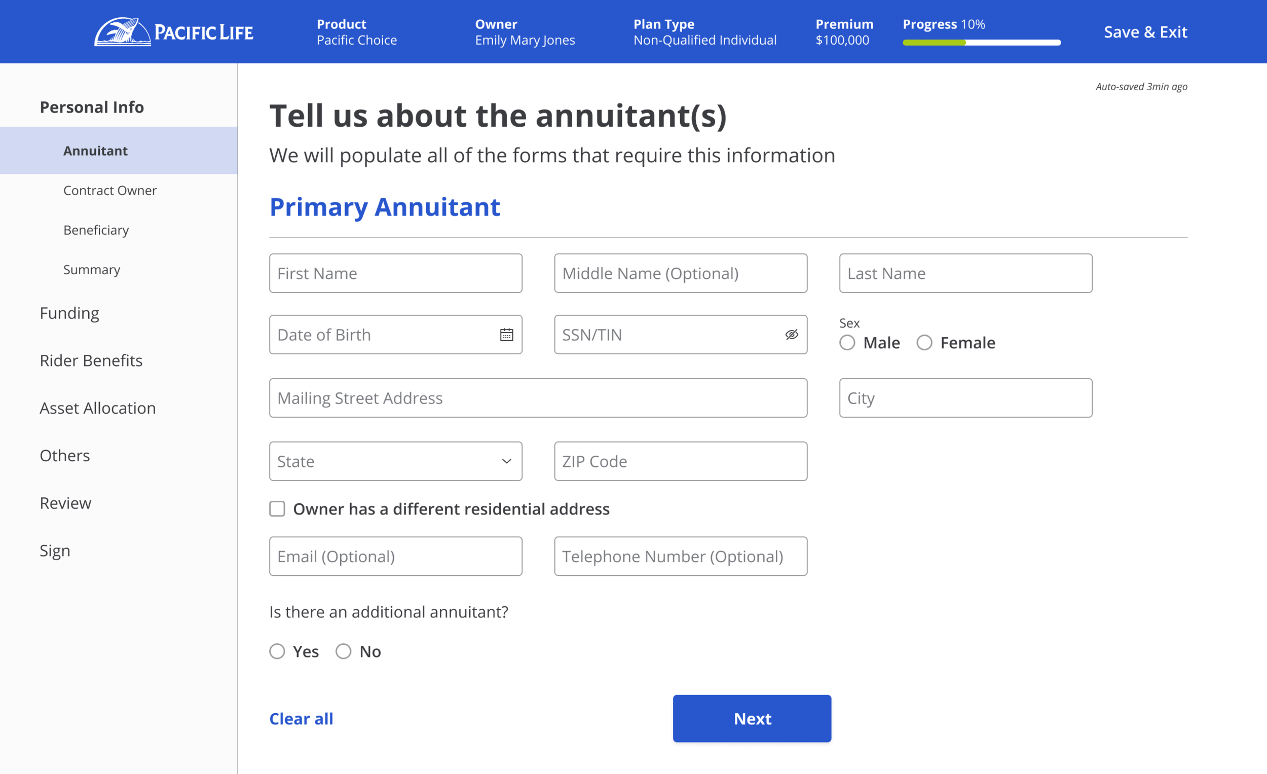
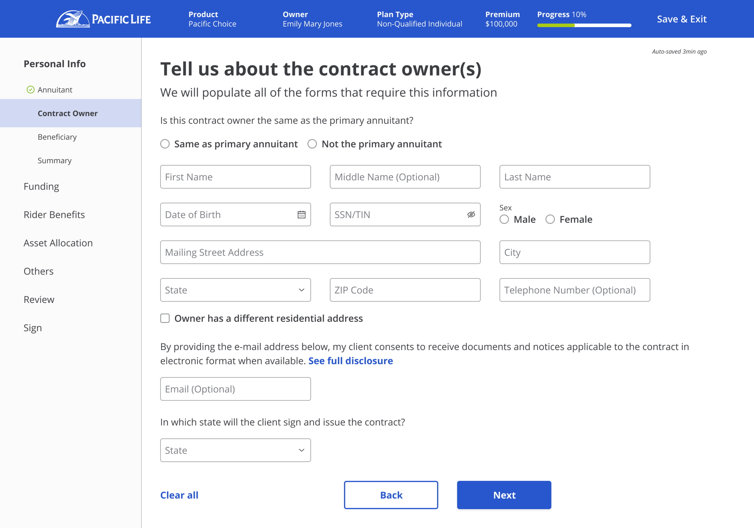
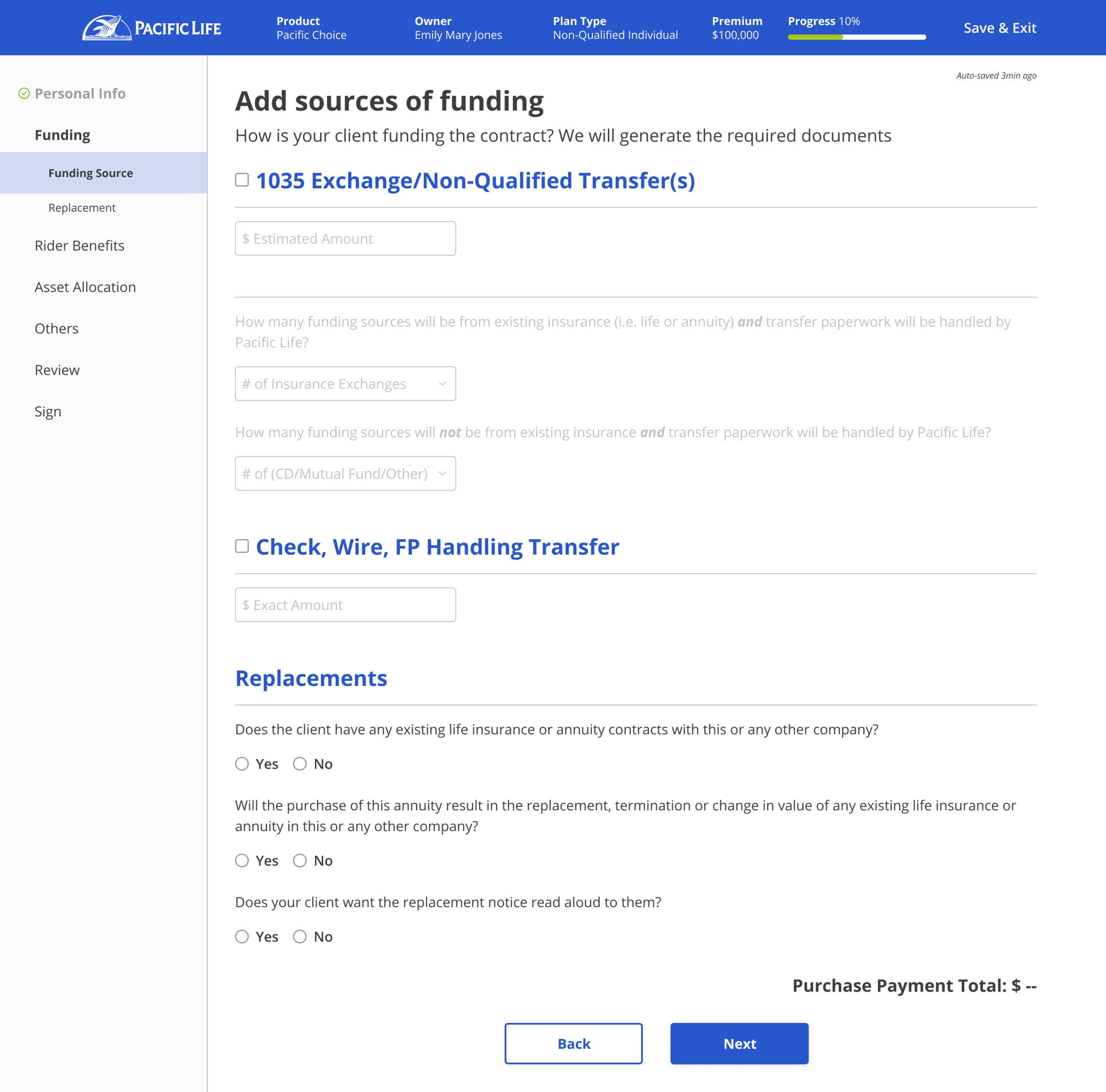
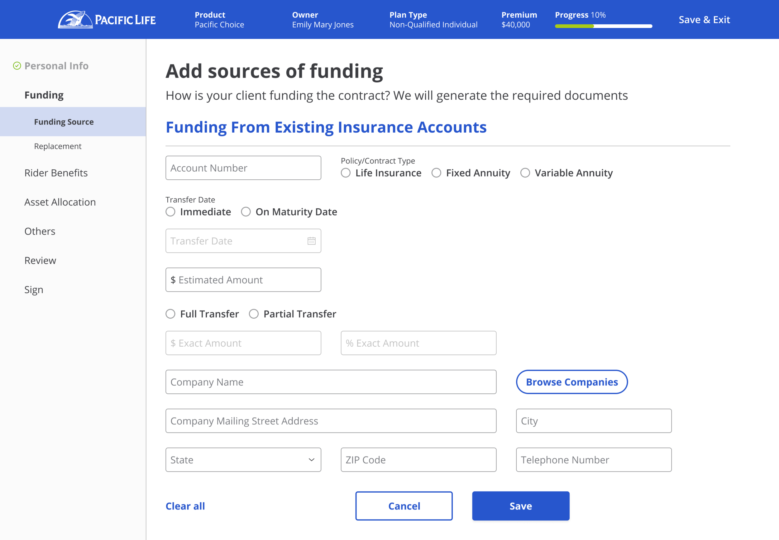
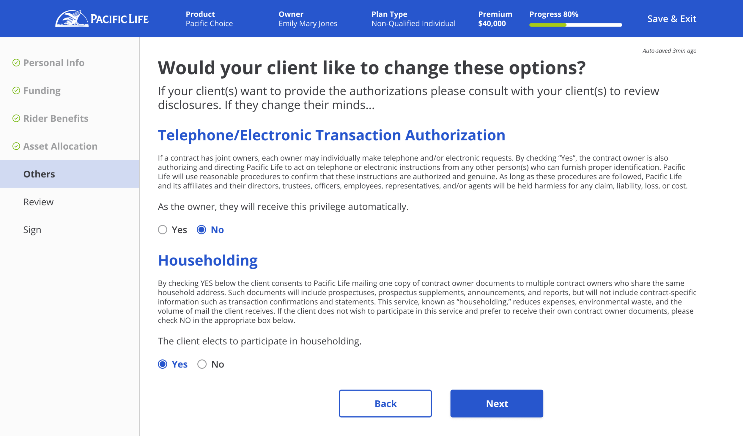
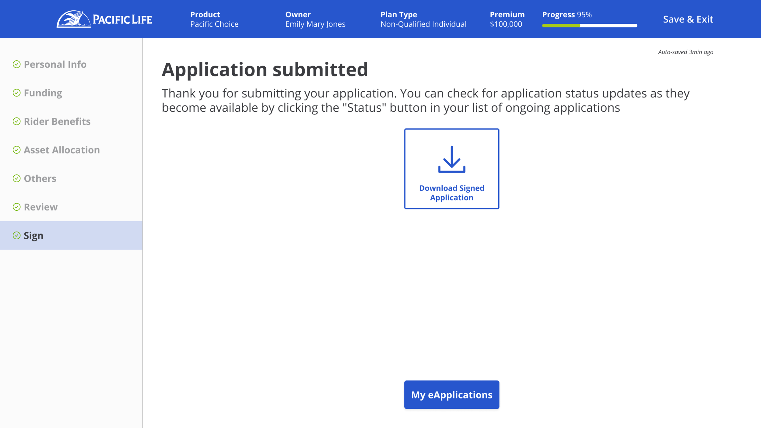
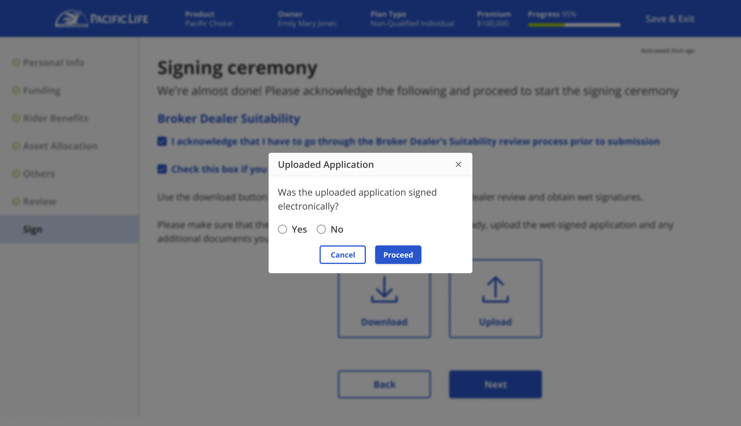
[Application Flow]
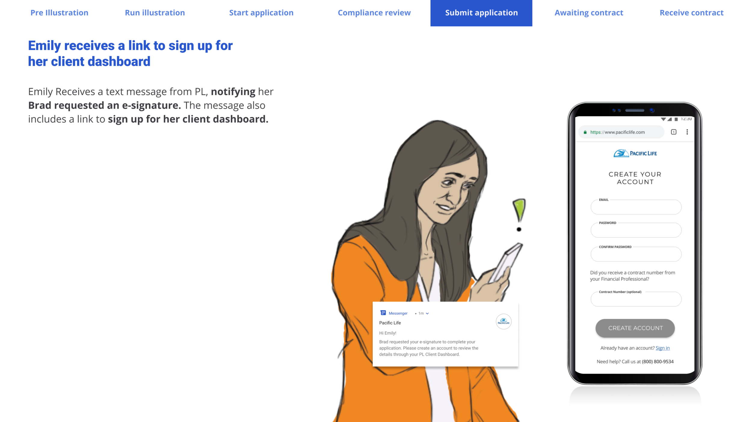
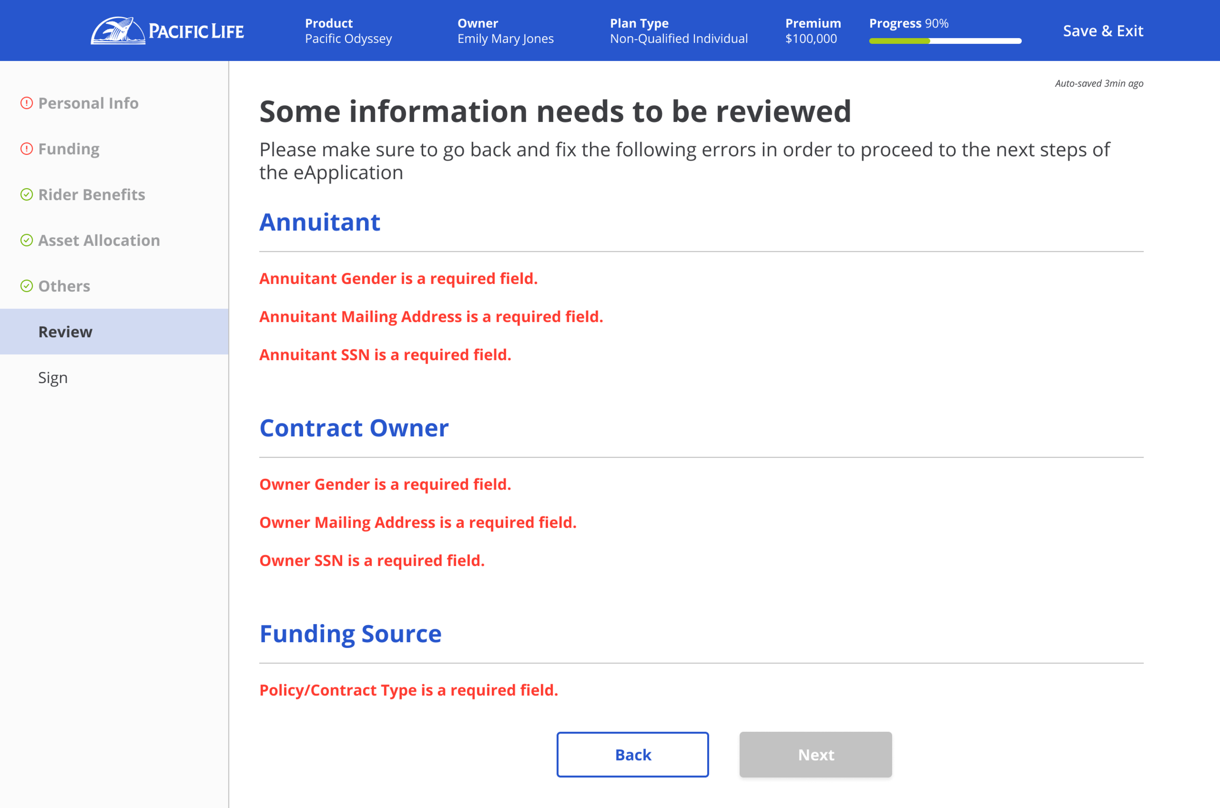
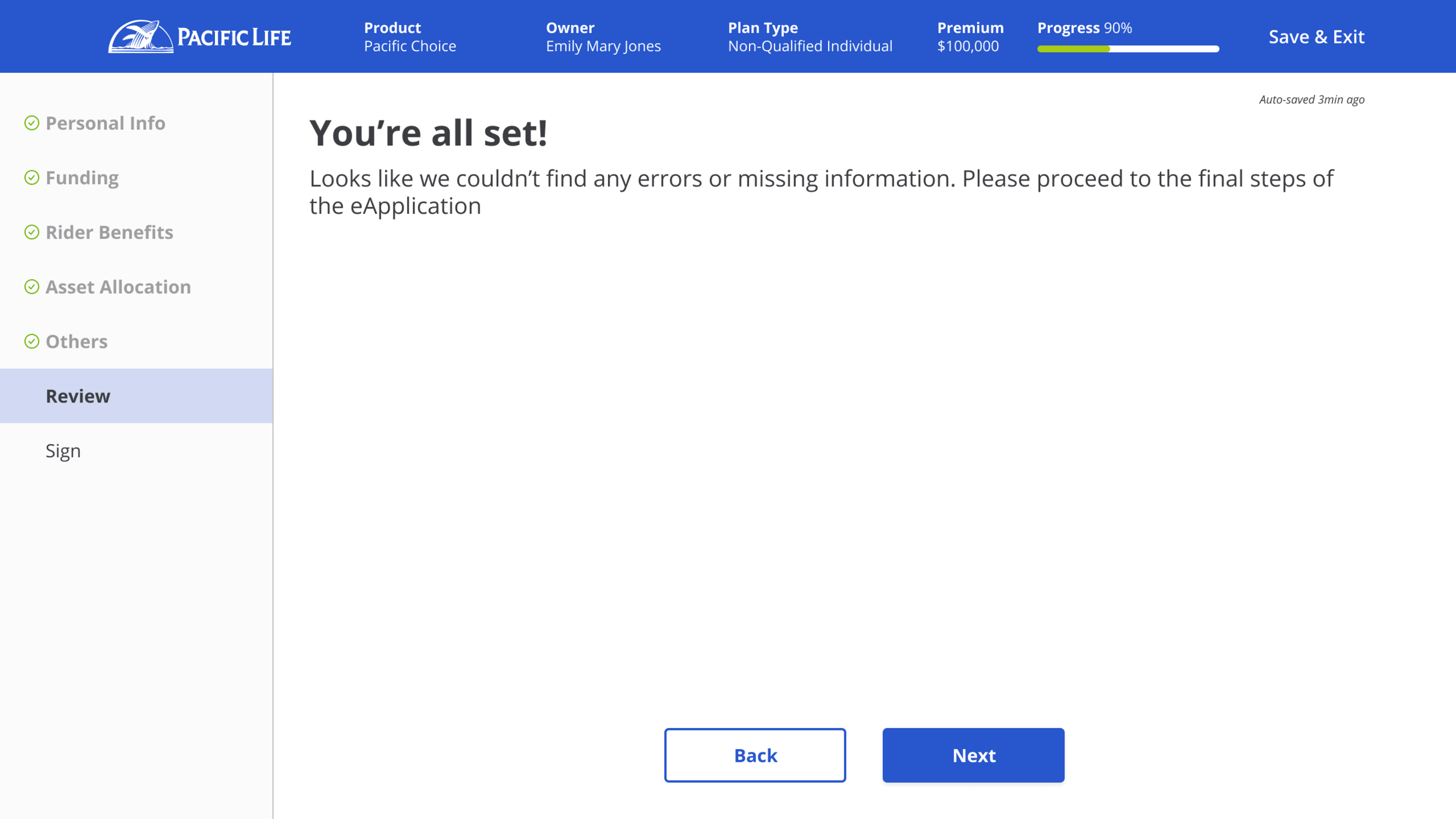
The application flow is the key element of this transformation. As financial professionals fill out the application, live error checks will alert and highlight any errors/missing fields, which happens quite frequently in paper applications. Sometimes financial professionals don’t have the information ready at the time of filling the application, and we definitely don’t want to stop them from moving forward - they can still continue to fill other areas of the application as they please, however they will need to clear all requirements before submitting. We’ve also pushed to allow financial professionals to submit their signatures electronically (digitally) or via wet signature through this platform - financial professionals were thrilled that this experience wasn’t only for one side and they had options, as many of their clients had different preferences.
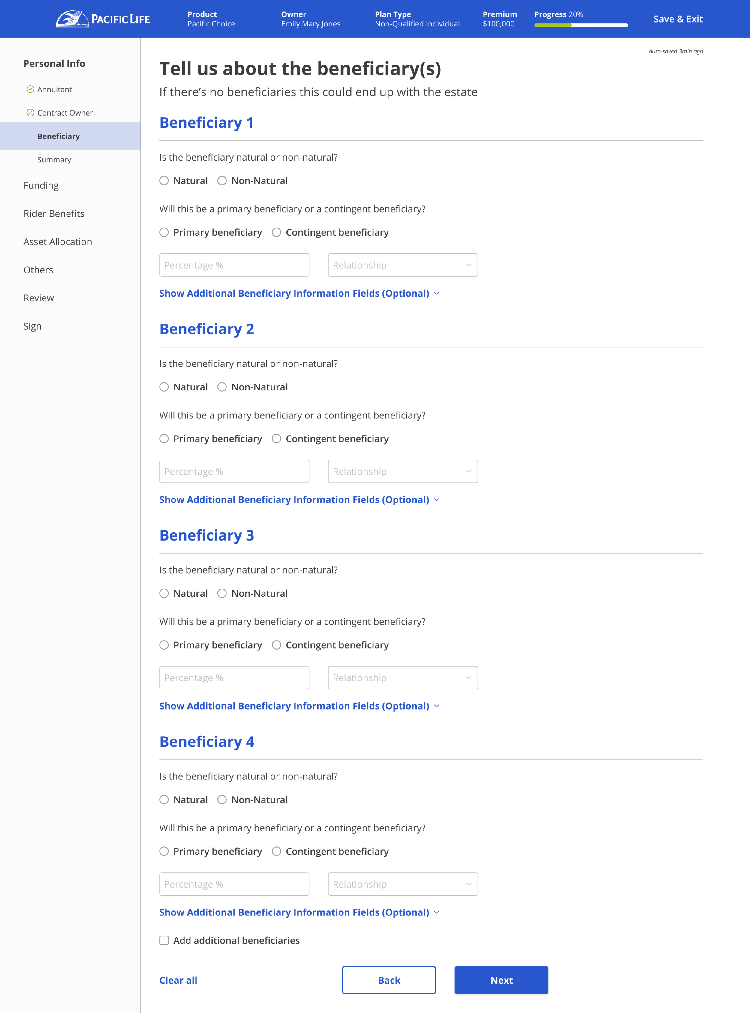
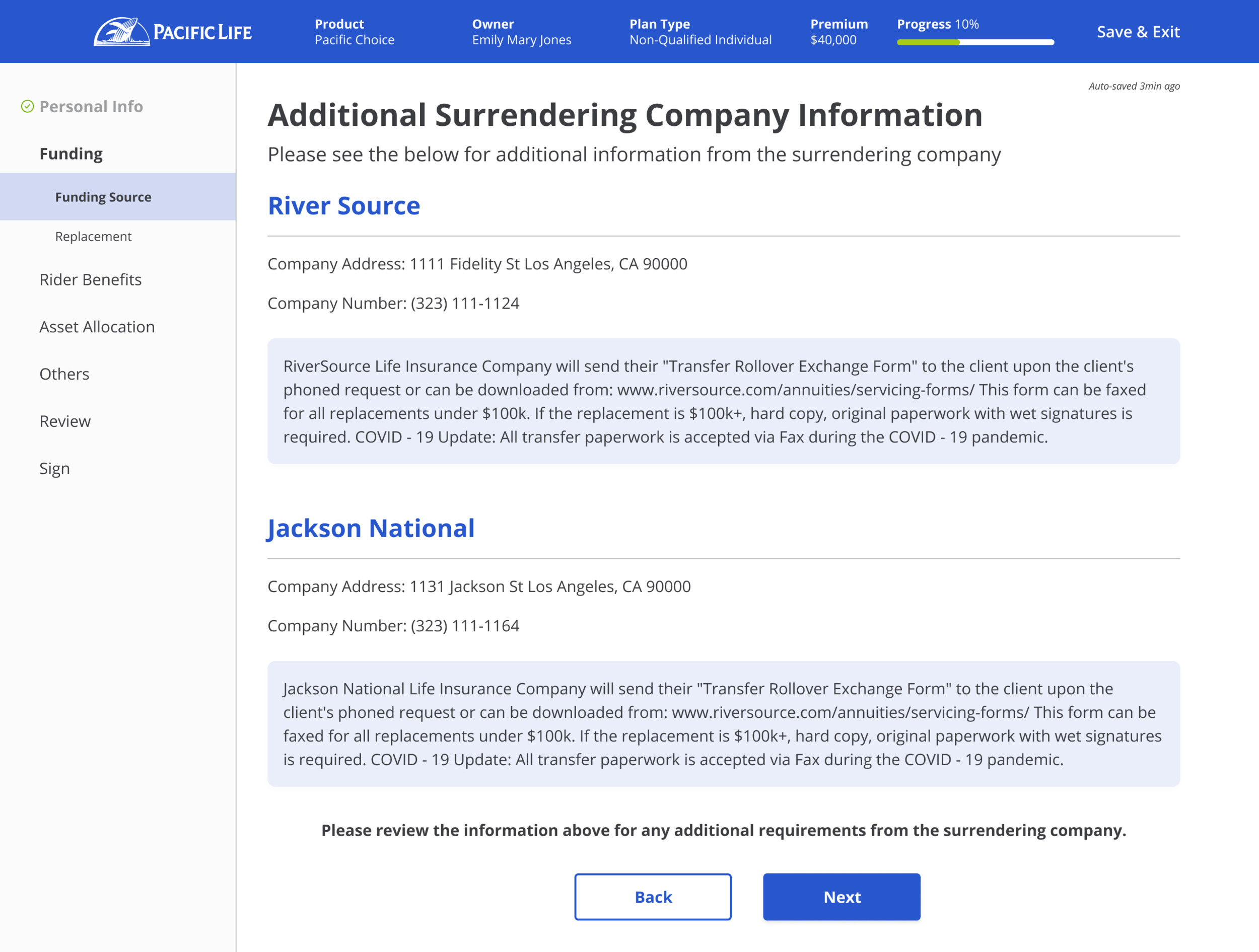
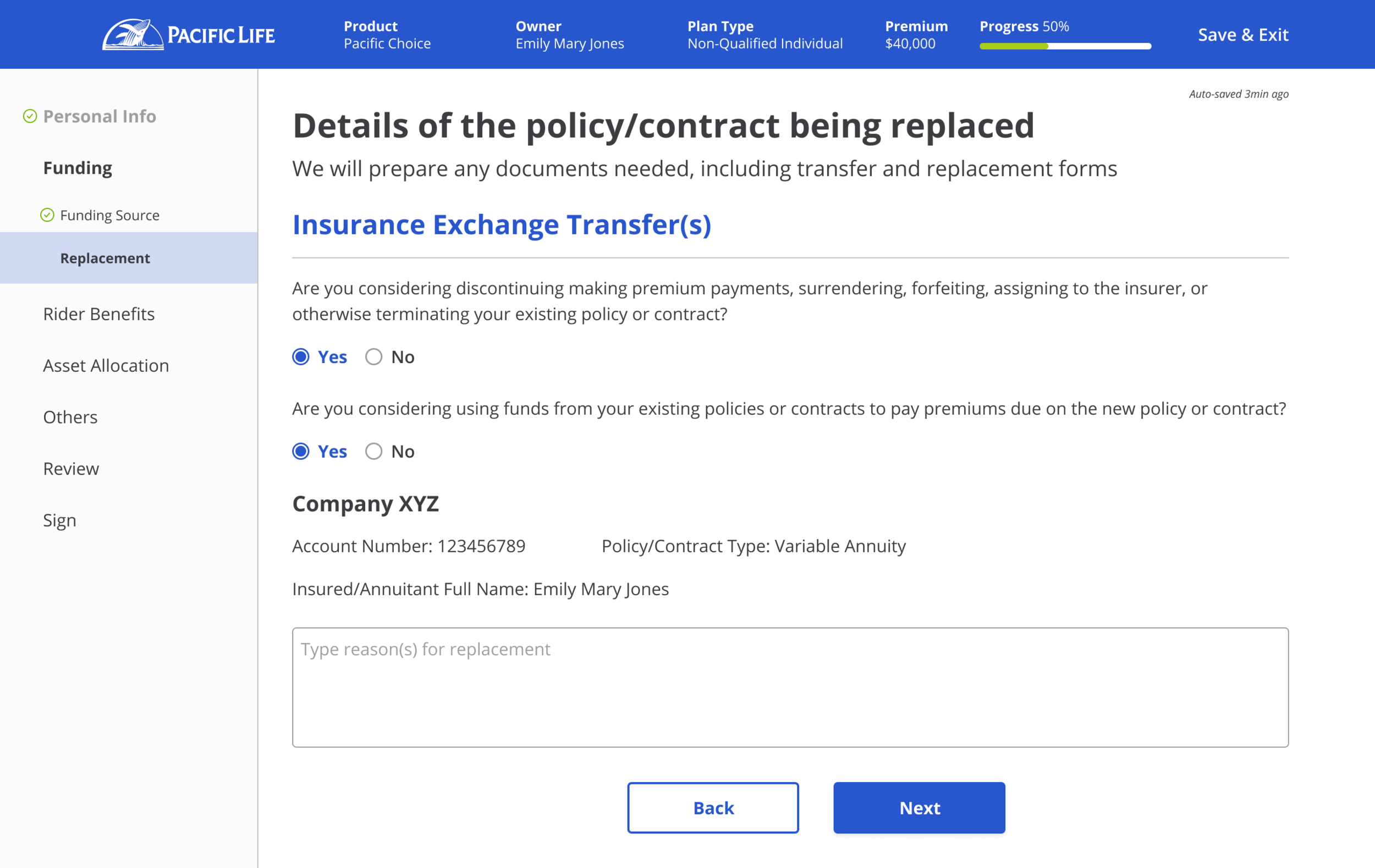
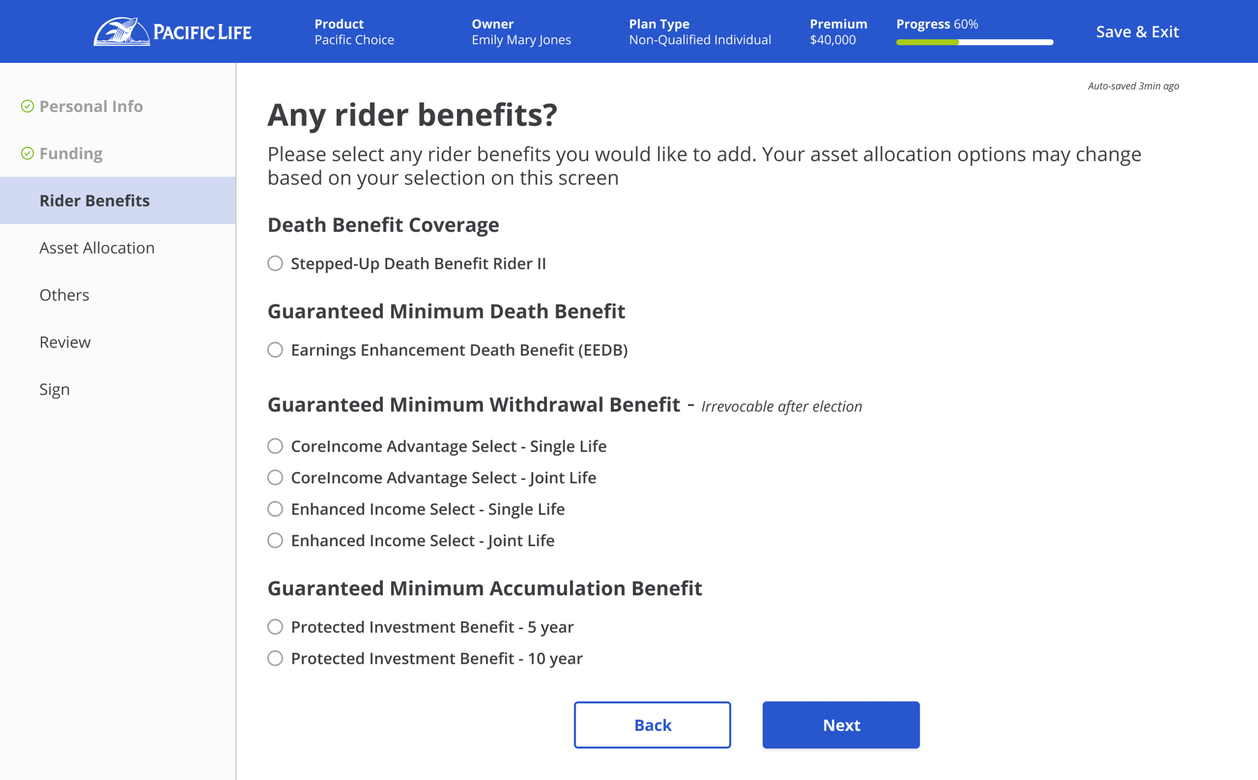
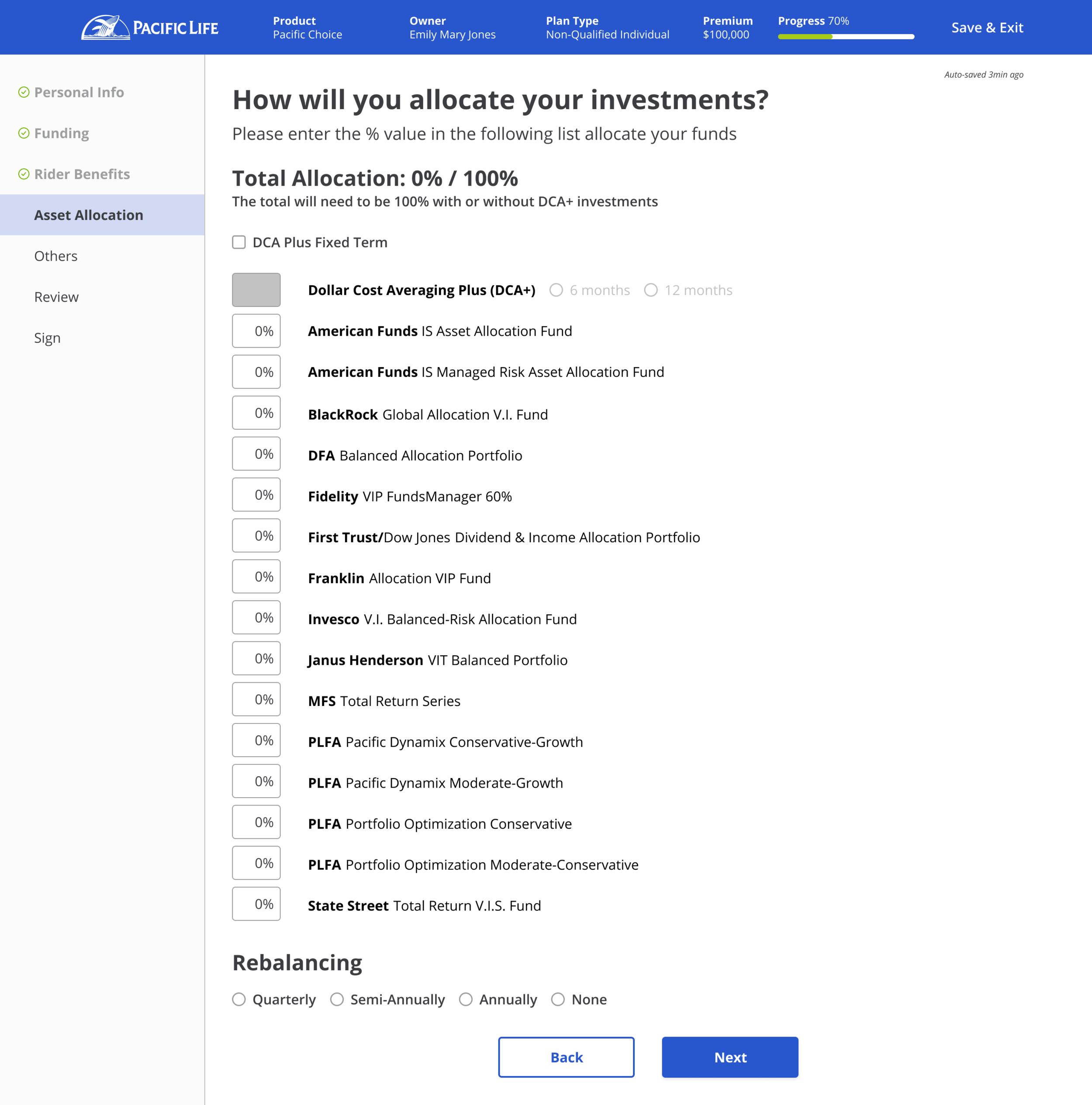
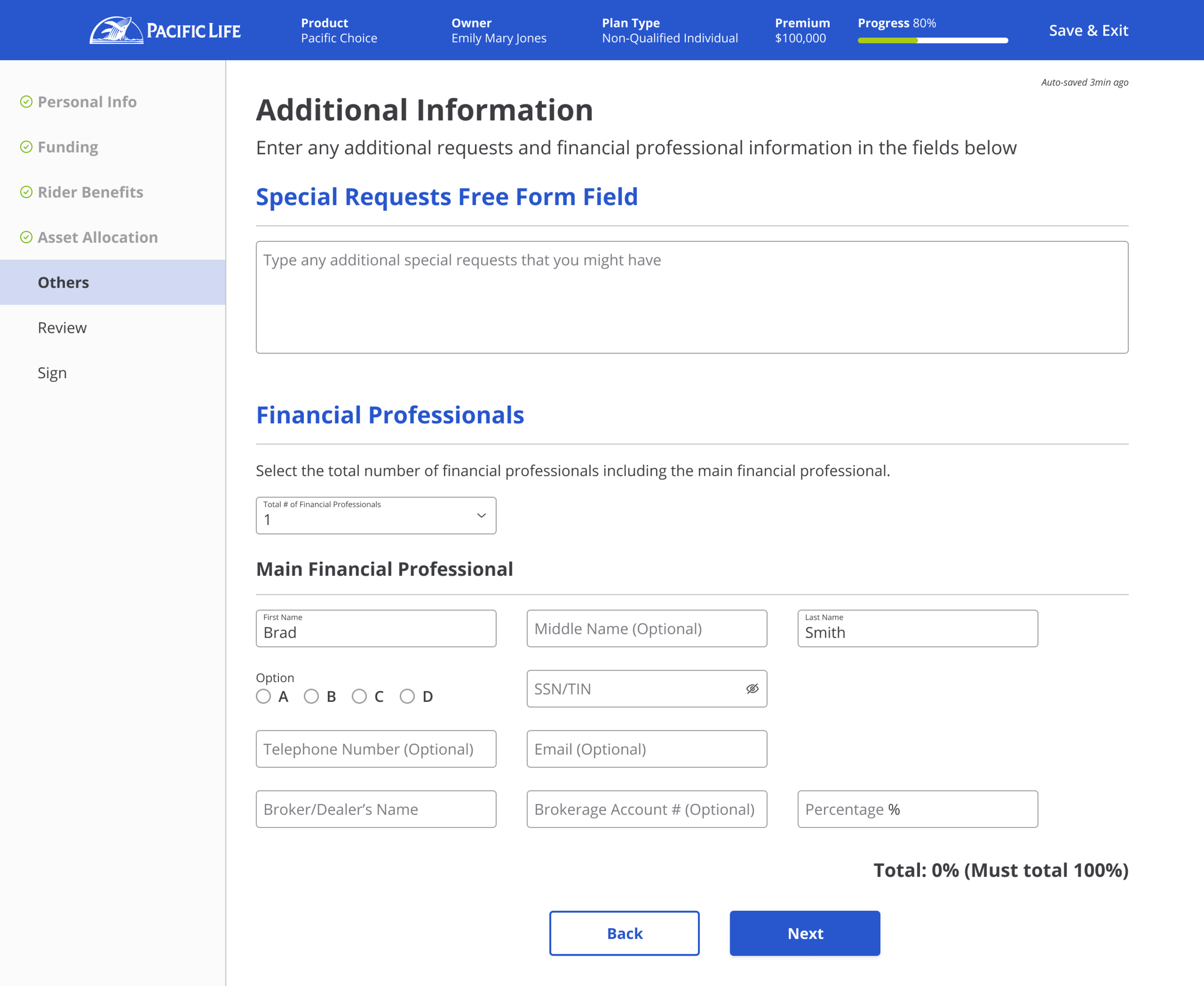
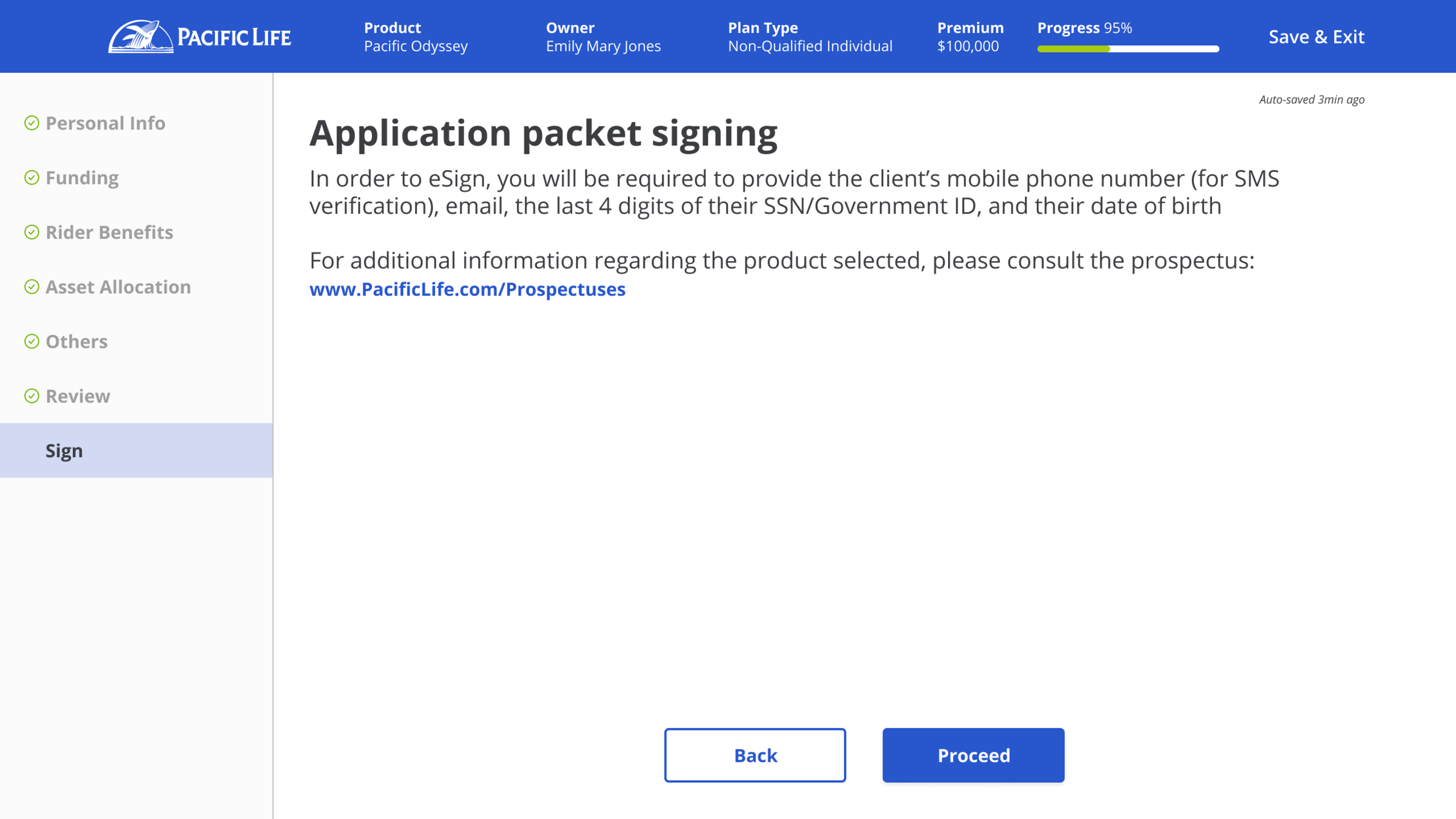
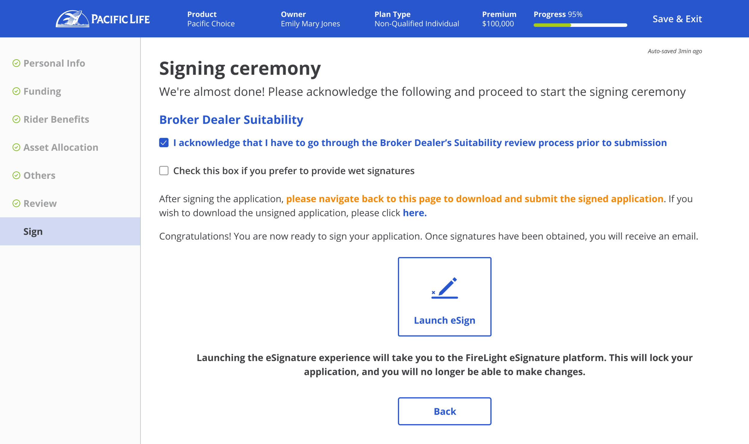
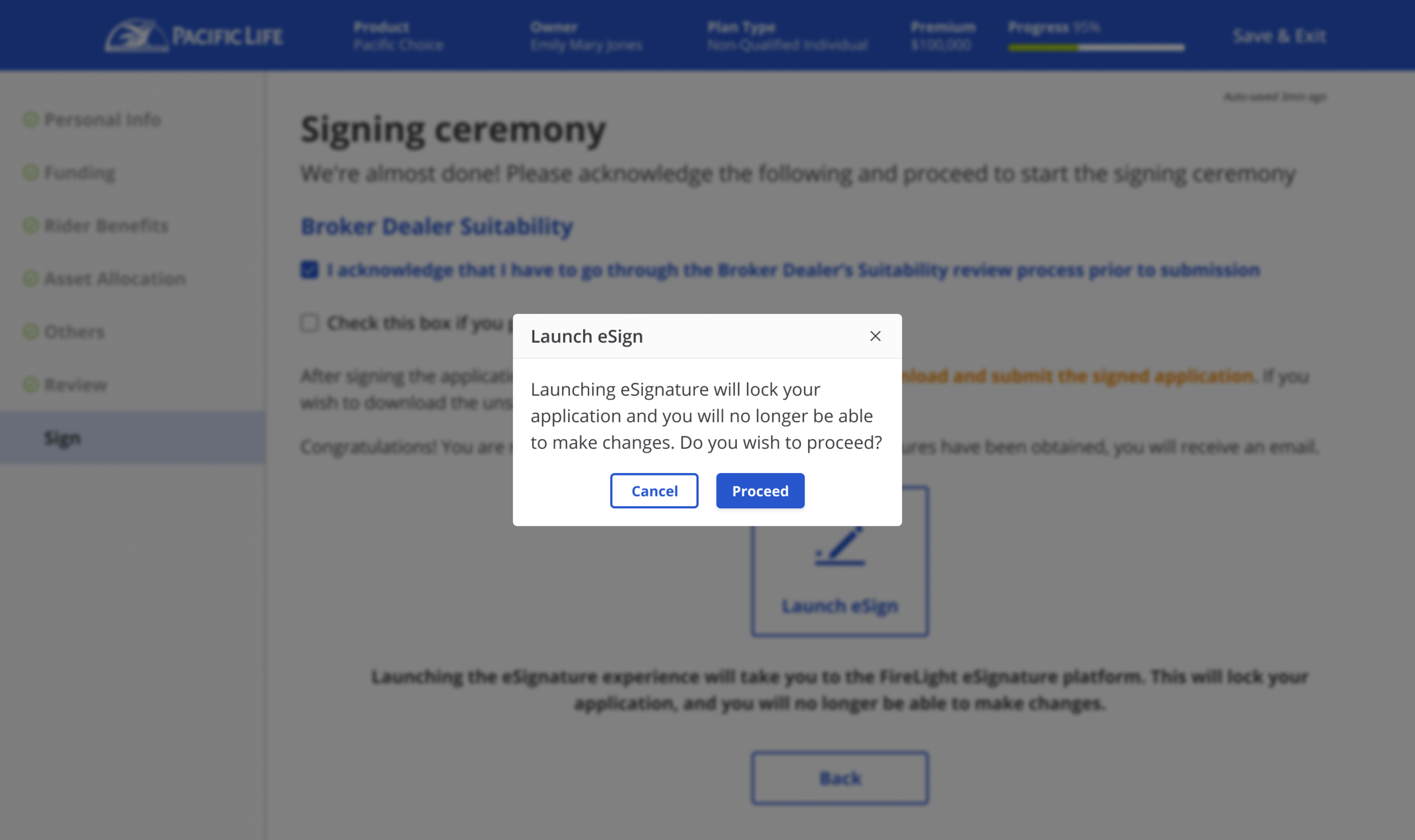
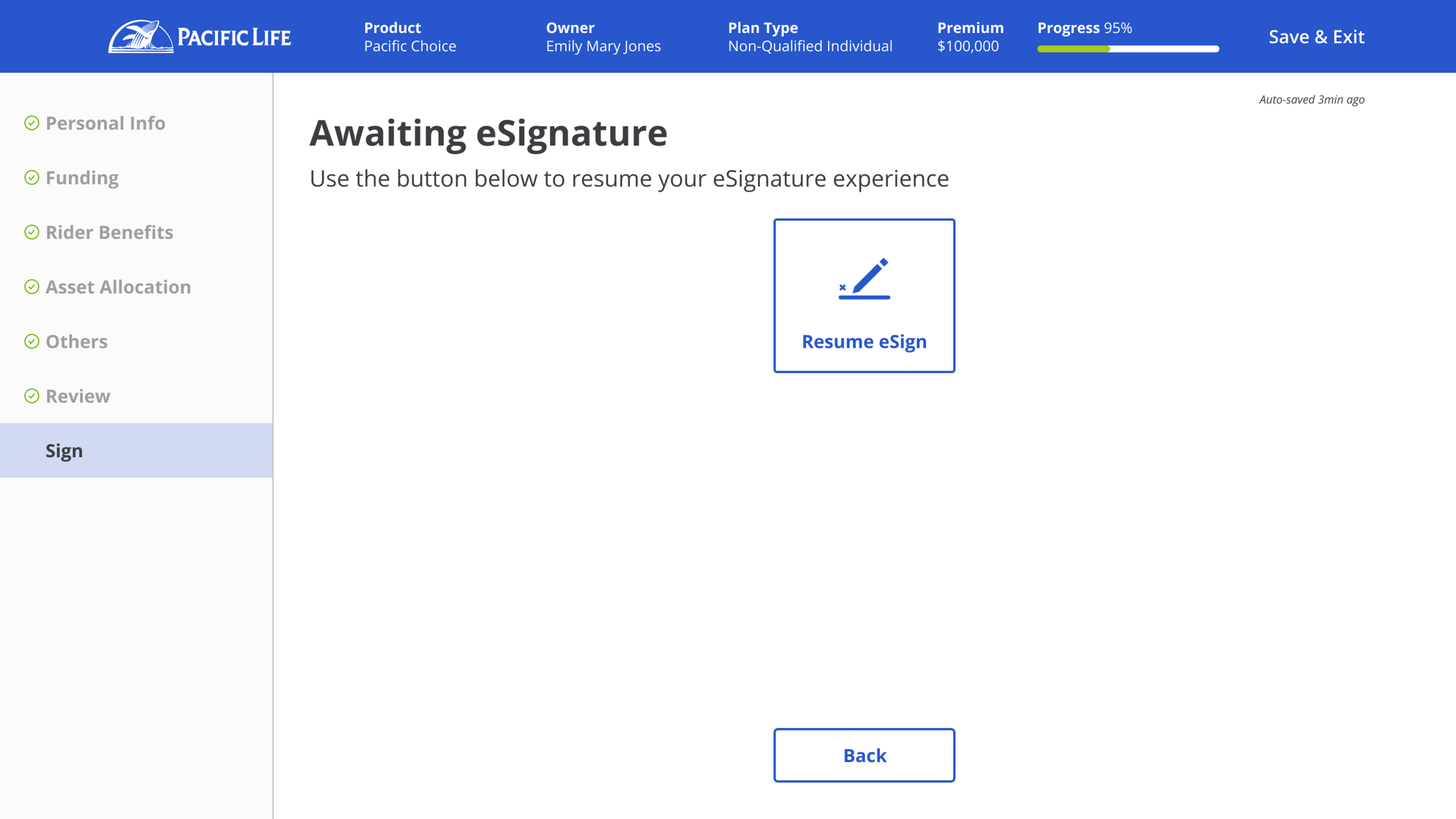
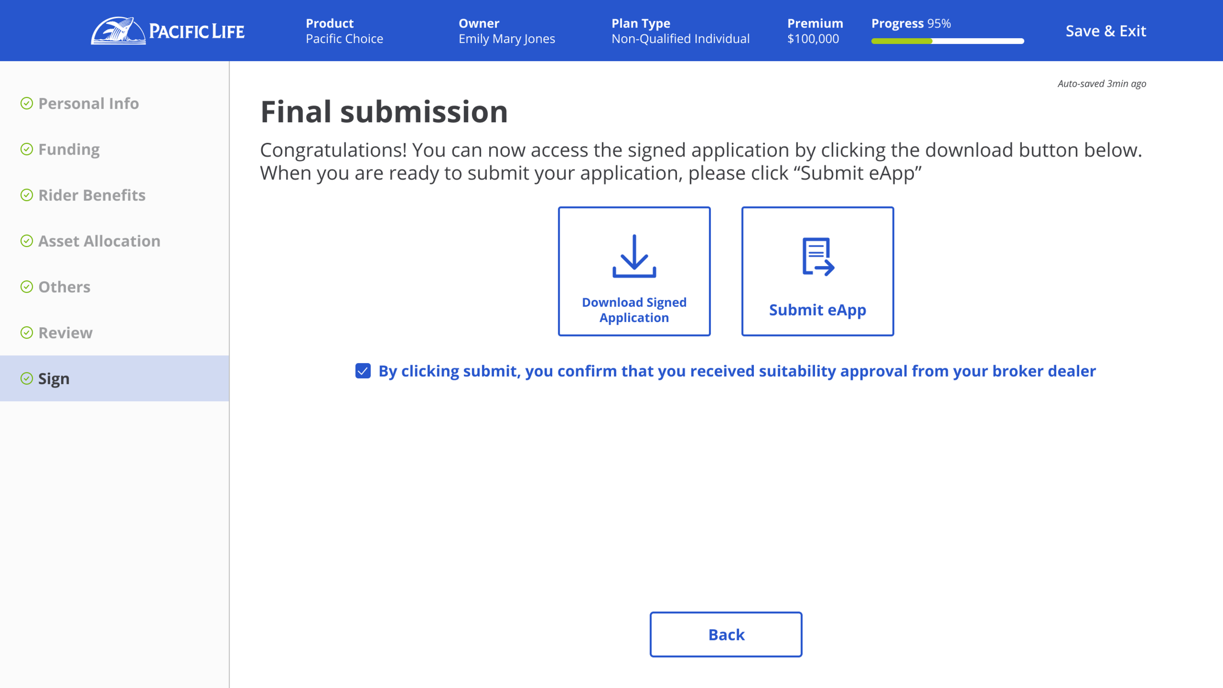
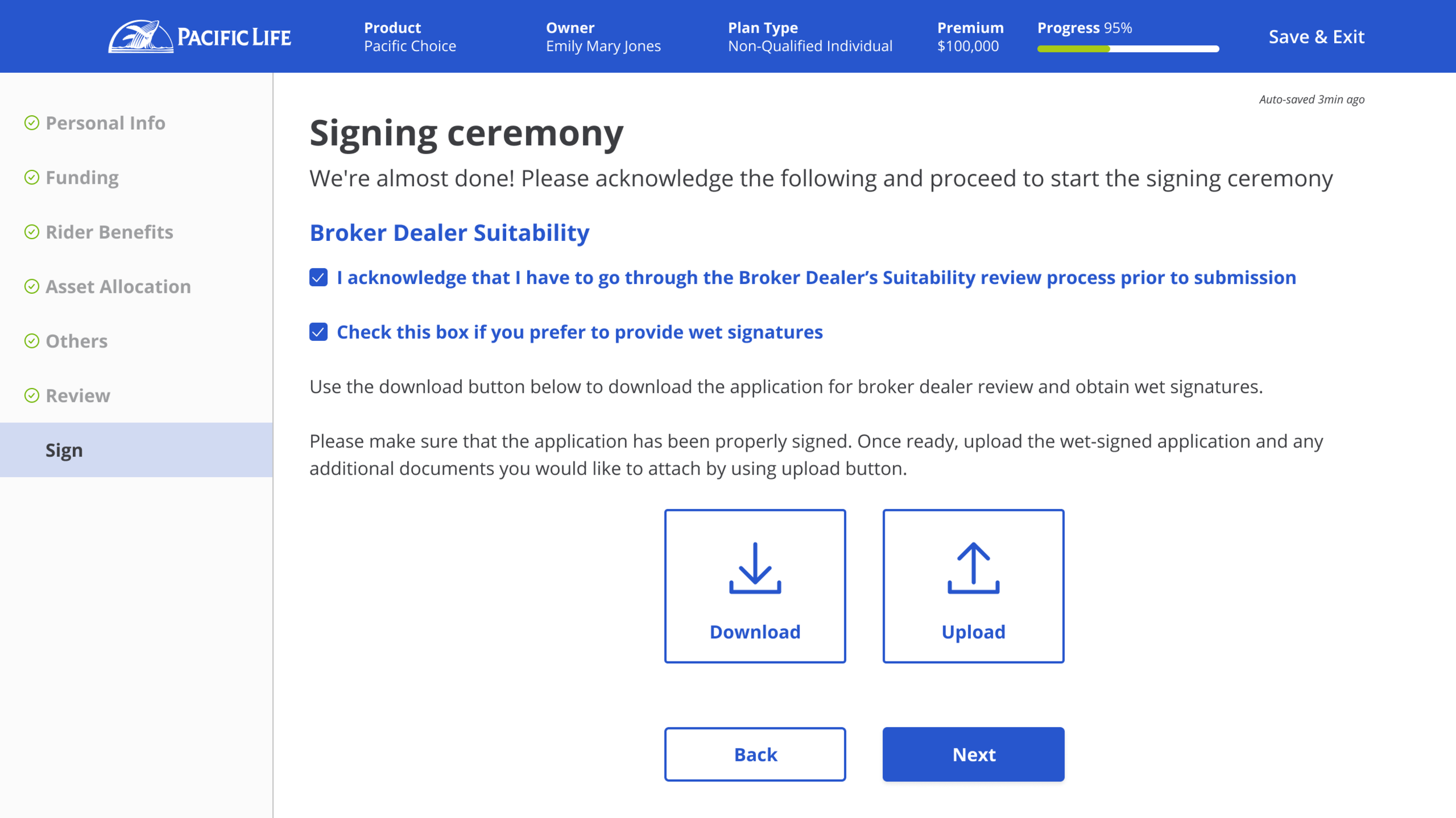
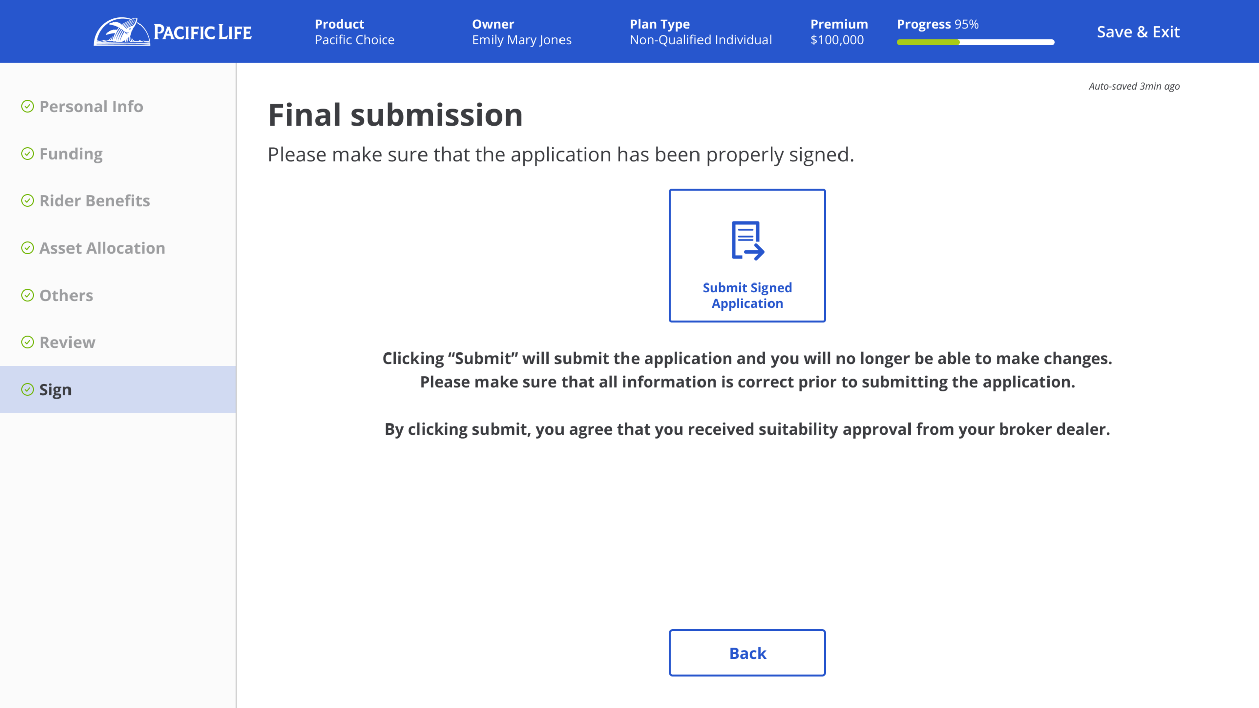

Unfortunately this is the largest area Figma will let me grab, but many, many more flows like these were created for different product lines, suitability & compliance documents, etc.
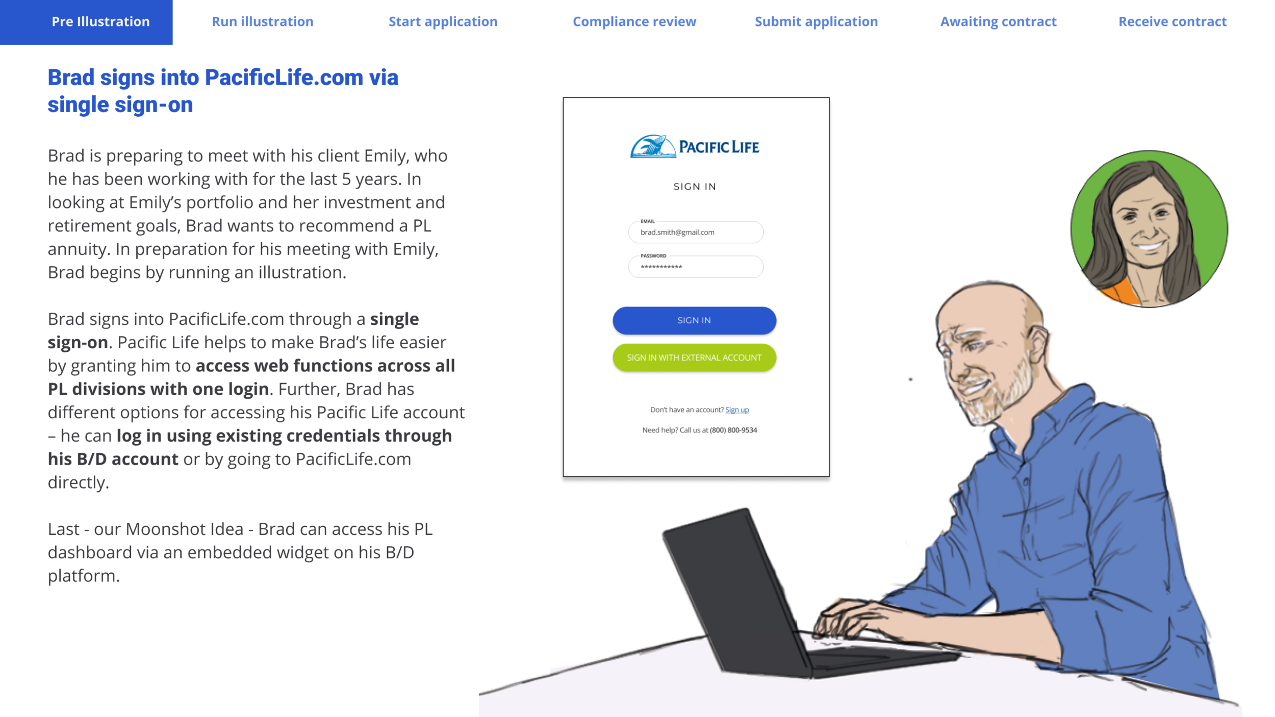
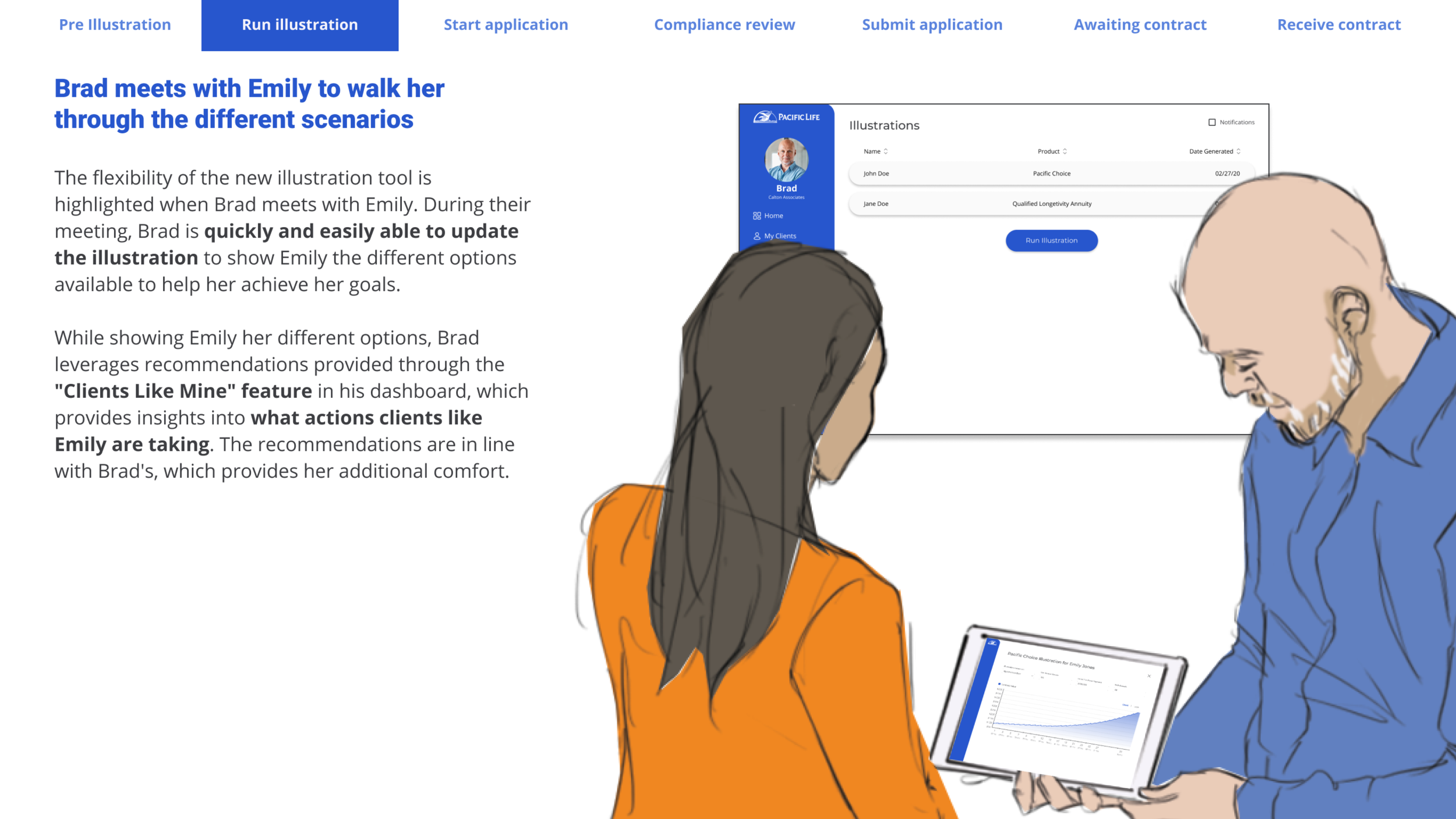
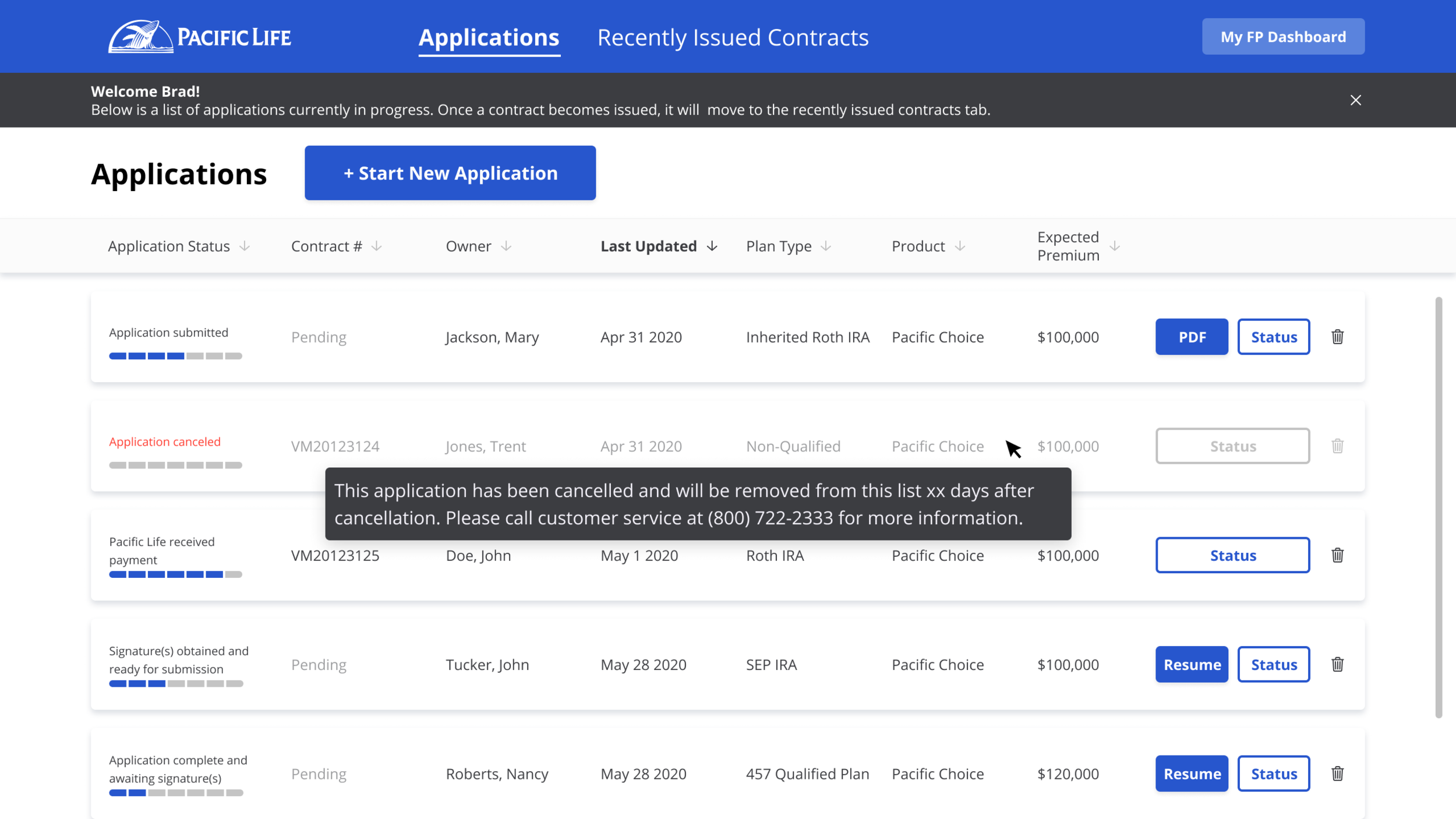
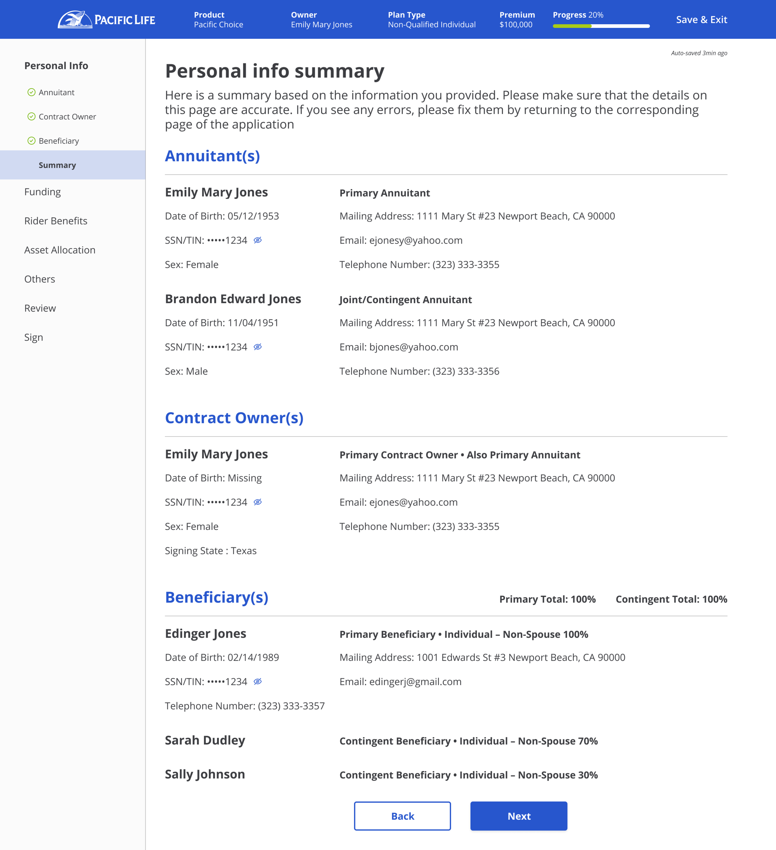
[Status Tracker]
The status tracker is another key element of this transformation. One financial professional we interviewed stated “…once an application has been submitted, it kind of falls into the abyss - and I have no way of finding about it unless I call Pacific Life”. The status tracker provides them details on each step - from the very beginning of an application all the way to the contract issuance.
STYLE SHEET
At the time of joining Pacific Life, this project was the first project to kick off an organization-wide digital transformation decision. This means that we didn’t have a proper design system set up for the organization, or different projects. I’ll elaborate more on this in a bit, but a simple style sheet was created for this particular journey.
The journey doesn’t end here…
As an ongoing effort to continue provide a cohesive experience in all departments and teams, the Hatch Labs design team has decided to develop our own design system. Currently the Pacific Life experience in different departments lack both the visual and experiential connection. With the addition of the Pacific Life Design System, a lot of the designs in this project and other projects will change eventually. There’s still a long way to go, but surely we are making good progress - and more importantly, learning and growing as a team.
Here is a quick preview of the collaborative works in progress - special thanks and shoutout to the awesome designers on the team!